
Recommended
More Related Content
What's hot
What's hot (20)
Similar to Chick Flick titles
Similar to Chick Flick titles (20)
More from daniellausher
More from daniellausher (12)
Recently uploaded
Recently uploaded (20)
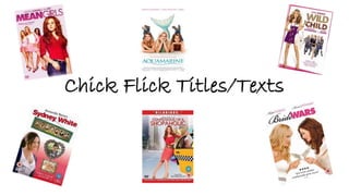
Chick Flick titles
- 2. During the opening sequence, the title of the film is displayed. The word ‘Girls’ is in pink font. Pink is a stereotypical colour for girls. This portrays the Chick Flick genre. Mean Girls This is the font of the titles during the opening sequence for the name of the actors. The colours change for each actor. The font of the titles is the same as the font for the name of the film. The first name is in bold letters and the surname is not in bold letters. In general the font of the titles is generally first name in bold letters and the surname not in bold letters.
- 3. Aquamarine During the opening sequence, the title of the film is displayed. The font is in capital letters and in a blue colour. The blue colour links in with the storyline. Blue can be seen as a calming colour and it symbolises faith and confidence. This is the font and colour of the actors title during the opening sequence. The font of the actors are in lower case letters and in a blue colour. Blue can suggest precision which can reflect upon the fact that the film was created with precision so that it had a perfect outcome. The main actors names are shown on their own but some additional characters are shown with more at once. The job titles and names of the producers and developers of the film are in a blue colour. The job titles are in capital letters and the names of the people are in lower case letters.
- 4. Wild Child There are no titles during the opening sequence. There is only the name of the film and the studio logo shown during the opening sequence. During the opening sequence, the film title is displayed. The font of the title is in capital letters. The writing is in gold and purple colour. Gold connotates sophistication. This links in with the theme of Wild Child. Purple is a calming colour, which could influence the audience to feel more relaxed. This is the only form of a title that is shown in the opening sequence of Wild Child. The writing is in white. White suggests purity. White is also considered to be the colour of perfection. This clearly links with the genre of chick flicks. Girls like to look and be like the ‘perfect’ person.
- 5. Sydney White During the opening sequence, the film title is displayed. The name of the title in a white colour font. The title also has a shadow behind it. This could represent a mirror and therefore suggest vanity. Women always look in mirrors and make sure that they look presentable. This is the font and colour of the titles during the opening sequence. The titles of the actors are in a white colour and capital font. The white colour suggests cleanliness. The titles are clear and visible which links with the meaning of cleanliness – if its clean a positive outcome will be visible. This is the titles for the producers and developers of the film. The job title (e.g. music by) is in lower case letters and the names are in capital letters. This is because capital letters draw in peoples attentions and the producers and developers will want to be known by their name.
- 6. Confessions of a Shopaholic During the opening sequence of the film, the title is shown. The title is in a pink colour. Pink is a stereotypical colour for girls. The colour pink represents love. Love is a key genre shown in most chick flick films. This is the font and colour of the titles for the actors during the opening sequence. The colour of the titles are also pink. The titles of the actors are in capital letters and in a clear font. The names of the main actors are shown singularly and the others actors are grouped. These are the titles for the developers and producers. The title (e.g. music supervisor) is in a swirly font. The swirly font is delicate and can link with women seen as being dainty. The name of the producer or developer is in pink colour and capital font.
- 7. Bride Wars During the opening sequence of the film, the title of the film is displayed. The word ‘Bride’ is in swirly fancy font. The swirly font is a stereotypical font for chick flicks. This is the font of the titles during the opening sequence. The text is in a white font. White suggests purity. Most of the titles in the opening sequence are white. Some of the titles in the opening sequence are in black font. Black connotates sophisticated. The titles that are in black font are the main producers and developers. Without them the film would not be possible.