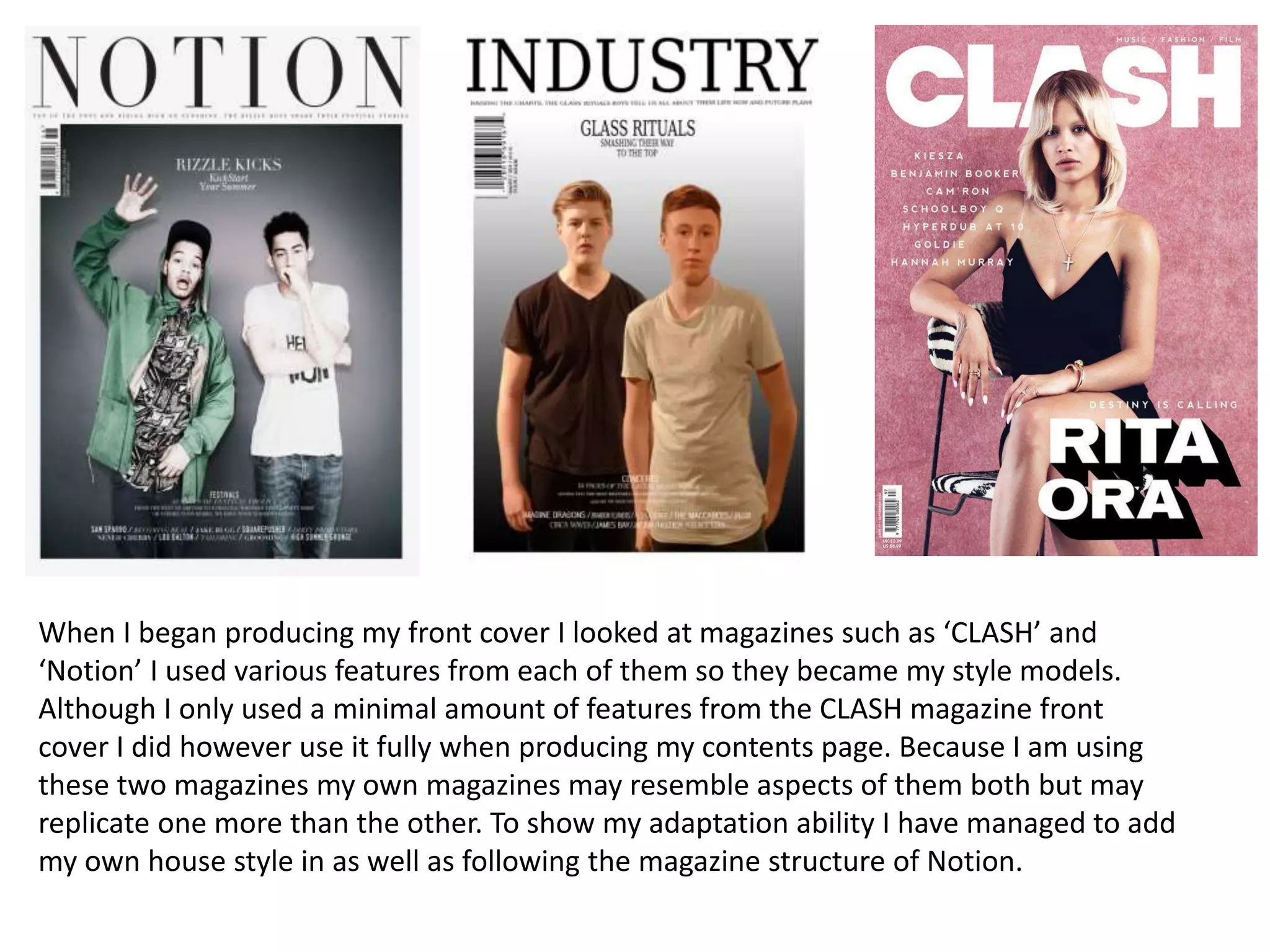
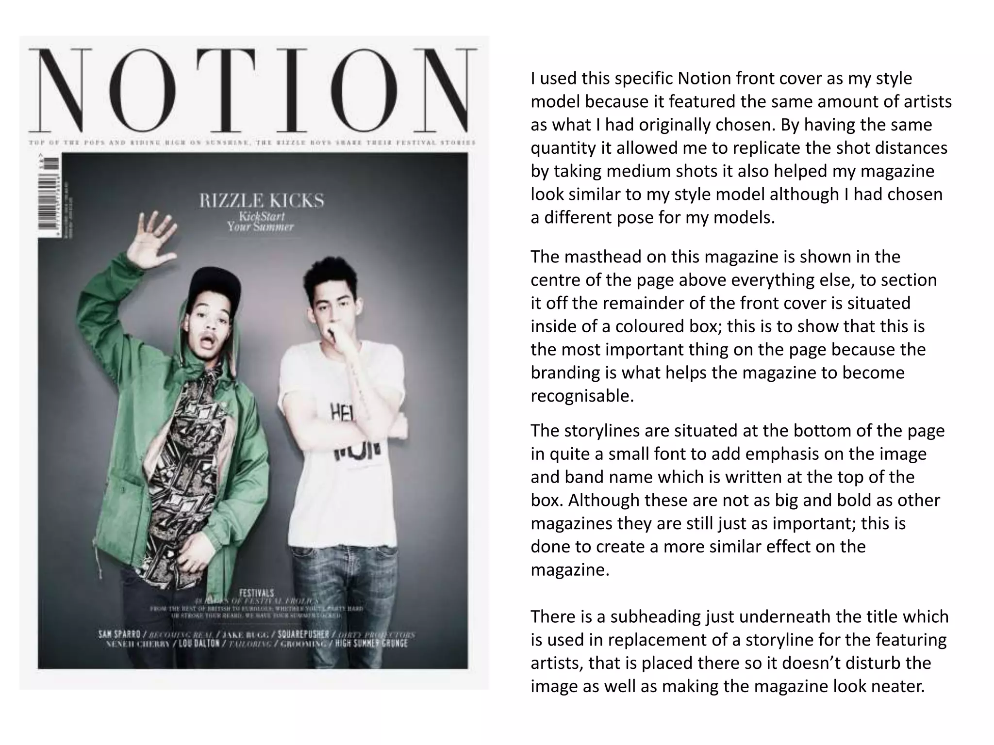
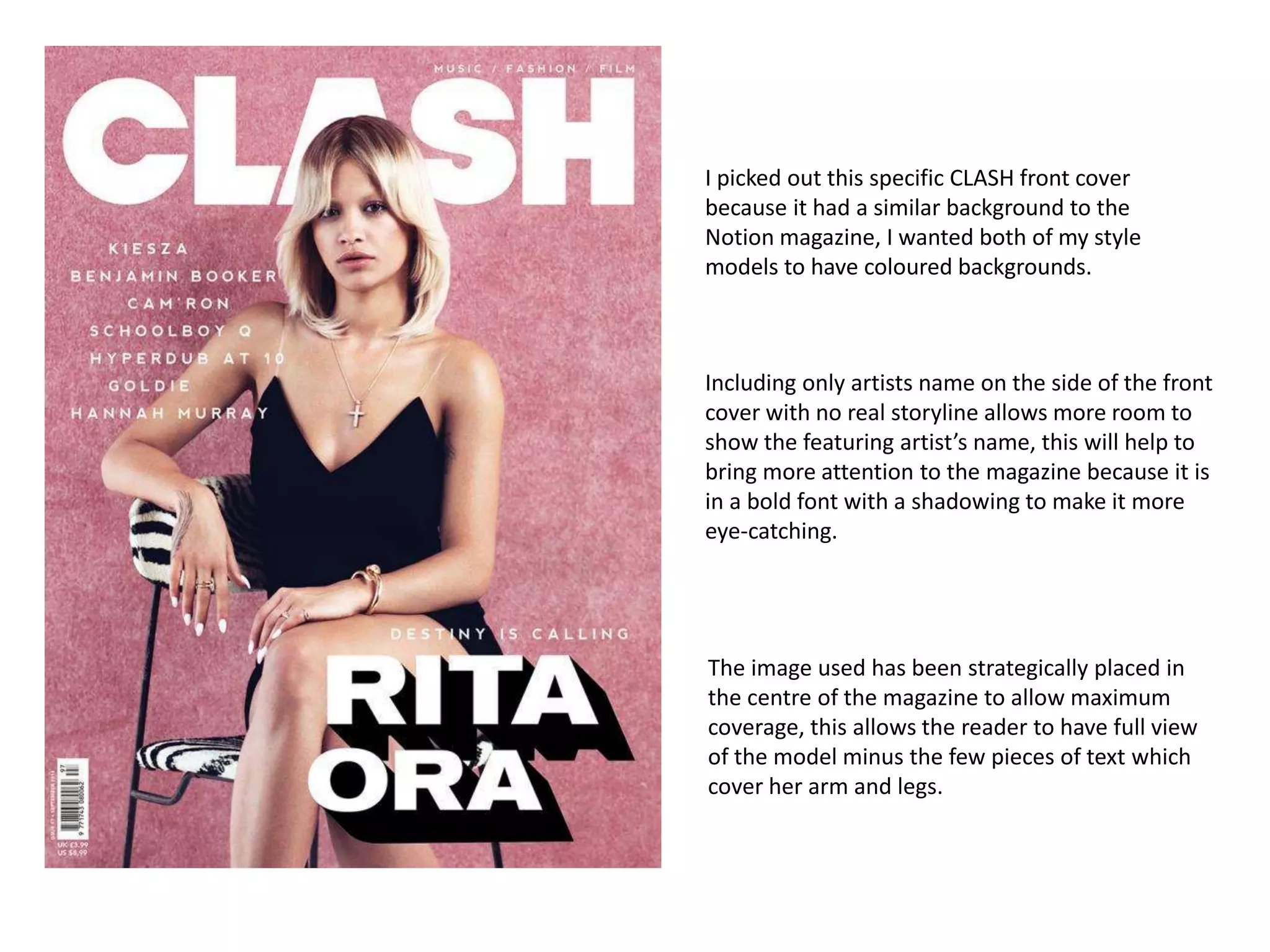
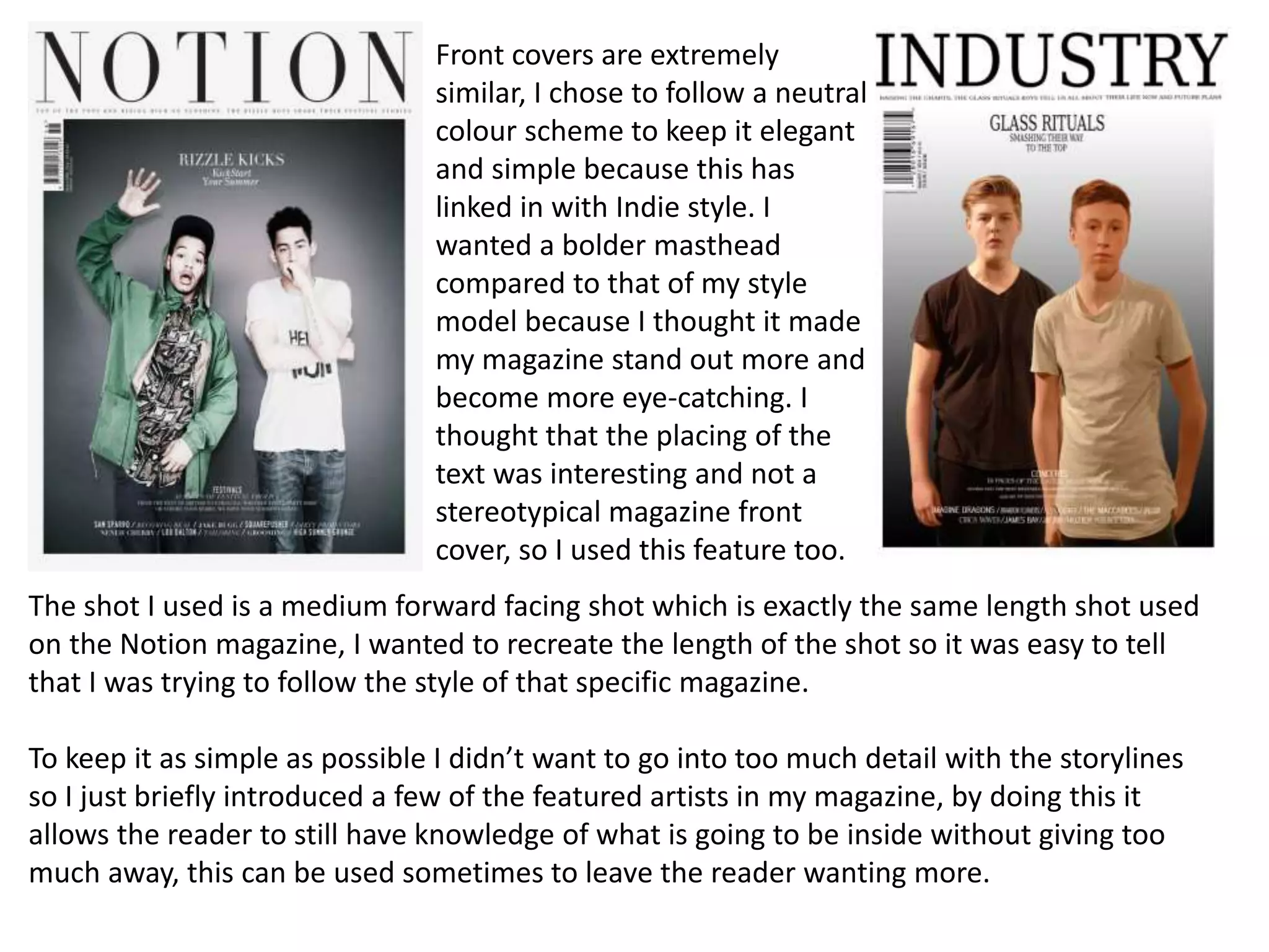
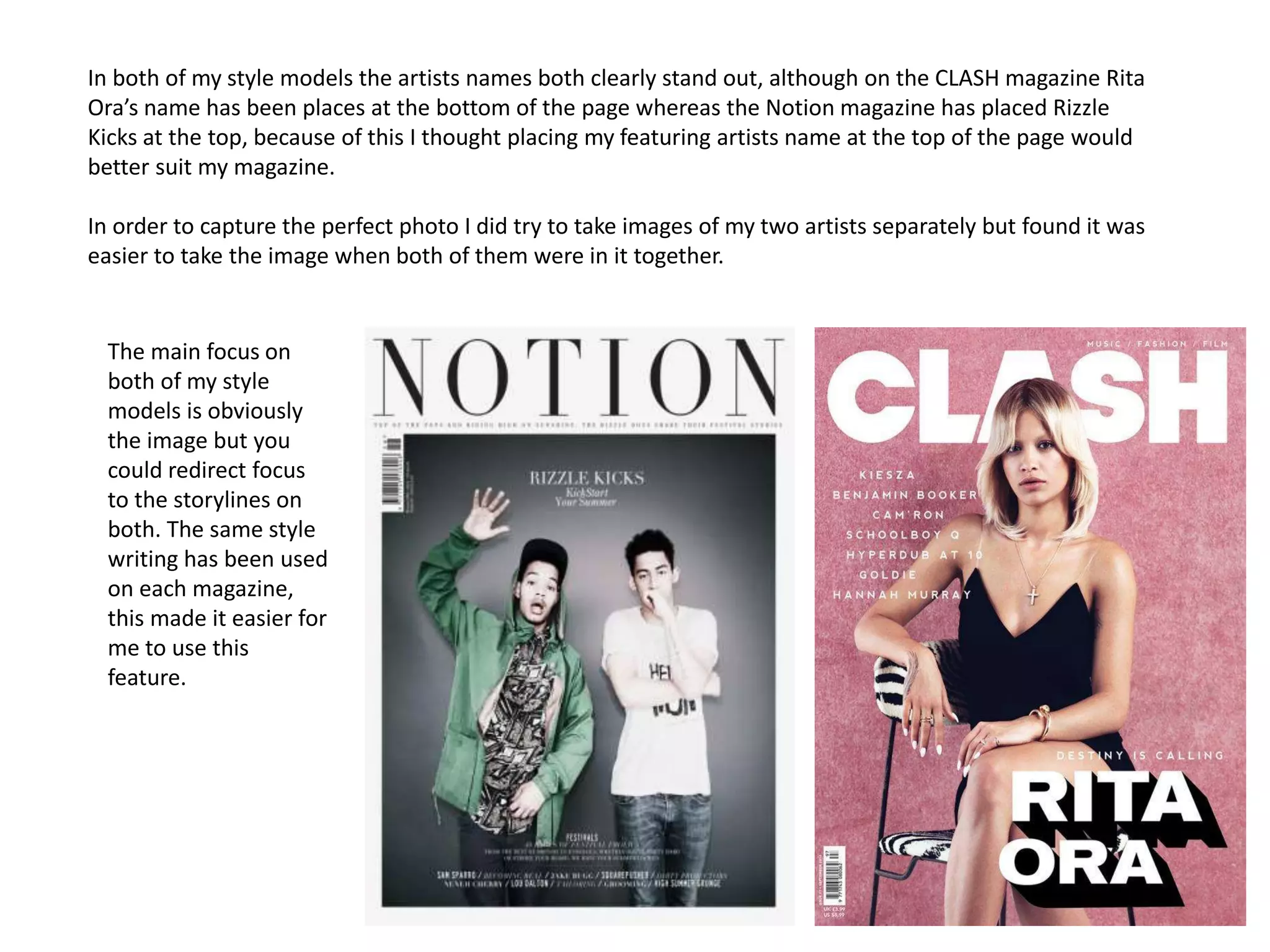
2. When I began producing my front cover I looked at magazines such as ‘CLASH’ and
‘Notion’ I used various features from each of them so they became my style models.
Although I only used a minimal amount of features from the CLASH magazine front
cover I did however use it fully when producing my contents page. Because I am using
these two magazines my own magazines may resemble aspects of them both but may
replicate one more than the other. To show my adaptation ability I have managed to add
my own house style in as well as following the magazine structure of Notion.
3. I used this specific Notion front cover as my style
model because it featured the same amount of artists
as what I had originally chosen. By having the same
quantity it allowed me to replicate the shot distances
by taking medium shots it also helped my magazine
look similar to my style model although I had chosen
a different pose for my models.
The masthead on this magazine is shown in the
centre of the page above everything else, to section
it off the remainder of the front cover is situated
inside of a coloured box; this is to show that this is
the most important thing on the page because the
branding is what helps the magazine to become
recognisable.
The storylines are situated at the bottom of the page
in quite a small font to add emphasis on the image
and band name which is written at the top of the
box. Although these are not as big and bold as other
magazines they are still just as important; this is
done to create a more similar effect on the
magazine.
There is a subheading just underneath the title which
is used in replacement of a storyline for the featuring
artists, that is placed there so it doesn’t disturb the
image as well as making the magazine look neater.
4. I picked out this specific CLASH front cover
because it had a similar background to the
Notion magazine, I wanted both of my style
models to have coloured backgrounds.
Including only artists name on the side of the front
cover with no real storyline allows more room to
show the featuring artist’s name, this will help to
bring more attention to the magazine because it is
in a bold font with a shadowing to make it more
eye-catching.
The image used has been strategically placed in
the centre of the magazine to allow maximum
coverage, this allows the reader to have full view
of the model minus the few pieces of text which
cover her arm and legs.
5. The shot I used is a medium forward facing shot which is exactly the same length shot used
on the Notion magazine, I wanted to recreate the length of the shot so it was easy to tell
that I was trying to follow the style of that specific magazine.
To keep it as simple as possible I didn’t want to go into too much detail with the storylines
so I just briefly introduced a few of the featured artists in my magazine, by doing this it
allows the reader to still have knowledge of what is going to be inside without giving too
much away, this can be used sometimes to leave the reader wanting more.
Front covers are extremely
similar, I chose to follow a neutral
colour scheme to keep it elegant
and simple because this has
linked in with Indie style. I
wanted a bolder masthead
compared to that of my style
model because I thought it made
my magazine stand out more and
become more eye-catching. I
thought that the placing of the
text was interesting and not a
stereotypical magazine front
cover, so I used this feature too.
6. In both of my style models the artists names both clearly stand out, although on the CLASH magazine Rita
Ora’s name has been places at the bottom of the page whereas the Notion magazine has placed Rizzle
Kicks at the top, because of this I thought placing my featuring artists name at the top of the page would
better suit my magazine.
In order to capture the perfect photo I did try to take images of my two artists separately but found it was
easier to take the image when both of them were in it together.
The main focus on
both of my style
models is obviously
the image but you
could redirect focus
to the storylines on
both. The same style
writing has been used
on each magazine,
this made it easier for
me to use this
feature.