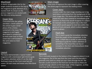
1. Masthead Main image
A clearly recognisable title for the A key area of exposure the main image is often covering
target audience located on the top of the whole page to represent the leading article
the magazine to grab attention on a
stacked shelf. As shown on the
Cover story
picture magazines are stacked with Located under the main image standing out in big
the title only being exposed. bold letters contrasting from the background of the
main image also. This works with the main image to
Cover lines reveal the main story covered to immediately grab
Contrasted with the yellow attention to those that would recognise it’s subject
and black a brief outline of for example in this article green day is the main
the article to give a brief story which would appeal to most fans within the
phase of the articles genres of rock and punk, which is what magazine
contained in the issue. This wants to attract.
magazine is not hugely Flash box
descripted in comparison This is used to grab the immediate attention
to most cover lines on front form the reader of the competition in the
covers but is still located in issue . A flash box is usually an advertising
the same place as most technique to grab the readers attention of
magazines. something in the issue they can buy or
compete in, the short and sharp phases draw
immediate attention.
Layout
The layout demonstrates a typical modern Barcode
magazine with a dominated right third to grab This is normally located on the bottom of the magazine where it is on
the readers attention while it’s on the shelf. this magazine. Out of the way from the cover story the barcode is
Nothing to busy on this front cover but still generally only used so a shop can scan I item through the till. The
covers all main areas and leaves very little blank barcode usually located on the front but not the back as there are
spaces. usually full page adverts on the back page of the magazine , so they
must have the full exposure of there product.
2. Mast head
The location of the mast head matches with the right third as it’s
the title of the section. As I said for the location of the right third
the right side is the part that’s revealed when flicking through the
pages but also the first side that’s read. Contents
The content is less descriptive as
there are only the titles of the
Main image sections in the issues.
To display the main
article the main image.
Layout
The layout of this magazine is
affective because the
Smaller photos construction of the images are
Each revealing the easy to view, and the contents
titles of the sections pages written on the side is
from the right third affective for when the reader
column. flicks through the pages it’s
the first thing they see
Right third
The most dominated part of the
Contrasting colours page containing the page
The use of black and numbers and sections which the
yellow allows the text to issue contains. This is a good
stand out from the rest . layout to use as a contents page
as the right side of the magazine
is the part that the writer reads
first on the page.