1. 1.In what ways does your media product use, develop or challenge forms and conventions of real
media products?
At the time we have thought about using the concept from ‘They Live’ for the first time and
searched for ‘Quad Damage’s’ song with lyrics that would fit this idea perfectly which ‘Dead Side’
appeared to be, we realised it is going to work very well together so the image will be an ideal
reflection of text and the other way round. The music video is rather amplifying the lyrics and as it
goes, it keeps adding news layers of meaning to the song. We have presented some examples in our
research on video theme where, for example we talked about the first two lines ‘Lucid Premonitions
have come to me, All that I can see is industry’ which describe the awareness of a capitalist society
surrounding the individual.
We also tried our best to keep the music video in a
heavy metal genre style. The performance shots were
recorded during the night, additionally to that we
pulled the blinds down so it could appear really dark.
Obviously, for our audience to be able to actually see
something we used three subtle lights all placed
down on the floor so the shadows of guitarist and
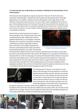
Long shot of the band fading into medium shot of Daniel,
drummer could emphasize their moves and enhance all kept in a dark, mysterious atmosphere.
the disturbing atmosphere of the video. The long shot
of the band which appears there first and is the most used performance shot does not even allow
the viewer to see the band members’ faces clearly. We thought of it as an enigmatic introduction of
the band which are rather the messengers of a sad but still somewhat hidden reality than a bunch of
pretty faces which appear there to ‘sell’ the video mostly just by their appearance. They remain
quite unexposed till 1:43 of the video when the pre-chorus is sang for the first time and Daniel is
screaming out the miserable truth ‘They're taking away my soul, Our lives are bought and sold,
Apocalypse worldwide, They come from the Dead Side’ about the capitalist society that we are living
in and exposes himself with the explicit message he has got for the world.
The intertextuality of ‘They Live’ scene within our music
video is fairly thorough. At first we wanted to re-create the
performance part literally shot after shot but as we wanted
it to have more of our own influence we have mixed it with
our own ideas. The basic bond is the concept of sunglasses
which reveal the world to be seen as it really is for the one
who is wearing them. Also, the black and white vision and
1:43 - pre-chorus starts zombie-like appearance of the aliens when having them on
are obvious connections. Therefore I think we have applied the most important ideas, the
foundations of the entire film’s plot. We have added a few new notions which I do not think are that
significant for an average ‘They Live’ fan to actually not realise about the resemblance between this
music video and the film so I think the intertextuality works there clearly.
2. 2. How effective is the combination of your main product and ancillary texts?
The genre of music made by Quad Damage – doom metal required us to create indeed a doomy,
disquieting atmosphere around the band by the use of all our products. What was hard to add was
some necessary commerce into the whole campaign as this particular music genre has mostly got a
niche audience which usually demands either not standing out too much from the conventions of
their favourite genre or doing completely opposite – being extremely original. We have chosen the
former – holding onto conventions and therefore
wereally wanted to be careful with ‘selling’ our
product – the band. The result of it was the star
ratings on the magazine advert being the only
‘mainstream’ suggestion in the marketing of our
band. The star ratings on the magazine advert
Quad Damage, since it was created,made black and red its colours of recognition and the band was
always trying to be associated with these colours. Such tones are working very well with a heavy
metal band’s branding as they have connotations to darkness, mystery, anger and even blood so we
did not even think about changing it. We have made some research into black and red cd covers of
any heavier rock bands so we could develop our ideas. The german
band KMFDM has used this mixture a lot (albums: Symbols, Adios,
Hau Ruck) and we also looked at Mothership by Led Zeppelin. They
are all kept in sort of a comic book style and this time we wanted to
make something different, something that will attract attention by its
distinctivness as we are still new on the market. Then, we found an
interesting artwork on DeviantART website and asked the artist for a
permission to use it which he replied positively about. Its inspiration
was based on Super Nintendo game ‘Earthbound’,in which the final
Led Zeppelin - Mothership
boss is a warped image of a fetus surrounded in darkness and luckily,
it was black and red.
For the album cover we just made the artwork look like a vortex but as we
edited it we wanted one of the ghoul faces to be way bigger than the rest
and so we did. Inside the case, you can see the artwork just as it appeared
initially. Last page of the inlay booklet has the other version of that
artwork printed on it which looks like a pastel work and has got some
yellow used. Inside the booklet there are lyrics for all six tracks in Times
New Roman font written in red with black background behind it. The old-
style fonts work well with such genre as they emphisize the mystery
behind it and bring up the ideas of some ancient cults, paganism etc. The
mystery is kept inside the case but the outside font looks quite digitalized,
although I think its shape fits together with the whole CD package. The
headline font on the magazine advert was I think a very good choice to
catch the eye of a random viewer as it is very radical and thick. Finally,
image of the band caught all in movement enhances the power brought
with their music and its warm and dark atmosphere fits with recognition
colours of Quad Damage – black and red which with a little bit of white are
Inlay booklet of the digipak
3. something that connects the entire digipak together. The darkness and demonic atmosphere is also
a common feature of each part of the digipak.
Our video is based on anti-consumerism and anti-elitism ideas and in a lot of aspects could be
compared to video for System of a Down’s song ‘B.Y.O.B.’. Big chunk of heavy metal music is driven
with the notion to release from chains on which system limits us and censors so this idea of riot is
also very important in the branding and representation of Quad Damage. The plot of our video
presents such approach clearly.