Flyer Flyers
•Download as PPTX, PDF•
1 like•337 views

This short document discusses using color in flyers to emphasize or de-emphasize elements. It contains copyright information for the author and mentions that presenter notes are required to view, along with various colored text and symbols examples.

Recommended
Recommended
More Related Content
Recently uploaded
Recently uploaded (20)
Featured
Featured (20)
Flyer Flyers
- 1. flyer flyers by Cara A. Brown caraabrown.com Copyright © 2015 by Cara A. Brown
- 2. Presenter notes are required. Click below to view.
- 36. COLOR can be used to emphasize or de-emphasize.
- 39. + =
Editor's Notes
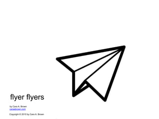
- 1 In this presentation, Cara A. Brown explores the universality of visual language for the purpose of designing more effective marketing collateral or ‘flyer flyers’. Cover ‘paper airplane’ icon created by Ilsur Aptukov from the Noun Project Copyright © 2015 by Cara A. Brown All rights reserved. This presentation or any portion thereof may not be reproduced or used in any manner whatsoever without the express written permission of the publisher.
- 2 Presenter notes are required. Click below to view.
- 3 Many places you go in the world, stop signs look similar. Most noticeably, they are all red. Isn’t that interesting? Why is that?
- 4 Well, we can start to understand why by looking at this flyer. Can you guess what it is for, even if you don’t speak Spanish? Why is that?
- 5 This is a bottle of water. Remember it. We will come back to this later.
- 6 We’ve all seen flyers that feel like this. Just trying to figure out what is being presented is a task. Flyers that aren’t designed with the reader in mind, feel confusing and could repel the reader. People are busy and distracted. With he growing amount of ‘noise’ clamming for our attention, the primary goal for your flyer is for the reader to be able to ingest whats being presented quickly. Remember the primary goal is not necessarily for the flyer to be ‘beautiful’. Its possible to have a beautiful flyer that is hard to comprehend.
- 7 The ultimate goal of your flyer is to inform and influence the reader toward taking a specific action. A ‘flyer flyer’ feels like this. A ‘flyer flyer speaks’ a specific language with fluency (hint: it isn’t English).
- 8 My background in experience design has afforded me the opportunity to understand how we process and evaluate experiences. Interestingly, the brain plays a major role. The brain processes information in our environment after receiving stimuli from our five sensory organs. Our hands, eyes, skin, ears and nose act as antennas that receive information and send that info to our brains for processing. Technically, you don’t smell with your nose, you smell with your brain. You don’t see with your eyes, you see with your brain. The brain processes layers of environmental stimuli differently. The primary language of the brain is visual. From infancy, the brain can process an image faster than the blink of an eye. Unlike written and spoken language which takes years of learning and practice, visual language is intuitive and universal. Memories are visual. 20% of our brain is designed for processing visuals. Speaking the language of the brain, will allow you to create flyer flyers that go beyond just appealing to the readers tastes and preferences or being pretty. Speaking visual language with fluency means your message is absorbed and retained. An individual's mood has been known to distort cognitive abilities. Emotions cloud rational, quick thoughts. By designing flyers to be pretty, pleasant, soothing, appealing, exciting, cool, etc, we have in that instant influenced emotions in our best interests. If the reader feels good viewing our flyer, they may be more open, receptive, interested and willing to consume the information presented on it. There are a few elements of visual language that are important to understand.
- 9 The first element of visual language is color. Colors convey emotion The conscious mind realizes things in layers, 1 at a time. The 1st layer is color. Color offers an instantaneous method for conveying meaning and message without words. Research says ...60% of the time people will decide if they are attracted or not to a message - based on color alone. General color psychology - 6 basic principles: Color can carry specific meaning. “Color meaning” is either based in learned meaning or biologically innate meaning. The perception of a color causes evaluation automatically by the person perceiving. The evaluation process forces color-motivated behavior. Color usually exerts its influence automatically. Color meaning and effect has to do with context as well. Raise your hand if you have ever seen... a policeman in a magenta uniform? a teal caution sign? a pink rubber safety cone?
- 10 Pantone is arguably the worlds leading color expert. Let’s quickly review some basic colors and their physiological and psychological effects.
- 11 Red. It is undeniable. The effect that red has on our brain is biologically innate. This is the reason why stop signs around the world are red. Red also increases our heart rate and appetite.
- 12 Orange is a high energy color. If overused it can cause anxiety Similar to stop signs, globally safety cones are orange. According to context, Orange can also indicate “cheap”, often seen in ‘Closing sale. All items must go!’ signs.
- 13 The famous Tigonderoga pencils and legal writing pads are yellow because yellow promotes alertness and attention.
- 14 Green sustainability movement
- 15 Blue is the most popular amongst men and women in America. Blue communicates trust. Police, or ‘Boys in Blue’ wear blue uniforms. The logos for Facebook and Twitter blue by design. Blue promotes productivity and non-invasiveness.
- 16 Purple is the color of the Christian papacy.
- 17 White is indeed a color.
- 18 High quality
- 19 Color preferences also differ based on sex, age, culture, geographical location. Certain colors are deemed appropriate for certain products.
- 20 Branding People often see the logo of a brand or company as a representation of that company. Without prior experience to a logo, we begin to associate a brand with certain characteristics based on the primary logo color. Color is the visual component people remember most about a brand and increases brand recognition by up to 80 percent.
- 21 Children They love TV/ Movie characters, who are usually composed of vibrant colors. Color improves comprehension by 73%, learning by 68% and reading by 48%.
- 22 Teenagers Boys favor black and red. Girls favor bright, vibrant ‘candy’ colors.
- 23 Parents Seeking responsibility and trust, favor blue and green. Also, less is more.
- 24 Professional adults When conveying a lot of info use monochromatic schemes to calm the reader. High contrast colors agitate them and thus create faster customer turnover. McDonald’s is a company that purposefully chose red and yellow for their logo colors. These colors excite children, while parents may grumble.
- 25 The second element of visual language - symbols. Symbols and shapes are universal and convey a lot of information in a short bit of time, compared to hearing or reading the information. Most buttons on your phone are symbols, not words. In fact most apps are symbols and colors. Even the numbers on key pads are numerals, not spelling out with words. Ex. “5”, not “five”. Basic geometrical shapes can be soft or hard, stable or threatening.
- 26 Purpose of a flyer It is a branded piece of communication. It carries the values, personality, characteristics of the brand...whether the logo is present or not. Sets a level of expectation for the reader - whats is in store, quality of service or experience. Informs and educates, which means it has to be legible, logical and correct. It influences action, which means it has to appeal to the audience.
- 27 So…I have some good news and bad news. Bad news. Getting people to do things is not for the faint of heart. Product companies spend large percentages of their budget to entice people to buy things. Now for the good news - Knowing this rule of 7, motivating people toward action is simple. On average, a human must be exposed to the information on average 7 times in order to get their attention and get them to make a decision. Parents might take some comfort in knowing this. If you have to ask your teen to take out the trash more than once, don’t be upset. This is how the brain is wired.
- 28 Often a flyer is the first exposure that serves to lead the reader to another point of exposure, like a website, an email or phone call.
- 29 Speak to your audience
- 30 Address needs and wants Imagine this…Its summer time at the Grand Canyon. We just finished a long hike under the hot, blazing sun. Having run out of water 30 minutes ago, our mouths are parched. We are more thirsty than we’ve ever been. As we climb the last incline to the end of the trail, we see two stands, one on either side of the road. On one side, there is a fancy booth with pictures of fancy logos and umbrellas and an enthusiastic salesman who sees us coming and starts in on his sales pitch. “Refreshment…Oasis for your mouth…freedom from the sun wrath, instant relief from the bondage of heat,”…on and on he goes. As he starts to explain the special ‘no-spill’ nozzle we glance over to the other side of the road. There we see a basic push cart, with ice buckets brimming over with bottled water. The sign that reads “Cold Water $1”. A nice guy with a smile says “Bottle of water for a dollar.” Who are we more likely to buy from at that moment? Being sun scorched and dehydrated, we probably aren’t the best candidates for a long sales pitch on a no-spill nozzle. We just want the water without the fuss. The moral of the story is to speak to your audience that is appropriate for their current context. People are busy and over stimulated. What you are offering may provide your audience with a real benefit. So, your task is to find a way to capture their attention and communicate your message in a manner in which they can receive it. Think about symbols and words that convey the meanings that each audience may be seeking.
- 31 Fun
- 32 Validation
- 33 Safety
- Purpose
- 34 Design dictionary.com defines ‘design’ as follows - plan and fashion artistically or skillfully; to intend for a definite purpose; to form or conceive in the mind; contrive; plan; to assign in thought or intention; purpose. Lets consider how to use colors, symbols and other design elements such as font to speak visual language with more fluency.
- 35 A Midwestern insurance company used color to highlight key information on their invoices. As a result, they began receiving customer payments an average of 14 days earlier.
- 36 Font can also be used to indicate purpose.
- 37 Clockwise from top left Thank you note for RACA pop up shop attendees. Golf Tournament announcement. New collection announcement. Annual Buddhist celebration invitation. Study hall event announcement for high school students.
- 38 Utilizing colors, symbols and messages with the purpose of speaking directly to the needs and wants of viewers is the key to effective collateral. Don’t just make flyers, make ‘flyer flyers’. Thank you ! To learn more about Cara A. Brown, visit caraabrown.com. For more information, or to bring this presentation to your team, please send an email to hi@caraabrown.com.