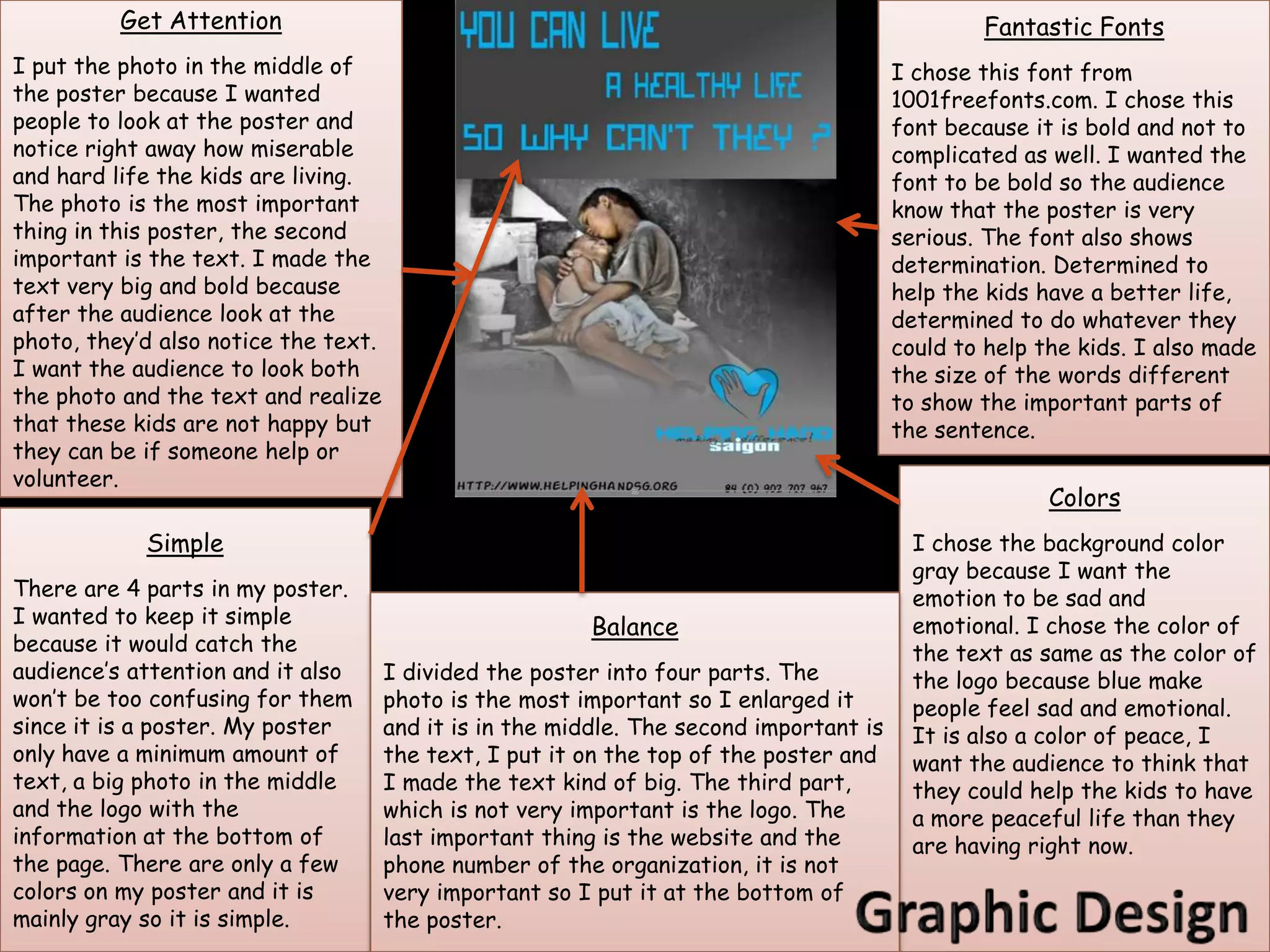
I made the background gray because I
wanted the poster to look emotional, I                Audience: Foreigners from the age of 20 to 40.
wanted it to make people feel sad and                 Purpose: To make people volunteer at orphanages in Saigon.
volunteer to help the orphanages. I used
gradient tool to make the top left corner
darker and it get lighter towards the right
bottom corner.

                                For the photo, I also used gradient
                                tool to make the photo fade and
                                blend in with background. I wanted
                                to make the photo fade in with the
                                background because in my mind, I
    I used color picker         was thinking that if people wanted
    to match the color          to help, the orphans would have a
    of the text with            better life and it also mean that
    the color of the            their miserable sad life is over and
    logo.                       their happy new life is starting.


    When I finished my                When I added this photo, I made a
    poster, I flattened all           new layer then I duplicated the
    the layers so I could             layer because I wanted to make the
    save it.                          boys stand out. After I duplicated
                                      the photo, I made the layer on top
                                      black and white, then I used the
                                      eraser to erase the boys so the
                                      background would be black and
                                      white and the boys would stand out
                                      with colors.

                                                                                   When I added this logo, I had to
                               I wrote the information of the
                                                                                   add a new layer then post the logo
                               organization at the bottom of the page so
                                                                                   on to that new layer. Before I post
                               the audience can contact the
                                                                                   the logo, I had to use magic wand to
                               organization. I made it small because it is
                                                                                   erase the white background around
                               not as important as the other things on
                                                                                   the logo.
                               the poster.
Get Attention                                                                          Fantastic Fonts
I put the photo in the middle of                                                         I chose this font from
the poster because I wanted                                                              1001freefonts.com. I chose this
people to look at the poster and                                                         font because it is bold and not to
notice right away how miserable                                                          complicated as well. I wanted the
and hard life the kids are living.                                                       font to be bold so the audience
The photo is the most important                                                          know that the poster is very
thing in this poster, the second                                                         serious. The font also shows
important is the text. I made the                                                        determination. Determined to
text very big and bold because                                                           help the kids have a better life,
after the audience look at the                                                           determined to do whatever they
photo, they’d also notice the text.                                                      could to help the kids. I also made
I want the audience to look both                                                         the size of the words different
the photo and the text and realize                                                       to show the important parts of
that these kids are not happy but                                                        the sentence.
they can be if someone help or
volunteer.
                                                                                                        Colors
            Simple                                                                         I chose the background color
                                                                                           gray because I want the
There are 4 parts in my poster.                                                            emotion to be sad and
I wanted to keep it simple                               Balance                           emotional. I chose the color of
because it would catch the                                                                 the text as same as the color of
audience’s attention and it also      I divided the poster into four parts. The            the logo because blue make
won’t be too confusing for them       photo is the most important so I enlarged it         people feel sad and emotional.
since it is a poster. My poster       and it is in the middle. The second important is     It is also a color of peace, I
only have a minimum amount of         the text, I put it on the top of the poster and      want the audience to think that
text, a big photo in the middle       I made the text kind of big. The third part,         they could help the kids to have
and the logo with the                 which is not very important is the logo. The         a more peaceful life than they
information at the bottom of          last important thing is the website and the          are having right now.
the page. There are only a few        phone number of the organization, it is not
colors on my poster and it is         very important so I put it at the bottom of
mainly gray so it is simple.          the poster.

Explanation helping-hand-poster

  • 1.
    I made thebackground gray because I wanted the poster to look emotional, I Audience: Foreigners from the age of 20 to 40. wanted it to make people feel sad and Purpose: To make people volunteer at orphanages in Saigon. volunteer to help the orphanages. I used gradient tool to make the top left corner darker and it get lighter towards the right bottom corner. For the photo, I also used gradient tool to make the photo fade and blend in with background. I wanted to make the photo fade in with the background because in my mind, I I used color picker was thinking that if people wanted to match the color to help, the orphans would have a of the text with better life and it also mean that the color of the their miserable sad life is over and logo. their happy new life is starting. When I finished my When I added this photo, I made a poster, I flattened all new layer then I duplicated the the layers so I could layer because I wanted to make the save it. boys stand out. After I duplicated the photo, I made the layer on top black and white, then I used the eraser to erase the boys so the background would be black and white and the boys would stand out with colors. When I added this logo, I had to I wrote the information of the add a new layer then post the logo organization at the bottom of the page so on to that new layer. Before I post the audience can contact the the logo, I had to use magic wand to organization. I made it small because it is erase the white background around not as important as the other things on the logo. the poster.
  • 2.
    Get Attention Fantastic Fonts I put the photo in the middle of I chose this font from the poster because I wanted 1001freefonts.com. I chose this people to look at the poster and font because it is bold and not to notice right away how miserable complicated as well. I wanted the and hard life the kids are living. font to be bold so the audience The photo is the most important know that the poster is very thing in this poster, the second serious. The font also shows important is the text. I made the determination. Determined to text very big and bold because help the kids have a better life, after the audience look at the determined to do whatever they photo, they’d also notice the text. could to help the kids. I also made I want the audience to look both the size of the words different the photo and the text and realize to show the important parts of that these kids are not happy but the sentence. they can be if someone help or volunteer. Colors Simple I chose the background color gray because I want the There are 4 parts in my poster. emotion to be sad and I wanted to keep it simple Balance emotional. I chose the color of because it would catch the the text as same as the color of audience’s attention and it also I divided the poster into four parts. The the logo because blue make won’t be too confusing for them photo is the most important so I enlarged it people feel sad and emotional. since it is a poster. My poster and it is in the middle. The second important is It is also a color of peace, I only have a minimum amount of the text, I put it on the top of the poster and want the audience to think that text, a big photo in the middle I made the text kind of big. The third part, they could help the kids to have and the logo with the which is not very important is the logo. The a more peaceful life than they information at the bottom of last important thing is the website and the are having right now. the page. There are only a few phone number of the organization, it is not colors on my poster and it is very important so I put it at the bottom of mainly gray so it is simple. the poster.