“Oh GOSH! Reflecting on Hackteria's Collaborative Practices in a Global Do-It...
Five cover 2
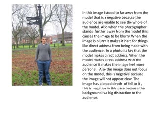
1. In this image I stood to far away from the
model that is a negative because the
audience are unable to see the whole of
the model. Also when the photographer
stands further away from the model this
causes the image to be blurry. When the
image is blurry it makes it hard for things
like direct address from being made with
the audience. In a photo its key that the
model makes direct address. When the
model makes direct address with the
audience it makes the image feel more
personal. Also the image does not focus
on the model, this is negative because
the image will not appear clear. The
image has a broad depth of fell to it ,
this is negative in this case because the
background is a big distraction to the
audience.
2. In this image the male is not
making strong eye contact with
the audience. This is very negative
because it will make the picture
look like it has no personal impact
on the audience. . Also the image
is blurry this is negative because
the image is hard to view and it
will not make the audience want to
purchase the magazin.Another
reason I am not able to use the
photograph because it does not
meet all of the magazine codes
and conventions. The magazine
cover is suppose to have make the
audience want to purchase the
product, if the model has a moody
look on his face , this could put
the audience of from buying it.
3. In the third image I chose the
model is making strong eye
contact with the audience. This is
a positive because it will make
the audience feel like the model
has some kind of personal
connection with them. The
lighting in this picture is natural
this good because its able to
brighten up the whole of the
image , this means the audience
can clearly see the models face.
Also the image has a narrow
depth of feel to it , this is positive
in this case because all of the
models face is in view and this
allows the attention of the
audience to be just on the model
and not get distracted by what is
going on in the background of the
image.
4. The model in this image is making direct
address with the audience. Also the light in
this image is great because it makes the image
and model within the image looked even
clearer. A reason this image can not be used is
because the model has his hand in his packets
this makes the image look unprofessional, also
there is a shadow on the image this makes it
difficult to see the face of the model . Also
another reason I am not using this image is
because when I took the photo I was too far
away from the model. Also in this photo the
main focus of the picture is the background. In
the photo the background is too over
powering this is negative because the audience
could be tempted to look at the background
more than they should. In the photo-shoot the
main focus should be on model this is very key
when taking the picture. As you can see the
model is not in focus.
5. .
For my second magazine cover I have
chosen to use this image . I have decided to
use this image because the model is
making direct address with the audience .
This is positive feature because it allows
the audience to feel like they have made a
personal connection wit the model. The
lighting in this picture is good because you
can clearly see the models face. Also there
is no shadow within this image this makes
the image easer to edit within Photoshop. I
have chosen these image over a greater
depth of feel to the image . Also I have
chosen this image is better than the rest
because , when I was taken the photo I was
able to get closer to the model. This means
the image had a greater colour structure
to it . The elements of green within the
picture make the image have a brighter feel
to it.