2. ‘He Loves Me Not’ textual graphics planning:
Throughout our teaser trailer there will be 5 times a textual graphics will be needed. Each
time there will be a similar theme. However, the last time, the title of the film, will be in a
different font.
1 – This Halloween
2 - In sickness and in health…
3 – To love and to cherish…
4 – Till death us do part.
5 – He loves me not.
For the first 3 textual cards will be red, clear, block font on a black background. The textual
card will shake slightly to add to the atmosphere of the film. Alternatively the black
background could be a dark wall with a scratchy surface to create a more interesting
experience for the viewers. For the last title card when the title appears I think the font
should either be fancy romantic writing in red; to emphasis the romance, or deformed
scratched font in a deep red. The red can be identified with both love and blood which is
why I think it will suit the themes of our film and its teaser trailer. The background on the
last title card should be similar to the others and I think the frame should still be shaky.
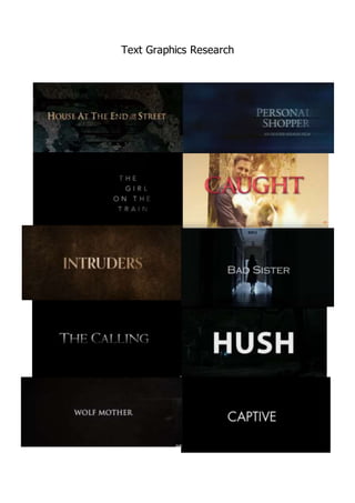
Here are some examples of what I think the textual graphics should look like…
This Halloween…
Summery:
In conclusion, the clear aspects of the textual graphics in a thriller filmare the 3 main colours;
Red, black and white. All these colours are bold and work well together. Dark backgrounds
are consistent throughout most of the examples. All though high key lighting is used is typical
for low key lighting to be used.
Till death us
do part