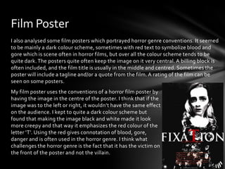
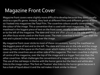
The document discusses conventions used in horror film trailers, posters, and magazine covers. It analyzes conventions like slow buildup music, dark lighting, scare shots, central images, dark color schemes with red text for posters. The student's media products aim to follow conventions like these but also challenge some. The trailer challenges showing killings and uses heartbeat sound. The poster challenges showing the victim not villain. The magazine cover challenges conventions with its black/white/red color scheme linking to the horror genre and image.
![Film Trailer
During the research and planning stages, I looked at least 5 different horror trailers to understand
and begin to analyse the conventions of the horror trailer. I analysed in detail ‘One Missed Call’ and
‘The Crazies’ which both had many conventions of the horror genre. After researching into the
trailers, I found that the conventions were: a slow build up soundtrack, usually being very quiet at
the beginning and more fast paced towards the end, a dark lighting and colour scheme, camera
shots of killings but usually stopping before the person is actually killed, close up shots of the main
actors including the antagonist, faster editing towards the end of the trailer, eerie music and some
trailers include actors dialogue [mostly the actors screaming/panicking]. In some trailers, a scare
shot is also included at the end.
In our trailer, as a group we wanted to stick as close to the horror genre as possible. We stuck to the
slow build up music which also was quite eerie sounding and had the faster paced editing towards
the end. When I was filming, I tried to keep the scenes quite dark, lighting wise, however the colour
scheme I challenged at the beginning of the trailer especially with the costumes and conformed to
more towards the end. Another thing our trailer conforms to, is to begin with some cheerful scenes
at the beginning of the trailer. In between the clips of film, I also inserted text slides which had the
film name, release date and text on a fade to black transition which gives a brief overview of the
film. However, we challenged the trailer by not having any scenes where it involved someone being
killed because we wanted there to be some suspense in the trailer. The trailer also used a heartbeat
sound effect which is used in some horror trailers. However, I think it made the trailer more tense
which is why I decided to add it in. At the end, we also included a scare shot which is used in quite a
few trailers.](https://image.slidesharecdn.com/question1-140124073628-phpapp02/85/Question-1-2-320.jpg)