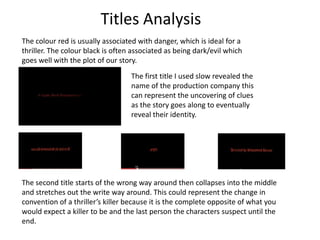
1. Titles Analysis The colour red is usually associated with danger, which is ideal for a thriller. The colour black is often associated as being dark/evil which goes well with the plot of our story. The first title I used slow revealed the name of the production company this can represent the uncovering of clues as the story goes along to eventually reveal their identity. The second title starts of the wrong way around then collapses into the middle and stretches out the write way around. This could represent the change in convention of a thriller’s killer because it is the complete opposite of what you would expect a killer to be and the last person the characters suspect until the end.
2. The third title has all of the letters in the word separately rotate together. This represents trying to figure out something before it reaches the end or is too late. The fifth title starts with only the middle visible but it then zooms out to reveal the whole word. This could represent that things aren’t always as the first look The forth title fades in and out quite quickly this can represent that when investigating a crime their may be a few seconds that are vital to uncovering the killer but it could be missed if not focused. The sixth title slowly fades in, moves across the screen slightly and fades out again. This could represent someone lurking in the dark.