This document discusses the analysis of titles and fonts used in horror films. It analyzes 4 different horror film titles, noting symbolism and meanings conveyed through visual design elements. Specific observations included are that an enlarged "D" refers to the word "Devil", dots on the word could represent blood, a reflected letter suggests hallucinations or blurred reality, a rusty title refers to a decaying skeleton, and scratched letters written in rage imply a psychopathic killer. Overall, the document examines how titles visually establish tones of evil, darkness, and violence for horror genres.
Beyond the EU: DORA and NIS 2 Directive's Global Impact
Font and title research and planning
1. Font and Title Research and Planning
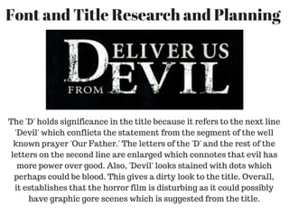
The 'D' holds significance in the title because it refers to the next line
'Devil' which conflicts the statement from the segment of the well
known prayer 'Our Father.' The letters of the 'D' and the rest of the
letters on the second line are enlarged which connotes that evil has
more power over good. Also, 'Devil' looks stained with dots which
perhaps could be blood. This gives a dirty look to the title. Overall,
it establishes that the horror film is disturbing as it could possibly
have graphic gore scenes which is suggested from the title.
2. This title looks very appealing as it has one letter that is
reflected horizontally which works well as it refers to the
concept of mirrors. From this title it could refer to bad
hallucinations as the concept of the mirror could blur
what the characters see in reality. Also, the significance
of red is very conventional in horror films. It represents
death and blood which gives the film a dark and
unsettling tone.
3. The title looks dirty which also links to 'Deliver us from
Evil' as they both have this appeal. The title here looks
more rusty which could refer to the 'skeleton' perishing
which gives the dark tone of the film. Also, the 'E' which
was replaced by '£' looks very bright, giving the sense
that it's shining. It could suggest that the key holds
significance in the film. Possibly hope by the use of colour
shown on the '£'.
4. This title appears very scratched and the harshness of the lines
suggest that it has been written by someone who is frustrated as he
writes with what looks like they are filled with fiery and rage. This
use of style gives the impression that the killer is a psychopath
whose intention is to kill. Especially, the title sounds striking which
gives the impression that the killer is going from one person to the
other. This definitely makes it clear that this film is categorised into
the horror genre as it uses this style to refer to the killer.