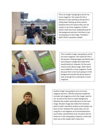
1. This is an image I was going to use for my
music magazine. The reason for this is
because it is eye catching as the person is
sitting down looking up at the camera.
However there are reasons why I am not
using it in my music magazine. Firstly it
doesn’t look very music related because of
the background and also I feel there is too
much going on in the image. Therefore I
didn’t think it would be suitable.
This is another image I was going to use for
my music magazine. The reason for this is
the person is looking happy and vibrant and
also sitting on a bright blue table which
would stand out. However, for the same
reason as the above image I didn’t feel it
was suitable for a music magazine. Purely
because there is too much going on in the
background and also the person doesn’t
look as though he is covering for a music
magazine.
Another image I was going to use in my music
magazine was this. I felt this would be suitable for
my indie rock magazine as he is the image I want to
use. As well as this there is a plain background,
therefore the readers and really focus on the main
image, the plain image also makes him stand out
which is what I wanted to achieve so the readers can
focus on him. However the reason why I am not
using this in my magazine as his facial expressions
aren’t what I wanted them to be. As well as this his
hands are in the wrong place; however I could crop
them out so the readers don’t notice this.
2. In this image I got my model to try
and give a ‘dirty look’ at the camera
as that is what my genre of music is
about, being individual and
rebellious. However I am not using
this image in my final magazine as I
wanted there to be more of a
background at the side so I could fit
in my cover lines and apply the rules
of thirds.
This is my final image I was going to use.
What I love about this image is the
motionless facial expressions which I was
trying to get him to do as the genre of my
magazine in rock and indie. This has
connotations of not caring what over
people think and being rebellious. However
I didn’t use this particular image as I found
a better facial expression which was also
side on which allowed more room for me
to include cover lines.