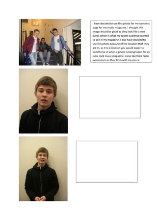
1. I have decided to use this photo for my contents
page for my music magazine. I thought this
image would be good as they look like a new
band, which is what my target audience wanted
to see in my magazine. I also have decided to
use this photo because of the location that they
are in, as it is a location you would expect a
band to be in when a photo is being taken for an
indie rock music magazine. I also like their facial
expressions as they fit in with my genre.
This is the photo that I will be using for my front
cover. I like this image as it has a plain
background which I wanted so the readers can
really focus on the main image, therefore it
stands out. I also like the angle of the photo and
the fact that he is looking straight into the
camera which is what you often find on the
front cover a music magazine. His facial
expression also fits in with my rebellious genre
of music.
This is photo I will be using for my double page
spread. Even though it is in the same location as
the image I will be using for my front cover. It is
a lot different as this is a medium shot and also
he is looking straight on at the camera, which is
what my target audience wanted to see in the
double page spread. As well as this the plain
background allows me to write my article in that
space, so therefore it is easy for the reader to
read.