
Recommended
More Related Content
What's hot
What's hot (14)
Viewers also liked
Viewers also liked (15)
Similar to Music magazine draft_and_photos_chosen
Similar to Music magazine draft_and_photos_chosen (20)
More from ReeceSylvester
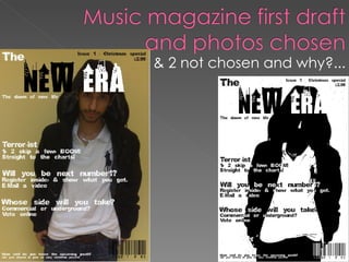
Music magazine draft_and_photos_chosen
- 1. & 2 not chosen and why?...
- 2. Sections for what the photos will match to in the magazine.
- 4. In my photo shoot plan I had planned to use one image for my front cover, and I had planned for it to be a close up of a person standing in front of a plain coloured background. I planned to make this image a close up, but out of the photographs which I took, this was the best one, with the best pose, and I thought it would be the best image to put on the front cover of my music magazine.
- 5. I did not use this image because I thought that it mainly the quality which it came out in was very poor. Also, I thought that it would be better to se the models face, and in this image, the models face is hidden, and although this may be a good pose to show upcoming artists, I thought it would still be better to show the face, as if this was a real upcoming artist, then people would like to know who it is, so that they could look out for them.
- 6. I did not use this image because I thought that it mainly the quality which it came out in was very poor. Also I thought that the positioning of the model in this image was not that good, as a small part of the models arm goes out of the picture. Finally, I did not use this image, as the main image for my front cover, as I thought that it was so close, so I decided to come further away for the image.
- 7. The background will be the main image which I have planned to do in my Photo shoot plan, and this will be of someone representing an upcoming artist, and it will be a close up of them, and will be placed on the centre of the cover, and will have a plain coloured background.
- 8. Here is the first draft of my music magazine. Here is another design which I made when I was trying out different styles.