1. ANALYSIS OF BILLBOARD DOUBLE PAGE SPREAD
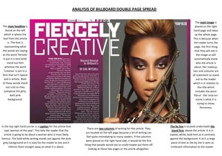
The main image is
placed on the right
hand page and takes
up the whole page.
This is because when
the reader turns the
page, the first thing
that they will see is
the image so will
automatically know
who the article is
about. Her makeup,
hair and costume are
all statement so stand
out to the reader
which is in relation to
the title which
includes the word
‘fierce’. Her mise-enscene is what it is
trying to show;
fierceness.
The main headline is
found on the left
which is where the
text from the article
is. The font is
representing what
the words are saying
as the word ‘fiercely’
is put in a very bold,
stand out font
whereas the word
‘creative’ is put in a
font that isn’t typical
and is artistic. Both
of these words stand
out a lot as they
juxtapose the girly,
dark pink
background.
In the top right hand corner is a caption for the article that
says ‘woman of the year’. This tells the reader that the
article is going to be about a woman who is most likely
famous. The bold white writing stands out against the dark
grey background so it is easy for the reader to see and it
informs them straight away on what it is about.
There are two columns of writing for this article. They
are located on the left page because a lot of writing can
feel quite intimidating to many readers. If the columns
were placed on the right hand side, it would be the first
thing that people would see so could maybe put them off
looking at those two pages or the article altogether.
The by line is located underneath the
stand first, above the article. It is in
capital, white, bold font as it contrasts
against the background. It isn’t a large
piece of text as the by line is seen as
irrelevant information to the reader.