Call Girls in Islamabad | 03274100048 | Call Girl Service
Chosen images
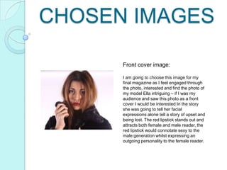
1. CHOSEN IMAGES
Front cover image:
I am going to choose this image for my
final magazine as I feel engaged through
the photo, interested and find the photo of
my model Ella intriguing – if I was my
audience and saw this photo as a front
cover I would be interested In the story
she was going to tell her facial
expressions alone tell a story of upset and
being lost. The red lipstick stands out and
attracts both female and male reader, the
red lipstick would connotate sexy to the
male generation whilst expressing an
outgoing personality to the female reader.
2. Contents page images:
So far these 4 images has caught my eye
the most in being outstanding image quality
for my contents page – I believe for a
contents page to succeed you need a wide
variety of images to ensure it being
interesting and showing of the genre of your
magazine. My image chosen of model
Claudia explores the genre of my magazine
through holding a guitar pulling a straight
face, normally in this pop/urban genre artists
tend to do this as it shows a sense of the
music telling a story about how they feel.
Ella crouching down starting into the
camera would suggest a difference in shots
being used, whilst the mid shot used
describes more of a cheeky shot of Ella
whilst she plays with her hair, sensing her
naughty personality. Whilst a mid shot of
Ruth sat on the floor crossed legged she
enables a more childish happy
character, with her hair up and long fringe
she would describe a calm quite personality.
All the images used show difference in
clothing, make up and angles helping to
give a variety of images for my contents
page hoping to ensure showing difference.
3. Double page spread 1 Image:
Here I wanted an extreme close up of my main model Ella as my starter of a double
page spread, I wanted to do this as I feel it creates a bond between the model and
reader and you can tell a story through the face in which she pulls. I choose this image
in particular because the model herself looks away from the camera it creates a sense
that she doesn't feel right in herself and maybe wants to avoid the manic world of being
in the music industry. Her hoop earrings with fur jacket and smart top would signify her
urban dress sense also stereotyped as a ‘hipster’ which would help to engage my
reader as they would stereotypically be known as a hipster. This chosen image also
helps to present a different range of images I have taken.
4. Double page spread 2 images:
For my double page spread I wanted to create a collage, in this I
would include a variety of images which I would mix together to
create this. I felt these images chosen showed a range of
outfits, shots and facial expressions. I felt the top left image showed
a darker side to Ella’s personality through the dark lipstick and hair
covering her face whilst the bottom left image foreshadowed a clear
and sensitive side to her.
5. Double page spread 3 images:
I have chosen these images for my final double page, the bottom left I have used as a A4 size
image on the right to the text, I choose to use this image as I felt it foreshadowed a mysterious
side to Ellas personality, her innocent face with dark purple lipstick whilst her hair flows over
her face I felt it was a good choice of image. Due to the context of the article an image needs
to overall summarise what is happening in the article as the image will be the first thing you
look at when choosing to read a magazine – in this situation my article is based on Ella having
many battles before facing her dream her looking away from the camera would convey a
sense of being lost – something in which my model was throughout part of the article.