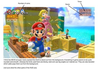
1. Timer
Number of coins
Score
I think the DEVS at super mario wanted this HUD to stand out from the background. Everything in game seems to be quite
rounded and smooth, whereas the fonts used here are blocky, bold and use big angles so it stands out. They are also beveled
which adds pops them out from the background.
(not sure what the other parts of the HUD are)