Beyond the EU: DORA and NIS 2 Directive's Global Impact
3. m&ms radial analysis
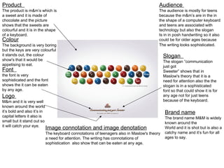
1. Product
The product is m&m’s which is
a sweet and it is made of
chocolate and the picture
shows that the sweets are
colourful and it is in the shape
of a keyboard.
Colour
The background is very boring
but the keys are very colourful
it stands out, the colour
show's that it would be
appetising to eat.
Font
the font is very
sophisticated and the font
shows the it can be eaten
by any age.
Logo
M&m and it is very well
known around the world
it’s bold and also it’s in
capital letters it also is
small but it stand out so
it will catch your eye.
Audience
The audience is mostly for teens
because the m&m’s are in the in
the shape of a computer keyboard
and teens are associated with
technology but also the slogan
Is in in posh handwriting so it also
could be for older ages because
The writing looks sophisticated.
Slogan
The slogan “communication
just got
Sweeter” shows that in
Maslow's theory that it is a
need for attention also the the
slogan is in a sophisticated
font so that could show it is for
any age not for just teens
because of the keyboard.
Brand name
The brand name M&M is widely
known around the
World and it is shot but is also a
catchy name and it’s fun for all
ages to say.
Image connotation and image denotation
The keyboard connotations of teenagers also in Maslow's theory
a need for attention. The writing has connotations of
sophistication also show that can be eaten at any age.