
Recommended
More Related Content
Viewers also liked
Viewers also liked (18)
Similar to Vibe cover analysis
Similar to Vibe cover analysis (20)
Recently uploaded
Recently uploaded (20)
Vibe cover analysis
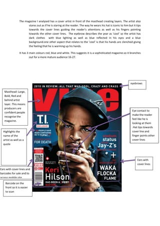
- 1. The magazine I analysed has a cover artist in front of the masthead creating layers. The artist also stares out as if he is staring at the reader. The way he wears his hat is iconic to him but it tips towards the cover lines guiding the reader’s attentions as well as his fingers pointing towards the other cover lines. The eyebrow describes the year as ‘cool’ so the artist has dark clothes with blue lighting as well as blue reflected in his eyes and a blue background.one other aspect that relates to the ‘cool’ is that his hands are clenched giving the feeling that he is warming up his hands. It has 3 main colours red, blue and white. This suggests it is a sophisticated magazine.so it branches out for a more mature audience 16-27. eyebrows Masthead: Large, Bold, Red and behind artist layer. This means producers are Eye contact to confident people make the reader recognise the feel like he is magazine. looking at them .Hat tips towards Highlights the cover line and name of the finger points other artist as well as a cover lines quote Ears with cover lines Ears with cover lines and barcodes for sale and to access mobile site Barcode on the front so it is easier to scan