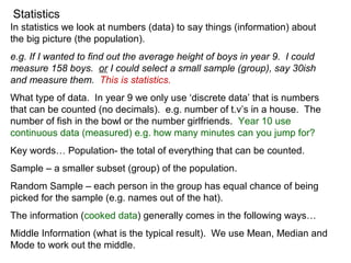
1. Statistics
In statistics we look at numbers (data) to say things (information) about
the big picture (the population).
e.g. If I wanted to find out the average height of boys in year 9. I could
measure 158 boys. or I could select a small sample (group), say 30ish
and measure them. This is statistics.
What type of data. In year 9 we only use ‘discrete data’ that is numbers
that can be counted (no decimals). e.g. number of t.v’s in a house. The
number of fish in the bowl or the number girlfriends. Year 10 use
continuous data (measured) e.g. how many minutes can you jump for?
Key words… Population- the total of everything that can be counted.
Sample – a smaller subset (group) of the population.
Random Sample – each person in the group has equal chance of being
picked for the sample (e.g. names out of the hat).
The information (cooked data) generally comes in the following ways…
Middle Information (what is the typical result). We use Mean, Median and
Mode to work out the middle.
2. Statistics
Finding the middle.
Mean (aka ‘average’) = total
/#in sample
Median = the very middle number (in order)
Mode = the most common.
Spread of the data. This is how far apart the numbers are. The key
measure of spread is the range (top – lowest). Spread tells how strong
the middle is. e.g which teacher is best? Teacher A students got 30%
50% and 70% (average of 50%), teacher B student got 10%, 50% and
90% (average of 50%).
Find the mean, median, mode and range for the following…
1) 7, 8, 10, 14, 15
2) 5, 1, 3, 5, 7, 10
3) 30, 32, 28, 34, 32, 33, 32, 36
3. Statistics
The key graphs to learn.
Information gives us a good idea of the middle and the spread of the data
for our sample. A graph is a useful way of presenting data.
Frequency Tables – a table showing the frequency of data items in
categories/intervals.
e.g. A road survey of drivers…
Colour Tally Frequency
White
Blue
Green
Red
Yellow
13
4
2
8
3
total 30
4. Statistics
Stem and Leaf Graph.
These are a quick way of recording larger numbers. e.g. how many
people on the bus that goes past the bus stop.
raw data 13, 35, 42, 19, 8, 21, 25, 13, 25, 44, 51, 33, 35, 9, 12
This can get messy and long (only 15 buses shown here could be 50+).
Unsorted Stem and Leaf
0
1
2
3
4
5
3,
5,
2,
9,
8,
1, 5,
3,
5,
4,
1,
3, 5,
9,
2,
Sorted Stem and Leaf
0
1
2
3
4
5
2,
3,
2,
3,
8,
1, 5,
3,
5,
4,
1,
5, 5,
9,
9,
Mean
Median
Mode
Range
418
/15 = 27.9
25
13, 25 & 35
51 – 8 = 43
5. Statistics
Another important area of statistics is when we compare two different
parts of the same thing. E.g. weights and heights.
PPDAC Problem – Do taller students weigh more?
Plan – Take a sample of students and measure weight
and heights (careful for lurking variables!)
Data – The actual measures.
Analysis – Creating a scatter plot.
Conclusion – What does our line of best fit say about the
two variables (bivariate data).
Drawing a scatter plot. Using www.new.censusatschool.org.nz get some
data (from the random sampler). Then we choose two of the variables
(categories) note the variables should have numbers not yes/no style
answers.
We just create a graph with two axis with the measures. x for weight and
y for height. Each person can be put onto the graph as a •.
6. Statistics
Another important area of statistics is when we compare two different
parts of the same thing. E.g. weights and heights.
PPDAC Problem – Do taller students weigh more?
Plan – Take a sample of students and measure weight
and heights (careful for lurking variables!)
Data – The actual measures.
Analysis – Creating a scatter plot.
Conclusion – What does our line of best fit say about the
two variables (bivariate data).
Drawing a scatter plot. Using www.new.censusatschool.org.nz get some
data (from the random sampler). Then we choose two of the variables
(categories) note the variables should have numbers not yes/no style
answers.
We just create a graph with two axis with the measures. x for weight and
y for height. Each person can be put onto the graph as a •.