Handwritten Text Recognition for manuscripts and early printed texts
Choosing font
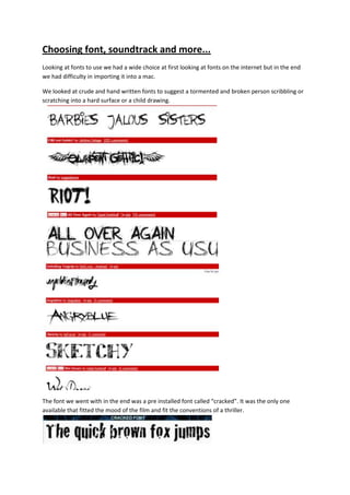
1. Choosing font, soundtrack and more...<br />Looking at fonts to use we had a wide choice at first looking at fonts on the internet but in the end we had difficulty in importing it into a mac.<br />We looked at crude and hand written fonts to suggest a tormented and broken person scribbling or scratching into a hard surface or a child drawing. <br />The font we went with in the end was a pre installed font called “cracked”. It was the only one available that fitted the mood of the film and fit the conventions of a thriller. <br />469901062990During the Editing process we added in a few experimental shots to add to the thrilling element. We added shots like out antagonist hiding in the dark cupboard staring demonically. Also a shot of the shadow leering over the victim in bed.<br />3343275327660<br />Also a clash of ideas during editing between the director and the editor resulted into a mash up and remix of the score. We had to try and carefully edit it all to keep the best elements of both sound tracks and edit into the final sequence.<br />http://www.youtube.com/watch?v=n6vmK6RHjgw<br />http://www.youtube.com/watch?v=bBmkWTUY7vQ<br />