How you can use color in restaurant table setting to create a great guest experience
•
1 like•455 views

Tork has made a study on how the brain reacts to different colors. Have a look at this slideshare to get inspiration on how you can set your table to create the mood you are looking for.

Recommended
Recommended
More Related Content
Viewers also liked
Viewers also liked (20)
Similar to How you can use color in restaurant table setting to create a great guest experience
Similar to How you can use color in restaurant table setting to create a great guest experience (20)
Recently uploaded
Recently uploaded (20)
How you can use color in restaurant table setting to create a great guest experience
- 1. A restaurant’s guide to colors A restaurant’s guide to colors
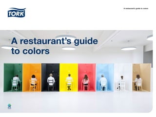
- 2. To investigate how colors affect experience, restaurant guests got to experience 8 different environments in 8 different colors. Each setting was designed with restaurant attributes completely covered in a monochrome color – from walls and floor to furniture and tableware. All guests were equipped with tools that measure brain waves and heart rate. The analysis showed clear and reoccurring patterns in moods and emotions provoked by different colors. The colors where also perceived to be suitable for diverse kinds of meals and with special restaurant experiences ranging from a romantic dinner date to a formal business lunch. The color restaurant experiment What’s your color? Color is everywhere. Color affect our mood and behavior. And although there are many aspects within a restaurant that affects the guest experience – color is a critical one. On the following pages you will find insights that are the result of an experiment where brain wave technology was used to investigate how restaurant guests react to colors.
- 3. The meditative green The brain wave results indicate a revitalizing quality for the green colour, with restorative deep relaxation and immune system improvement. The heart rate was also below average in this room. In line with this, the green colour was described as relaxing, calm and welcoming. An environment in which to recover and heal, rather than get excited or experience romance. I would like to bring friends and family to the green room, people I know very well. ”
- 4. The happy orange Overall, orange was perceived as modern and fun typically associated with happy experiences together with kids and friends. On the other hand orange could also be seen as somewhat unromantic, a bit stressful and not luxurious. The brain wave and heart rate results showed that orange might be a more neutral choice compared to other strong colors such as yellow. Orange also gave mid-range indications of gamma waves, associated with learning and information processing. My favorite room was the orange one because it made me feel really happy. ”
- 5. The sophisticated black Black is a color of complexity. It was perceived as luxurious, modern and sophisticated but at the same time a bit unwelcoming and boring. It was strongly perceived to be suitable for a sophisticated event where you leave your kids at home. The brain wave readings indicated high levels of creativity and arousal, but also a lower level of focus – making it less appealing for business set-ups. I make the connection between good food and darker colors, for some reason it feels more fancy than happy colors. ”
- 6. The exciting yellow Yellow is an exiting and fun colour. The brain wave results indicated higher states of arousal and conscious focus, but in extreme cases also higher stress levels. Also, both the average and max heart rates where high for yellow. The colour was perceived to be suitable together with breakfast but also the most popular colour for a venue where to bring kids. Results indicate yellow as suitable for an exciting and arousing environment. The yellow color gave me an energy-boost and made me feel more awake. ”
- 7. Red that stands out and provokes powerful emotions rather than blending in. Red gave high indications in the delta and theta brain wave ranges - meaning strong emotional connection and high levels of creativity. Heart rate results where also high, indicting a stimulating environment. Perhaps not surprising, red is strongly associated with romance and evening drinks. However there is also an exciting and fun side of red. Red is for intimate meetings with someone you like – perhaps not suitable for business partners. ” The romantic red
- 8. The blue colour gave high indications in the delta wave range, which means deeply relaxed states. High theta wave also indicates creativity and high emotional connection. This responds to the fact that blue was described welcoming, calm and relaxing. Blue was perceived to work well for a family-friendly venue to have breakfast or coffee, but not so well for a luxurious restaurant experience or a venue used for business meetings. I think I liked the blue room the best. I dont really know why, but it was a nice calm color. ” The calm blue
- 9. White stood out and yielded low indications for all brain wave ranges – indicating a neutral colour and something of a blank canvas for guests’ experiences. White is also perceived as the best colour for business settings. The colour is seen as luxurious and modern, but scored low on aroused emotions such as fun and exiting. A color suitable to create neutral environments that do not distract from the task at hand. The white felt clean, modern and luxurious. ” The luxurious white
- 10. Brown scored low on the majority of brain wave ranges, indicating a neutral colour. The delta wave range and heart rate results suggest that brown may also encourage relaxation. Brown is perceived as traditional, neutral and relaxing. Brown is perhaps not the best choice to create arousing experiences, but was perceived to be a good colour for more traditional venues and easy to match with other colors. I guess I am a bit conservative, but I like the brown room the best. ” The traditional brown
- 12. The color nuances used in the experiment are derived from the color palette within the Tork tabletop assortment, and napkins from Tork were also used as a part of the monochrome settings. Tork has a new complete range of tabletop products such as napkins, tableware, dispenser napkins and custom print solutions - available in a unique color palette of 20 colours. The colors have been selected based on customer’s most popular choices. In addition, Tork have chosen new intuitive product names, updated packaging design and created a web tool to make it easier to select and order products that goes well together. All together, making it easy to create the right impression for your guests. Learn more at www.sca-tork.com Making it easy to create the right experience Simple to choose Make the right impression Fit for purpose