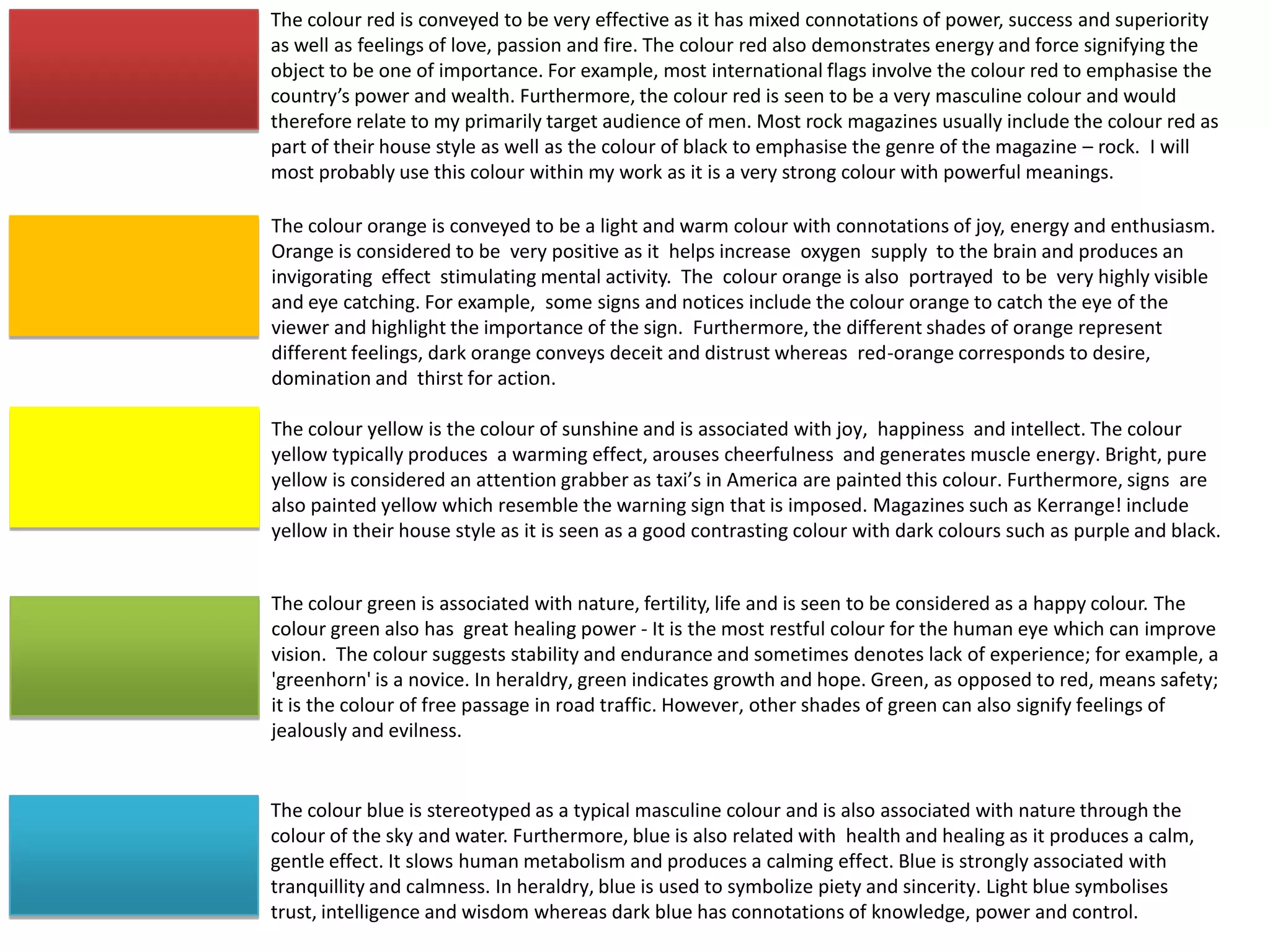
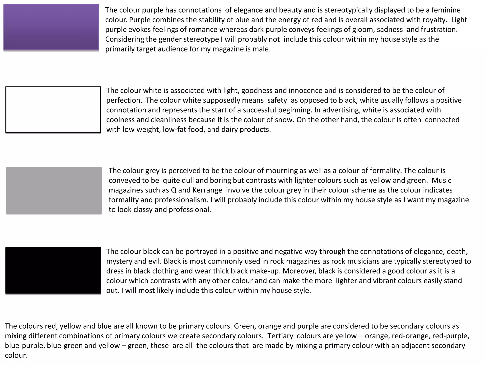
The document discusses the meanings and connotations associated with different colors. It notes that red conveys power, passion, and importance and would relate well to the target male audience. Orange suggests joy and energy while stimulating the brain. Yellow represents happiness and intellect. Green is linked to nature and growth. Blue induces calmness. Purple symbolizes beauty but may not be suitable due to its feminine stereotype. White signifies innocence while black can portray elegance or mystery. The document considers using red, grey, and black in the magazine's color scheme to look professional and match the rock genre.
HỌC TỐT TIẾNG ANH 11 THEO CHƯƠNG TRÌNH GLOBAL SUCCESS ĐÁP ÁN CHI TIẾT - CẢ NĂ...
The Powerful Meanings and Uses of Colour in Magazines
1. The colour red is conveyed to be very effective as it has mixed connotations of power, success and superiority
as well as feelings of love, passion and fire. The colour red also demonstrates energy and force signifying the
object to be one of importance. For example, most international flags involve the colour red to emphasise the
country’s power and wealth. Furthermore, the colour red is seen to be a very masculine colour and would
therefore relate to my primarily target audience of men. Most rock magazines usually include the colour red as
part of their house style as well as the colour of black to emphasise the genre of the magazine – rock. I will
most probably use this colour within my work as it is a very strong colour with powerful meanings.
The colour orange is conveyed to be a light and warm colour with connotations of joy, energy and enthusiasm.
Orange is considered to be very positive as it helps increase oxygen supply to the brain and produces an
invigorating effect stimulating mental activity. The colour orange is also portrayed to be very highly visible
and eye catching. For example, some signs and notices include the colour orange to catch the eye of the
viewer and highlight the importance of the sign. Furthermore, the different shades of orange represent
different feelings, dark orange conveys deceit and distrust whereas red-orange corresponds to desire,
domination and thirst for action.
The colour yellow is the colour of sunshine and is associated with joy, happiness and intellect. The colour
yellow typically produces a warming effect, arouses cheerfulness and generates muscle energy. Bright, pure
yellow is considered an attention grabber as taxi’s in America are painted this colour. Furthermore, signs are
also painted yellow which resemble the warning sign that is imposed. Magazines such as Kerrange! include
yellow in their house style as it is seen as a good contrasting colour with dark colours such as purple and black.
The colour green is associated with nature, fertility, life and is seen to be considered as a happy colour. The
colour green also has great healing power - It is the most restful colour for the human eye which can improve
vision. The colour suggests stability and endurance and sometimes denotes lack of experience; for example, a
'greenhorn' is a novice. In heraldry, green indicates growth and hope. Green, as opposed to red, means safety;
it is the colour of free passage in road traffic. However, other shades of green can also signify feelings of
jealously and evilness.
The colour blue is stereotyped as a typical masculine colour and is also associated with nature through the
colour of the sky and water. Furthermore, blue is also related with health and healing as it produces a calm,
gentle effect. It slows human metabolism and produces a calming effect. Blue is strongly associated with
tranquillity and calmness. In heraldry, blue is used to symbolize piety and sincerity. Light blue symbolises
trust, intelligence and wisdom whereas dark blue has connotations of knowledge, power and control.
2. The colour purple has connotations of elegance and beauty and is stereotypically displayed to be a feminine
colour. Purple combines the stability of blue and the energy of red and is overall associated with royalty. Light
purple evokes feelings of romance whereas dark purple conveys feelings of gloom, sadness and frustration.
Considering the gender stereotype I will probably not include this colour within my house style as the
primarily target audience for my magazine is male.
The colour white is associated with light, goodness and innocence and is considered to be the colour of
perfection. The colour white supposedly means safety as opposed to black, white usually follows a positive
connotation and represents the start of a successful beginning. In advertising, white is associated with
coolness and cleanliness because it is the colour of snow. On the other hand, the colour is often connected
with low weight, low-fat food, and dairy products.
The colour grey is perceived to be the colour of mourning as well as a colour of formality. The colour is
conveyed to be quite dull and boring but contrasts with lighter colours such as yellow and green. Music
magazines such as Q and Kerrange involve the colour grey in their colour scheme as the colour indicates
formality and professionalism. I will probably include this colour within my house style as I want my magazine
to look classy and professional.
The colour black can be portrayed in a positive and negative way through the connotations of elegance, death,
mystery and evil. Black is most commonly used in rock magazines as rock musicians are typically stereotyped to
dress in black clothing and wear thick black make-up. Moreover, black is considered a good colour as it is a
colour which contrasts with any other colour and can make the more lighter and vibrant colours easily stand
out. I will most likely include this colour within my house style.
The colours red, yellow and blue are all known to be primary colours. Green, orange and purple are considered to be secondary colours as
mixing different combinations of primary colours we create secondary colours. Tertiary colours are yellow – orange, red-orange, red-purple,
blue-purple, blue-green and yellow – green, these are all the colours that are made by mixing a primary colour with an adjacent secondary
colour.