Scaling API-first – The story of a global engineering organization
Superbad opening sequence
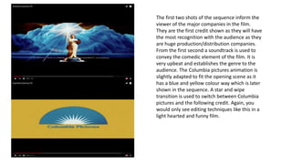
1. The first two shots of the sequence inform the
viewer of the major companies in the film.
They are the first credit shown as they will have
the most recognition with the audience as they
are huge production/distribution companies.
From the first second a soundtrack is used to
convey the comedic element of the film. It is
very upbeat and establishes the genre to the
audience. The Columbia pictures animation is
slightly adapted to fit the opening scene as it
has a blue and yellow colour way which is later
shown in the sequence. A star and wipe
transition is used to switch between Columbia
pictures and the following credit. Again, you
would only see editing techniques like this in a
light hearted and funny film.
2. The soundtrack changes pitch for a second to signal information is going to to shown to the
audience. The first title shown is the distribution company Columbia Pictures. This is the
second time they are credited in the film which implies the important role they played in
the film. The font used is called ’Suomi’. It is bold and always in capitals which clearly tells
the reader it is institutional information.
3. The next piece of information shown are the actors/actresses. Unlike other opening
sequences the cast of the production have been credited before the crew. Eg the
director. The soundtrack continues through this section of the opening to give a
comedic effect to the film. Bright and fast transitions are used to further suggest the
genre to the audience. The colour of the font changes to accommodate the
background colour of the shot so the font is easily visible despite colour changes.
4. The font never stays in the same
place to make the opening
interesting and hopefully engage the
audience as they are more likely to
take notice of it. The lesser members
of the crew are now being shown in
the sequence as it seems an
ascending order of importance takes
place.
5. Eventually the director is revealed to the audience at the end of the
sequence. This may be done so the viewer has to watch on to find
out who played this role in the film. The colours used are more
likely to be associated with a younger audience as they are very
bright and bold. When the last credit appears, so do the
silhouettes, signifying the film is about to start.