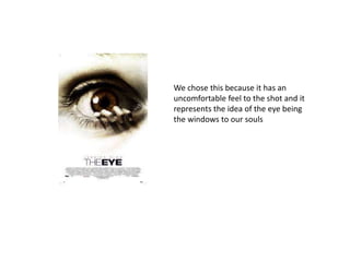
1. We chose this because it has an
uncomfortable feel to the shot and it
represents the idea of the eye being
the windows to our souls
2. This poster represents the casual
everyday suburban area, the reflection
in red(blood) represents hidden
history/meaning behind the house and
the person standing in front of it. The
colour grey makes it stand out because it
gives the poster an eerie feel to it
3. We chose this poster because it has a
good after effect and it communicates
the title really well with the audience.
4. It shows the women as being
timid, vulnerable and viewed as
the victim and her response is
fear just like it is in our film trailer.
5. We chose this magazine because it
resembles the satanic rituals that we will be
incorporating into our film trailer.
6. We also chose this magazine because it
resembles the satanic rituals that we will be
incorporating into our film trailer.