
Recommended
More Related Content
Similar to Visual Communication Definition and Benefits
Similar to Visual Communication Definition and Benefits (20)
More from 丹 丹
More from 丹 丹 (15)
Recently uploaded
Recently uploaded (20)
Visual Communication Definition and Benefits
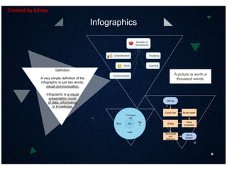
- 1. Infographics Definition A very simple definition of the infographic is just two words: visual communication. Infographic is a visual presentation mode of data, information or knowledge. Benefits of Smartphone Shopping Learning Communication Entertainment Work Get up Comb hair Brush teeth Have breakfast Dress Take books and stationery Go to school Blue Sky Vast Hig h Changea ble A picture is worth a thousand words. Created by Edraw
- 2. Visualize and simplify ideas, facilitating data analysis and presentation. 1 offer more attractive and attention-drawing content. 2 Make information easier to consume and understand, saving time and effort for readers. 3 Add fun. 4 Benefits of Infographics Created by Edraw
- 3. Data-driven Infographics Pie Chart Doughnut Chart Bar/Column Chart Line Chart Spider Chart Gauge Chart ... Flowcharts Mind Maps Most Commonly Used Infographics Created by Edraw
- 4. Keep it simple, clear and readable. Make it knowledgeable. Use high quality graphics. Tips to Make Effective Infographics Use awesome colors that work together. Ensure the accuracy.Make it your way. Created by Edraw
- 5. Flowchart Example CustomerSales Technical support TesterDevelopment No No Customer request help or report errors Sales issue Resolve the issue and respond customer Yes No Confirm with customer New issue Test the issue Fix the issue Yes Resolve solution No Finished Technical analysis Reproduced the issue Error report Yes Resolved? Get more details from customer Resolve solution Yes More feedback Confirm with customer Finished Software Service Cross-Functional Process Created by Edraw
- 6. Edraw Benefits 1 Abundance of functions Org Chart Application Check sheet Employment Evaluation Time sheet Calendar Employee information 2 Ease of use Similar user interface with MS Various templates and examples 3 Increase efficiency Collaborate easily Communicate visually 5 Save time Automatic generation Minimized learning curve Smart predefined shapes 4 Save money Low price for high quality Free technology support Seamless integration with MS Mind Map Example - Edraw's Benefits in HR Management Created by Edraw
- 7. Data-driven Infographics Example - City Competitiveness Dashboard 8.2 City A 5.4 City B 12.8 City C 15.3 City D 9.7 City E Population (million) The proportion of the floating population 12% City A 22% City B 28% City C 32% City D 11% City E 34 16City E 56 24City D 42 15City C 28 6City B 35 12City A The number of hospital The number of universities 100 1K 2K 3K 4K 5K 6K 7K 8K 9K 10K $2.5KHouse price 356 267City E 496 344City D 480 212City C 228 120City B 328 152City A The number of well-known brands High-rise commercial buildings 72% 28% 28 72 Annual income of more than $100,000 84% 16% 16 84 81% 19% 19 81 77% 23% 23 77 71% 29% 29 71 The average price of commercial house Created by Edraw