
Recommended
Recommended
More Related Content
Similar to Nediger_Infographics_2019.pdf
Similar to Nediger_Infographics_2019.pdf (20)
Recently uploaded
Recently uploaded (20)
Nediger_Infographics_2019.pdf
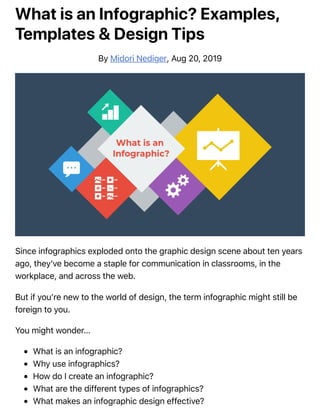
- 1. What is an Infographic? Examples, Templates & Design Tips By Midori Nediger, Aug 20, 2019 Since infographics exploded onto the graphic design scene about ten years ago, they’ve become a staple for communication in classrooms, in the workplace, and across the web. But if you’re new to the world of design, the term infographic might still be foreign to you. You might wonder… What is an infographic? Why use infographics? How do I create an infographic? What are the different types of infographics? What makes an infographic design effective?
- 2. Today, I’ll give you a crash course on infographics and infographic design (along with examples of infographic templates) to answer all of these questions and more! What is an infographic? Infographics defined: According to the Oxford English Dictionary, an infographic (or information graphic) is “a visual representation of information or data” . But the meaning of an infographic is something much more specific. An infographic is a collection of imagery, charts, and minimal text that gives an easy-to-understand overview of a topic. As in the example below, infographics use striking, engaging visuals to communicate information quickly and clearly.
- 4. The most visually unique, creative infographics are often the most effective, because they grab our attention and don’t let go. But it’s crucial to remember that the visuals in an infographic must do more than excite and engage. They must help us understand and remember the content of the infographic, as seen in this infographic about palm reading from Jing Zhang: Ready to dive right in and create your first infographic? Check out our ultimate infographic design guide for everything you need to get started. Why are infographics used? Infographics are great for making complex information easy to digest. They can be helpful anytime you want to: Provide a quick overview of a topic Explain a complex process Display research findings or survey data Summarize a long blog post or report Compare and contrast multiple options Raise awareness about an issue or cause When you need to give someone a really quick rundown on something that can be hard to explain in words alone, an infographic is a good way to go.
- 5. This means that infographics can be useful in pretty much any industry. Marketers use infographics to build brand awareness and boost engagement: Consultants use timeline infographics to visualize project timelines and to simplify new/industry-specific topics to their clients: Governments use infographics to share statistics and census data: Source Educators use infographics to make content more memorable for students:
- 7. And nonprofits use infographics to promote events and raise awareness for their causes: Need to explain a complex process? Our process infographics can help communicate cumbersome processes in a visual way. Infographics can be useful whenever you need to communicate information quickly, or any time you want to make an impact with your data or your message. How do I create an infographic? If I’ve convinced you that infographics are a tool you should be using, you’re probably wondering how you can create your own infographic. Our step-by-step guide on how to create an infographic is a great resource. This video guide will also show you how you can make an infographic in just 5 steps: No matter how excited you are to get started making your very first infographic, you shouldn’t jump into the design process without a game plan. Instead, start by creating an infographic outline. Organize your information with an infographic outline The process of creating an outline will help you organize your thoughts and ensure that your content will work in an infographic.
- 8. Create an infographic outline from existing content using these 4 steps: 1. Determine the key takeaways of your content 2. Determine the title, headers, subheaders and facts 3. Consider the length of paragraphs and points 4. Include notes for the designer Starting with an outline in this format will ensure that the rest of the design process goes smoothly. For a more detailed run-down of this process, check out our guide on how to create an infographic outline. Pick an infographic template Once you’ve got an outline, you’re ready to pick an infographic template. Pre-made infographic templates (like the one below) can give you the design inspiration you need to get your infographic rolling. Even just using them as a jumping-off point can be helpful. There’s a lot to consider when picking an infographic template, including the colors, fonts, length, size, and style of each template, and how well each of those factors aligns with your content. But most importantly, you need to pick the right type of infographic template for your content. What are the different types of infographics, you ask?
- 9. What are the different types of infographics? At Venngage, our library of infographic templates is sorted into 9 different categories: 1. Statistical infographics 2. Informational infographics 3. Timeline infographics 4. Process infographics 5. Geographic infographics 6. Comparison infographics 7. Hierarchical infographics 8. List infographics 9. Resume infographics This video summarizes these 9 types of infographics and when to use them: Each type of infographic is tailored to visualizing a different type of content. Informational infographics, for example, are typically more text-heavy than the other types of infographics. Like this example from Course Hero below, they work best as summative, standalone pieces that provide a high- level explanation of a topic. There are also informational infographics that explain something niche, but very simply. These are handy to have as visual references for topics that are new and unfamiliar. TalentLyft’s infographic on recruitment metrics is a great example – a short and sweet summary on the six key recruitment metrics hiring managers should understand and track.
- 10. Statistical infographics, on the other hand, are more focused on numbers, charts, and data. They tend to contain much less text than informational infographics and have less of a narrative flow. Instead, they make a statement with big numbers and standalone facts, like this infographic from Mobile Future. Similarly, this infographic from Podia on the “State of the Side Hustle” uses numbers and stylization to make its most important points prominent with sparse supporting text. Choosing the right type of template for your content is one of the keys to a successful infographic. For a full description of each type of infographic, and when to use them, check out this guide to the 9 types of infographic templates. What makes an infographic design effective? When it comes to designing an effective infographic, it’s important to recognize that our brain seeks patterns in visual information to help us make sense of the world. We can use this idea to structure our information visually and create patterns that will enhance the message that we’re trying to communicate. Let’s run through some infographic design best practices to help you create infographics are as effective as they are beautiful. Also, check out our post on 7 ways to customize your infographic template for more easy hacks on how to make your design pop. Use lines, borders, and shapes to group related information
- 11. Even something as simple as the position and grouping of elements on a page can influence the way our readers understand our graphics. If we use basic design elements like borders, lines, circles, and squares to visually organize our content, our readers will find it easier to interpret that content. For example, we can enclose related elements within an outline or a shape. Most infographics, like the one below, use tactic this to break up the design into multiple sections, making the graphic easier to scan. Alternatively, when the structure of the information is the main focus of the infographic (like in an organizational chart or a flow chart) it can be helpful to explicitly connect related elements with lines. Like in this marketing flow chart infographic: Click the template above to make an organizational chart. Edit the template to your liking–no design experience needed. Want more tips on organizing your information in an infographic? Check out our step-by-step guide on how to summarize information and present it visually. Use one contrasting color to guide your readers’ attention Another major design element to think about is color. We’re naturally inclined to use color to make infographics look pretty, but color can also be used as a powerful communication tool. Just like lines and borders, colors can be used to indicate information
- 12. groupings, as seen in the business strategy infographic example below: But more importantly, we can use color to draw attention to particular pieces of information and push supporting information into the background. Pick one color that contrasts with all of the other colors in the graphic, and use it to make the most important information stand out. Take the infographic below, for example. The bright yellow circles contrast with the blue background to make the icons (the most important visual aspect of the graphic) stand out. This strategy also happens to be highly trendy–pops of color are one of the biggest graphic design trends of 2020. Need some infographic color scheme inspiration? Check out our guide on how to pick colors for infographics. Create a text hierarchy with three different font styles Fonts are one of the first things people notice when they first look at an infographic. If chosen poorly, fonts can ruin an otherwise great infographic. Our roundup of popular font types will steer you on the right path. The key to using fonts correctly in infographics is to create a clear text hierarchy with three different font styles–one for the main heading, one for the section headings, and one for the body text. The main header font should be the biggest and can be the most stylized. Think of it as the way to set the mood of your infographic.
- 13. The font for the section headers should be a bit smaller and less stylized, but it should still stand out on the page. Finally, the font for the body text should be smallest, and not stylized at all. It needs to be as easy to read as possible. Not sure what a readable font looks like? Here’s a quick reference guide to fonts that are great for body text: For more infographic font tips and best practices, check out our guide all about choosing infographic fonts. Use images, icons, and illustrations to make key takeaways memorable Last but certainly not least, make sure that the focus of your infographic is on visuals like images, symbols, icons, illustrations, and charts. Visuals are crucial for making your information engaging and memorable. The best infographics have an equal balance of text and visuals. The easiest way to make sure you have enough visuals in your graphic is to add an icon to represent each header, as seen in the example below: Or even better, create visual examples of each main point in the infographic, as seen in this example from Elle & Company: It’s important to have fun with your design, too. It doesn’t need to be strictly business-y and serious. Infographics are supposed to be engaging and
- 14. memorable, and illustrations are great story-telling devices. If you’re feeling really ambitious, you can even create a feature visualization like the one below that represents all of your information visually, eliminating the need for almost all of the text. Source Making a data-heavy infographic and need help visualizing your data? Check out our guides on designing effective charts and choosing the best charts for your infographic. Conclusion The best infographics use a combination of text, images, and data to inform and engage. If you’re ready to create infographics that strike the perfect balance between fun and educational, make sure you follow these infographic design best practices: Use lines, borders, and shapes to group related information. Use one contrasting color to draw attention to key information. Create a text hierarchy with three different font styles. Use images, icons, and illustrations to make key takeaways memorable. For more help getting started on your first infographic, check out this guide: How to make an infographic in 5 steps.