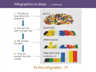
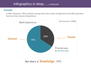
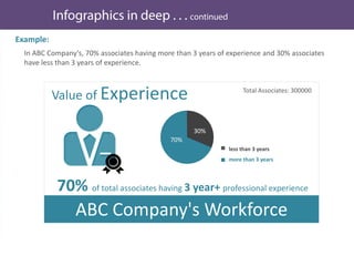
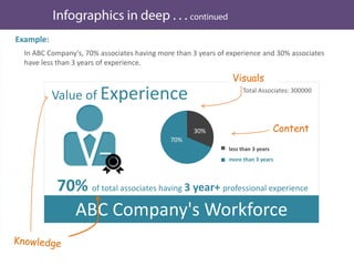
Download as PDF, PPTX
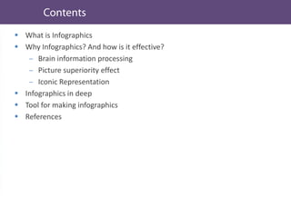
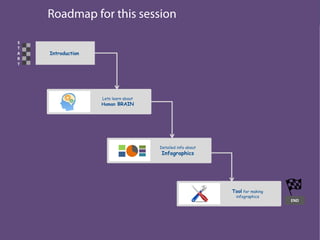
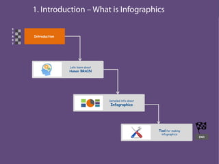
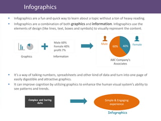
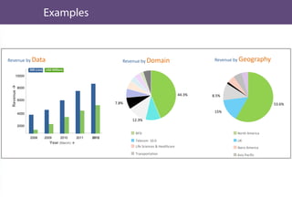
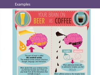
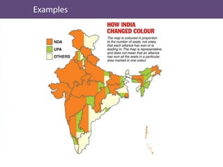
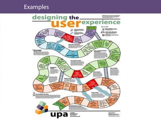
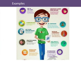

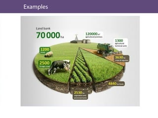
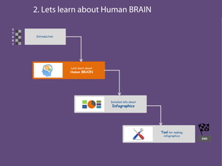
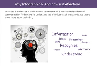


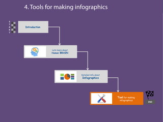


This document discusses infographics and how they can be an effective way to present data visually. It begins by defining infographics and explaining why they are effective by leveraging how the human brain processes visual information better than text. The document then discusses key aspects of infographics like visual content, data/content, and conveying a message or insight. It provides examples of effective and ineffective infographics. Finally, it discusses tools that can be used to create infographics, including desktop software like Adobe Illustrator and online tools like Visual.ly and Wordle.net that allow creating different types of visualizations.


