
Recommended
More Related Content
What's hot
What's hot (20)
Viewers also liked
Viewers also liked (20)
Similar to James Blunt Digipack Analysis
Similar to James Blunt Digipack Analysis (6)
More from Smith_
More from Smith_ (18)
Recently uploaded
Recently uploaded (20)
James Blunt Digipack Analysis
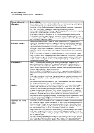
- 1. CD DigipackAnalysis 'Moon Landing:ApolloEdition'- JamesBlunt Genre elements Conventions Characters – One character is shown - the artist, JamesBlunt. Representedas anaverage workingclass male travellingthroughspace whichsymbolisesdeep thoughts. Front cover - Blunt's headphotoshopped to be unaccompaniedbyhis body, superimposed over a long shot of space and a graphic image of a lightning bolt. Hiseyes are photoshopped to be bright blue. Althoughbright blue eyes are oftenseenas stereotypically attractive, the unnaturalbright shade is more abstract. Inside cover - Longshot of James Blunt sat on a normal leather seat inaverage working class male attire, photoshoppedto appear to be a seat inspace. Bodyposture like that of an astronaut midlaunch. The overall effect is of a stereotypical man lost inthought or going to places that he's not beento before. Narrative events– The narrative appears to be of a character, James Blunt, sittinginhis home and lost in thought over deepmatters or planning to go onan adventure to places he has never been before. There is a narrative enigma as we start to wonder what Blunt is thinking about, but suggestionthat the character wants to move on to new, greater things. Front cover - James Blunt's headwithout a bodyfloating throughspace suggests that his headis lost in deep, uncharteredandnew thoughts. Implication ofadventure anda desire to explore. Inside art - We see a shot of Blunt sat in what appears to be a typical front room, but the photo is edited to appear to be a spaceship inlaunch, suggesting that hisheadis awayfrom earth anddeep inthought. On the other side, there is anequation next to a satellite with what appears to be a mapof a journey, as if Blunt is planningto go on anadventure to somewhere he has never been. Iconography – There is a paraphernalia ofsymbolic codes relatingto things out of thisworldsuchas space, stars, a satellite, andplanets. This suggests deepthoughts andadventure to new places that man hasalways dreamed of. The album title, 'Moon Landing', reiteratesthis. The use of space inmost mediatexts tends to symbolise unboundcreativity, broadening horizons, newthoughts, or a lackof concentration. Graphic symbol ofthe lightning bolt onthe front cover suggests the songs will be quickin tempo, symbol relatingto the skybut almost out of place as it carriesno connotations of space Inside cover - Symbolism of the leather chair is the onlything whichtiesBlunt downto the real world, implies that it is onlya figurative trip to the moon, the character is indeep thought. CDs - Simpleiconographyof a footprint on the CD is reminiscent of the famous symbol of "the footprint onthe moon" left bythe Apollospace mission. Setting- The mise enscene is all darkblue andmade to looklike it is inouter space. Space suggests deep thoughts andcreativity, as well as adventuring to new places. These are all very abstract concepts whichare stereotypical ofindie albums. As Steve Neale says, "genres are instances ofrepetition and difference." Thisis because the artist does not tryandsellthe album byusing their face but rather with a deeper concept whichappealsto artists with a more niche audience that like to be able to identifywith the artist (Katz's Usesand Gratifications Theory). James Blunt appeals to anaudience ofthis kind, unlike albums which are directlytiedto one of the Big 3 recordlabels, despite 'Moon Landing' being from Atlantic, a subsidiaryof Warner Bros). Technical and audio codes– Front cover - Close up ofJames Blunt witha direct mode of address, eyes photoshopped to look unnaturallybrighter, lightingdirect against his face is editedto look almost unhuman. Guttenberg DesignPrinciple - artist name is above the keysignifier and the album title is below so as not to spoil the image. Rule ofthirds - the keysignifier is directlyinthe middle, with text above andbelow, to create a balancedandsophisticated aesthetic. Superimposedover a mise enscene of space createsthe narrative enigma of deepthought. Inside cover - Longshot of Blunt sat ona leather seat. All appears normal but the shot is editedsothat it appears to be floating inspace (we cansee that not all is editedawayas his feet are ina stone floor). Back cover - Simple blue backgroundto make the informationeasyto read - two columns listing the songs on bothdiscs. Guttenberg DesignPrinciple - informationsuchas the age rating and the types of media players that the album can playon in the terminal area.
- 2. Barcode is at the topinthe middle soit is out of the wayanddoesnot spoilthe balanced appearance of the backcover.