1. In what ways does your media product use, develop or challenge forms and conventions of real media
products?
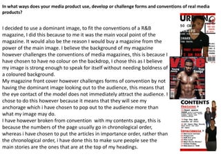
I decided to use a dominant image, to fit the conventions of a R&B
magazine, I did this because to me it was the main vocal point of the
magazine. It would also be the reason I would buy a magazine from the
power of the main image. I believe the background of my magazine
however challenges the conventions of media magazines, this is because I
have chosen to have no colour on the backdrop, I chose this as I believe
my image is strong enough to speak for itself without needing boldness of
a coloured background.
My magazine front cover however challenges forms of convention by not
having the dominant image looking out to the audience, this means that
the eye contact of the model does not immediately attract the audience. I
chose to do this however because it means that they will see my
anchorage which i have chosen to pop out to the audience more than
what my image may do.
I have however broken from convention with my contents page, this is
because the numbers of the page usually go in chronological order,
whereas i have chosen to put the articles in importance order, rather than
the chronological order, i have done this to make sure people see the
main stories are the ones that are at the top of my headings.
2. I have however developed the form in which the writing is set out in
on my contents page, I have done this as I found the sub-headings in
Vibe magazine that I based my magazine on interesting and they made
me want to know what was in each section. This has turned out to be
a good convention in my magazine as it means that my target
audience will be able to turn to the article/feature on straight away
and wont have to worry about where to find each page.
I have challenged convention in my double page spread by
not using the whole image on one page idea, I decided to
challenge this as I think having bigger columns means the
text in my magazine looks bigger. Which would ultimately
mean that more people are going to spend time actually
being interested in what the article has actually got to say,
and not just staying looking at the dominant image which
takes up most of the page on the other side.
I have however kept the column from that the double page
spread is set out in, I have done this as I think this is a
simple format and it means the reader knows exactly
which section to go from and to, whilst reading the article.