Cloud Frontiers: A Deep Dive into Serverless Spatial Data and FME
Question One
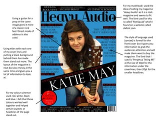
1. For my masthead I used the
idea of calling my magazine
‘Heavy Audio’ as it is a rock
magazine and seems to fit
Using a guitar for a well. The font used for this
prop in the cover is called ‘RiotSquad’ which I
image gives it more found on a website called
of a classic rock dafont.com
feel. Direct mode of
address is also
used. The style of language used
(syntax) is formal for the
front cover but it gives you
information to grab the
Using titles with each one
audiences attention and will
of my cover lines and
make them want to buy the
putting a black background
magazine. The font that I
behind them has made
used is ‘Perpetua Titling MT’
them stand out more. The
at the size of 18pt for the
layout of the magazine is
information under the
neat but also messy at the
coverlines, then 20pt for the
same time and gives you a
smaller headlines.
lot of information to look
at.
For my colour scheme I
used red, white, black
and blue. I felt that these
colours worked well
together and helped
certain aspects or
headlines of the page
stand out.
2. Font used for the title is a
unique font and isn’t used Direct mode of
for anything else in the address for the
magazine. Using white for cover image. Artist
the colour makes it stand is looking directly at
out but doesn’t take your the camera.
attention away from the
cover image.
Main cover line is
interesting and will make
you want to buy the
magazine to read the
article. The layout is neat
but scattered across the
page, and the use of
language is slightly
informal. The fonts that
are used are similar to
the title.
Yellow, white and
black are used for
the colour scheme
on this front cover.
3. The photographs that are
used were took at a I used one main column
concert of a professional for my contents page as I
signed band whilst they thought it would be best to
were playing. I also group all of the
captioned the pictures to information together to
give the audience more make it look more
information on who the professional.
picture is of if they didn’t
know.
I used the name of the
magazine at the top of my
contents page. When
writing about the pages, I
put a black box behind the
heading for that page and
When writing the made the font white to
information out for each make it stand out.
page, I made sure that the
style of the language used
was slightly informal, but
informative so it will make When choosing the colour
the reader want to find out scheme, I made sure that it
more about the article that was similar to the front
is on that page. page (white, black and
blue).
4. The word contents is used
to sum up the page. All of
the titles that have been
used on this contents page
The style of language is
are in a bold yellow font
slightly informal yet gives
and have a black
the reader the information
background behind them
on what they want to
to make them stand out to
know, and comes across in
grab the audiences
a friendly interesting way
attention.
to hold the readers
attention.
The photographs that are
used are captioned to they
The page is divided into
are linked to the pages
three columns. One
where there would be
column has page
more information on that
information and the other
artist. They are also either
two have pictures in that
staged or took at a
link to the articles.
concert.
5. The main heading ‘Revolvers’ is spread out across
both of the pages. Also in the article, I gave the
questions a different font and then made the font
yellow to make the questions stand out more.
Both of the
photographs that
are used have
instruments in
them. The main
picture was taken When writing the
whilst he was article I split the
playing, where as columns into
the smaller three to give it
picture was more of a
staged. professional feel.
I also added a
standfirst
underneath the
title with a bit of
information
about the band
that I
interviewed.
The colour scheme that I used for my double page is white
The style of language used is laid back and informal but will give the yellow black and blue. I chose to use this theme because it
reader information on what they want to know. is similar to my front cover and my contents page. Using
yellow on the questions and blue on the last paragraph
makes them stand out more.
6. The main photograph that is used grabs your attention as
it uses the direct mode of address. The dark eye make up
that is used shows that she is a rock artist. There are two
columns that
have been
used for this
article and the
questions are
in a bold font
and a different
colour so they
stand out
more.
The style of
language that
is used is
informal yet
informative,
to get the
information
across to the
reader.
The headings that are used are typed in a bold and dramatic font to stand out. The colour scheme to this page is
pink and white, it is carried through out the whole page – the colour pink is used for the more dramatic fonts, the
words that the writer wanted to stand out in the standfirst, drop caps, and questions.