SlideShare a Scribd company logo
1 of 3
SAM SMITH ALBUM COVER
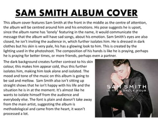
This album cover features Sam Smith at the front in the middle as the centre of attention,
the album will be centred around him and his emotions. His pose suggests he is upset,
since the album name has ‘lonely’ featuring in the name, it would communicate the
message that the album will have sad songs, about his emotion. Sam Smith’s eyes are also
closed, he isn’t inviting the audience in, which further isolates him. He is dressed in dark
clothes but his skin is very pale, his has a glowing look to him. This is created by the
lighting used in the photoshoot. The composition of his hands is like he is praying, perhaps
he is praying for better times, or more friends, perhaps even a partner.
The dark background creates further contrast to his skin
colour, this makes him appear cold, thus this further
isolates him, making him look alone and isolated. The
mood and tone of the music on this album is going to
be sad and mellow. Sam Smith also isn’t sitting up
straight shows that he isn’t happy with his life and the
situation he is in at the moment. It’s almost like he
wants to isolate himself from the audience and
everybody else. The font is plain and doesn’t take away
from the main artist, suggesting the album is
methodological and came from the heart, it wasn’t
processed a lot.
NICKI MINAJ ALBUM COVER
This digipak cover is very minimalist and simplistic. It doesn’t feature the artist on the front,
which is strange for Nicki Minaj as she is well known for being self indulged and putting
herself on the front of most things she sells. The significance of the finger print can link to
her individual style. Nicki Minaj does have a well known individual style, just like everybody's
finger prints are different; her style is different. The significance of the pink connects to her
image, she often presents herself as a ‘Barbie’ type girl, thus the pink represents this on the
front cover. The pink will also appeal to her female fans.
Furthermore the use of the paint like splatter looks a lot
like a make up splash, this can represent how Nicki uses
lots of make up. However it could also represent that she
is taking her make up off, and this album is her stripping
herself back the basics. The white background can also
represent her simplistic style. Or the pink print on the plain
background can represent herself against all the other
music styles. So although she doesn’t feature on the front
of her album, it still represents her style and her
personality in the music industry. Also the font of ‘ the
pinkprint’ is like an autograph as if she has signed it, the
album is hers, and is from her style.
THE SATURDAYS ALBUM COVER
This sexualises the women in the band, it appears that they could potentially be naked.
They actually all do look wet as well, so the image in provocative. They are all wearing pink
lipstick, which shows the unity within the band. The fact they appear naked yet all have full
faces of make up on, heavily sexualises them. This can be to attract male audiences as the
men want to date them. Also attracting the female audience as they want to be them, and
look that perfect and attractive. Their composition shows them as all being important, as
none of them are taking up more space than any of the other ones. The background has a
gradient and is plain, it makes it look like light is shining behind them, making them seem
angelic. The font used is curved and looks playful, not rigid and structured. The font can be
a representative of the band and the band’s music. In that the music is easy listening and
the girl members are easy going.
The use of the gradient background can be a symbol of
the depth of their music, this album may have lots of
different types of songs with lots of types of different
emotions. There facial expressions are all the same and
are quite harsh, this can represent how the music
industry has made them. That they have to harsh, or it
could be a signal that they are serious about making and
selling music.

More Related Content

What's hot

Sam smith album cover analysis
Sam smith album cover analysisSam smith album cover analysis
Sam smith album cover analysisAbbiireland
 
CD Covers Presentation
CD Covers PresentationCD Covers Presentation
CD Covers Presentationmaherr
 
Textual analysis of cd’s
Textual analysis of cd’sTextual analysis of cd’s
Textual analysis of cd’sTPS_OM
 
Artists/Bands Image Analysis
Artists/Bands Image AnalysisArtists/Bands Image Analysis
Artists/Bands Image Analysispaduaanne
 
Analysing Digipaks - Sia
Analysing Digipaks - SiaAnalysing Digipaks - Sia
Analysing Digipaks - Siacaitlinalyx
 
Analysing digipaks1
Analysing digipaks1Analysing digipaks1
Analysing digipaks1caitlinalyx
 
Media slide show homework
Media slide show homeworkMedia slide show homework
Media slide show homeworkHannah Patrick
 
Research into Digipacks
Research into DigipacksResearch into Digipacks
Research into Digipackssairaalixo
 
Analysis of digipack a2 media
Analysis of digipack a2 mediaAnalysis of digipack a2 media
Analysis of digipack a2 mediahollylaverick
 
All evaluation
All evaluationAll evaluation
All evaluation09jjackson
 
Katy perry advert analysis
Katy perry advert analysisKaty perry advert analysis
Katy perry advert analysisnaomi_pierce
 

What's hot (19)

Sam smith album cover analysis
Sam smith album cover analysisSam smith album cover analysis
Sam smith album cover analysis
 
CD Covers Presentation
CD Covers PresentationCD Covers Presentation
CD Covers Presentation
 
Florence digipak.docx 2
Florence digipak.docx 2Florence digipak.docx 2
Florence digipak.docx 2
 
Digipak analysis 2
Digipak analysis 2Digipak analysis 2
Digipak analysis 2
 
.Aoep3
.Aoep3.Aoep3
.Aoep3
 
Ancillary Research
Ancillary ResearchAncillary Research
Ancillary Research
 
Textual analysis of cd’s
Textual analysis of cd’sTextual analysis of cd’s
Textual analysis of cd’s
 
Presentation1
Presentation1Presentation1
Presentation1
 
Madonna poster
Madonna posterMadonna poster
Madonna poster
 
Artists/Bands Image Analysis
Artists/Bands Image AnalysisArtists/Bands Image Analysis
Artists/Bands Image Analysis
 
Media digipacks
Media digipacksMedia digipacks
Media digipacks
 
Analysing Digipaks - Sia
Analysing Digipaks - SiaAnalysing Digipaks - Sia
Analysing Digipaks - Sia
 
Posters
PostersPosters
Posters
 
Analysing digipaks1
Analysing digipaks1Analysing digipaks1
Analysing digipaks1
 
Media slide show homework
Media slide show homeworkMedia slide show homework
Media slide show homework
 
Research into Digipacks
Research into DigipacksResearch into Digipacks
Research into Digipacks
 
Analysis of digipack a2 media
Analysis of digipack a2 mediaAnalysis of digipack a2 media
Analysis of digipack a2 media
 
All evaluation
All evaluationAll evaluation
All evaluation
 
Katy perry advert analysis
Katy perry advert analysisKaty perry advert analysis
Katy perry advert analysis
 

Viewers also liked

Digi pak analysis blog ready final
Digi pak analysis blog ready finalDigi pak analysis blog ready final
Digi pak analysis blog ready finalTaliaWilson
 
Music album cover analysis
Music album cover analysisMusic album cover analysis
Music album cover analysisJennykam
 
LIL WAYNE ALBUM COVER ANALYSIS
LIL WAYNE ALBUM COVER ANALYSISLIL WAYNE ALBUM COVER ANALYSIS
LIL WAYNE ALBUM COVER ANALYSISDaniel Aboudy
 
Cd album cover analysis
Cd album cover analysisCd album cover analysis
Cd album cover analysis07wilsk
 
R&b music video codes and conventions
R&b music video codes and conventionsR&b music video codes and conventions
R&b music video codes and conventionsjayden1234
 
Analysis of cd covers
Analysis of cd coversAnalysis of cd covers
Analysis of cd coversambcheesmanxx
 
Analysis of CD Covers
Analysis of CD CoversAnalysis of CD Covers
Analysis of CD Coversambcheesmanxx
 
Album cd cover analysis
Album cd cover analysisAlbum cd cover analysis
Album cd cover analysisAzakria
 
analysis of album covers
analysis of album coversanalysis of album covers
analysis of album covershibahassan98
 
Cd cover analysis rihanna – loud
Cd cover analysis rihanna – loudCd cover analysis rihanna – loud
Cd cover analysis rihanna – loudsophiejvbell
 
Album cover analysis
Album cover analysisAlbum cover analysis
Album cover analysisKristyWright
 

Viewers also liked (11)

Digi pak analysis blog ready final
Digi pak analysis blog ready finalDigi pak analysis blog ready final
Digi pak analysis blog ready final
 
Music album cover analysis
Music album cover analysisMusic album cover analysis
Music album cover analysis
 
LIL WAYNE ALBUM COVER ANALYSIS
LIL WAYNE ALBUM COVER ANALYSISLIL WAYNE ALBUM COVER ANALYSIS
LIL WAYNE ALBUM COVER ANALYSIS
 
Cd album cover analysis
Cd album cover analysisCd album cover analysis
Cd album cover analysis
 
R&b music video codes and conventions
R&b music video codes and conventionsR&b music video codes and conventions
R&b music video codes and conventions
 
Analysis of cd covers
Analysis of cd coversAnalysis of cd covers
Analysis of cd covers
 
Analysis of CD Covers
Analysis of CD CoversAnalysis of CD Covers
Analysis of CD Covers
 
Album cd cover analysis
Album cd cover analysisAlbum cd cover analysis
Album cd cover analysis
 
analysis of album covers
analysis of album coversanalysis of album covers
analysis of album covers
 
Cd cover analysis rihanna – loud
Cd cover analysis rihanna – loudCd cover analysis rihanna – loud
Cd cover analysis rihanna – loud
 
Album cover analysis
Album cover analysisAlbum cover analysis
Album cover analysis
 

Similar to Album cover analysis

Album Cover Analysis
Album Cover AnalysisAlbum Cover Analysis
Album Cover AnalysisHollyFreeman
 
Textual analysis
Textual analysisTextual analysis
Textual analysismilliebevan
 
Analysing Album Covers
Analysing Album CoversAnalysing Album Covers
Analysing Album Coversrachael swan
 
Cd album front and back cover analysis
Cd album  front and back cover analysisCd album  front and back cover analysis
Cd album front and back cover analysisshahnaziee
 
Analysis of dijipacks a2 media studies
Analysis of dijipacks a2 media studies Analysis of dijipacks a2 media studies
Analysis of dijipacks a2 media studies hollylaverick
 
Analysis of digipaks
Analysis of digipaksAnalysis of digipaks
Analysis of digipaksgarrett001
 
Album cover analysis Improvements
Album cover analysis ImprovementsAlbum cover analysis Improvements
Album cover analysis ImprovementsHollyFreeman
 
Appendix 9: Poster analysis (AO2)
Appendix 9: Poster analysis (AO2)Appendix 9: Poster analysis (AO2)
Appendix 9: Poster analysis (AO2)chazzrodgers
 
Digipak analysis
Digipak analysisDigipak analysis
Digipak analysiscaseypheby8
 
Analysis of magazine advert
Analysis of magazine advertAnalysis of magazine advert
Analysis of magazine advertMediaEdWright
 
Textual analysis of real texts
Textual analysis of real textsTextual analysis of real texts
Textual analysis of real textsMollyleah
 
Analysis Of DVD Covers
Analysis Of DVD CoversAnalysis Of DVD Covers
Analysis Of DVD CoversAdil AbbAs
 
Magazine advert analysis- Anna Gajda
Magazine advert analysis- Anna GajdaMagazine advert analysis- Anna Gajda
Magazine advert analysis- Anna GajdaAnna Gajda
 
Digipak analysis
Digipak analysisDigipak analysis
Digipak analysiscaleah kerr
 

Similar to Album cover analysis (20)

Album Cover Analysis
Album Cover AnalysisAlbum Cover Analysis
Album Cover Analysis
 
Textual analysis
Textual analysisTextual analysis
Textual analysis
 
Analysing Album Covers
Analysing Album CoversAnalysing Album Covers
Analysing Album Covers
 
Cd album front and back cover analysis
Cd album  front and back cover analysisCd album  front and back cover analysis
Cd album front and back cover analysis
 
Analysis of dijipacks a2 media studies
Analysis of dijipacks a2 media studies Analysis of dijipacks a2 media studies
Analysis of dijipacks a2 media studies
 
Media harrison
Media harrisonMedia harrison
Media harrison
 
Media harrison
Media harrisonMedia harrison
Media harrison
 
Analysis of digipaks
Analysis of digipaksAnalysis of digipaks
Analysis of digipaks
 
Album cover analysis Improvements
Album cover analysis ImprovementsAlbum cover analysis Improvements
Album cover analysis Improvements
 
Ancillary task
Ancillary taskAncillary task
Ancillary task
 
Appendix 9: Poster analysis (AO2)
Appendix 9: Poster analysis (AO2)Appendix 9: Poster analysis (AO2)
Appendix 9: Poster analysis (AO2)
 
Digipak analysis
Digipak analysisDigipak analysis
Digipak analysis
 
Magaizne adverts analysis
Magaizne adverts analysisMagaizne adverts analysis
Magaizne adverts analysis
 
Analysis of magazine advert
Analysis of magazine advertAnalysis of magazine advert
Analysis of magazine advert
 
Textual analysis of real texts
Textual analysis of real textsTextual analysis of real texts
Textual analysis of real texts
 
Analysis Of DVD Covers
Analysis Of DVD CoversAnalysis Of DVD Covers
Analysis Of DVD Covers
 
Magazine advert analysis- Anna Gajda
Magazine advert analysis- Anna GajdaMagazine advert analysis- Anna Gajda
Magazine advert analysis- Anna Gajda
 
Digipack analysis
Digipack analysisDigipack analysis
Digipack analysis
 
Album covers
Album coversAlbum covers
Album covers
 
Digipak analysis
Digipak analysisDigipak analysis
Digipak analysis
 

Album cover analysis

  • 1. SAM SMITH ALBUM COVER This album cover features Sam Smith at the front in the middle as the centre of attention, the album will be centred around him and his emotions. His pose suggests he is upset, since the album name has ‘lonely’ featuring in the name, it would communicate the message that the album will have sad songs, about his emotion. Sam Smith’s eyes are also closed, he isn’t inviting the audience in, which further isolates him. He is dressed in dark clothes but his skin is very pale, his has a glowing look to him. This is created by the lighting used in the photoshoot. The composition of his hands is like he is praying, perhaps he is praying for better times, or more friends, perhaps even a partner. The dark background creates further contrast to his skin colour, this makes him appear cold, thus this further isolates him, making him look alone and isolated. The mood and tone of the music on this album is going to be sad and mellow. Sam Smith also isn’t sitting up straight shows that he isn’t happy with his life and the situation he is in at the moment. It’s almost like he wants to isolate himself from the audience and everybody else. The font is plain and doesn’t take away from the main artist, suggesting the album is methodological and came from the heart, it wasn’t processed a lot.
  • 2. NICKI MINAJ ALBUM COVER This digipak cover is very minimalist and simplistic. It doesn’t feature the artist on the front, which is strange for Nicki Minaj as she is well known for being self indulged and putting herself on the front of most things she sells. The significance of the finger print can link to her individual style. Nicki Minaj does have a well known individual style, just like everybody's finger prints are different; her style is different. The significance of the pink connects to her image, she often presents herself as a ‘Barbie’ type girl, thus the pink represents this on the front cover. The pink will also appeal to her female fans. Furthermore the use of the paint like splatter looks a lot like a make up splash, this can represent how Nicki uses lots of make up. However it could also represent that she is taking her make up off, and this album is her stripping herself back the basics. The white background can also represent her simplistic style. Or the pink print on the plain background can represent herself against all the other music styles. So although she doesn’t feature on the front of her album, it still represents her style and her personality in the music industry. Also the font of ‘ the pinkprint’ is like an autograph as if she has signed it, the album is hers, and is from her style.
  • 3. THE SATURDAYS ALBUM COVER This sexualises the women in the band, it appears that they could potentially be naked. They actually all do look wet as well, so the image in provocative. They are all wearing pink lipstick, which shows the unity within the band. The fact they appear naked yet all have full faces of make up on, heavily sexualises them. This can be to attract male audiences as the men want to date them. Also attracting the female audience as they want to be them, and look that perfect and attractive. Their composition shows them as all being important, as none of them are taking up more space than any of the other ones. The background has a gradient and is plain, it makes it look like light is shining behind them, making them seem angelic. The font used is curved and looks playful, not rigid and structured. The font can be a representative of the band and the band’s music. In that the music is easy listening and the girl members are easy going. The use of the gradient background can be a symbol of the depth of their music, this album may have lots of different types of songs with lots of types of different emotions. There facial expressions are all the same and are quite harsh, this can represent how the music industry has made them. That they have to harsh, or it could be a signal that they are serious about making and selling music.