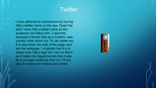
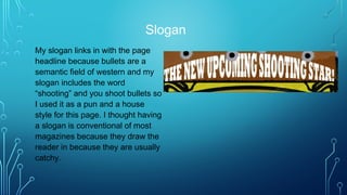
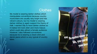
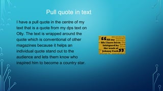
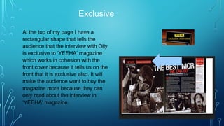
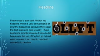
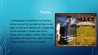
4. Wooden theme
I have adhered to conventions
by having a wooden border
around the page. It is wooden
because this sticks to the house
style of the magazine. I also
have olly playing an acoustic
guitar which is in an indexical
sign of country music. Also It is
a symbol of olly because he is
playing it on the dps and front
cover.
5. Page numbers
I have the page numbers in the
corners that match up with the
contents page because they are in
the bullets and the pages that the dps
are on match up with what they say
on the contents page. I have the
dateline at the bottom on the border
which is very conventional for most
magazines so people know when it
was published so they know how new
the magazine is. I also have the
masthead at the bottom so I keep this
as a house style that stays throughout
the magazine.
6. Bullet holes
I have manipulated conventions by
having a smoking bullet hole in the
middle of the letter ‘O’ in my
headline and bullet holes in the
pug. This shows the western theme
and can be used as a sign for
western as well. However other
magazines usually have their
headlines clear and fully noticeable.
The pug that the headline has been
manipulated by making it faded so
the audience can see through and
see the detail in the background.
7. Web address
I have used a web address on my
page so people can find out about
Olly T on the internet. However
even though this is conventional for
other magazines, I manipulated
them by having it in the border
down the side of the page on the
boarder. I also did this so the
border at the bottom of my page
wasn’t crowded.
8. Background
I have challenged conventions by
having the whole of the background as
an image of the outdoors. Other
country magazines have it all as a
studio background or have half of the
dps as an outside environment. I have
placed Olly on the image so it looks
like he is walking out into the field
which I use as a under meaning to
show Olly going out into the world.
9. Twitter
I have adhered to conventions by having
Olly’s twitter name on the dps. Down the
side I have Olly’s twitter name so the
audience can follow him. I used this
because it shows Olly as a modern, new
country artist which my TA can relate too.
It is also down the side of the page next
too the webpage. I originally had it in a
shape over Olly’s legs but I did not like it
as it made my magazine look like it was
for a younger audience than my TA but
also it looked out of place and untidy.
10. Slogan
My slogan links in with the page
headline because bullets are a
semantic field of western and my
slogan includes the word
“shooting” and you shoot bullets so
I used it as a pun and a house
style for this page. I thought having
a slogan is conventional of most
magazines because they draw the
reader in because they are usually
catchy.
11. Clothes
My model is wearing darker clothes which
manipulates conventions because country
music/stars are usually very bright and has
vibrant colours, but my model is wearing
darker clothes to again support the theory of
Hall. I wanted Olly to have darker clothes so
it makes him look older and more mature
which could also attract a female audience.
However I also followed conventions
because he is wearing a check shirt and
denim jeans which is very typical of country
stars.
12. Pull quote in text
I have a pull quote in the centre of my
text that is a quote from my dps text on
Olly. The text is wrapped around the
quote which is conventional of other
magazines because it helps an
individual quote stand out to the
audience and lets them know who
inspired him to become a country star.
13. Dropped capital
I have used a dropped capital twice in
my text because this is very
conventional of most magazines. I
always wanted this in my magazine
because big magazines like Q and
Maverick use it in theirs so I saw it as
a sign of quality and professionalism.
14. Exclusive
At the top of my page I have a
rectangular shape that tells the
audience that the interview with Olly
is exclusive to ‘YEEHA’ magazine
which works in cohesion with the
front cover because it tells us on the
front that it is exclusive also. It will
make the audience want to buy the
magazine more because they can
only read about the interview in
‘YEEHA’ magazine.
15. Pull quote language
I have used slang in my pull quote to
appeal to a younger audience. I used
the word “lad” which is a modern
phrase and is very conventional in
teenage magazines because they
want to connect with the audience.
16. Headline
I have used a san serif font for my
headline which is very conventional of
country magazines because they keep
the text plain and bold usually. I have
kept mine simple because I have bullet
holes over the top of the text so I didn’t
want to make it too hard to read and I
wanted it to be clear
17. Frame
I manipulated conventions by having a
frame around my dps text so that it was
easy to read and stands out. I chose this
frame because it looked like mirror
frame from a western home. Also I used
the colours to match the colour scheme
of the headline on the front cover.