
Recommended
More Related Content
What's hot
What's hot (20)
Similar to Learning Aim B and C
Similar to Learning Aim B and C (20)
More from MayankKumar398
More from MayankKumar398 (20)
Recently uploaded
Recently uploaded (20)
Learning Aim B and C
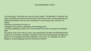
- 1. “Los Hermanos” is the title of my movie, which means “The Brothers” in Spanish, the value of brotherhood will be the main point of the whole movie, and this because the relationship between the two main characters it’s very strong, even if they’re not related. I decided to promote the movie on: -Instagram with posters, wallpapers and backstage shot -YouTube publishing a trailer, and it’s also where the movie it’s going to be released itself. The genre of the movie will be crime, more specifically will follow the Mobster/Drama codes and conventions, therefore I decided to have some strong graphic images and aspect in my campaign that will be reflected in my movie. For example, the use of weapons, strong languages and the consume of alcohol. LOS HERMANOS- PITCH
- 2. As most of the movies of this kind of genre, the movie is most suitable for people over 15 years old, this because young aged children will not be able to understand what the movie’s talking about. It won’t also be a positive message for the young audience because of the violence background, and the drugs/alcohol misuse. Half of the dialogues are in Spanish, so people that have never watched shows like Narcos or Breaking Bad, which are also shows with an age rating of 15 and 18 years old, wouldn’t feel familiar with this kind of narration and wouldn’t get the reason of why the characters will have this Spanish slang and strong accent. Usually this type of entertainment is aimed to a male audience, therefore all the characters will portray a highlighting of masculinity, but there won’t be no offense to the female world, this because it won’t even be nominated. TARGET AUDIENCE
- 3. The most recent blockbuster movie that meets the genre criteria of my movie, is The Irishman, therefore I decided to inspire myself by the work of hundred-million dollars movie media campaign. Netflix for The Irishman didn’t only do a traditional generic social media campaign, but it also did a viral market campaign. In fact in some of the North and South America states, fake newspapers and wanted posters with Al Pacino’s(portraying Jimmy Hoffa) face have been distributed
- 4. To have a clear feedback from the target, I decided to make them fill a survey for me. Most of them have been aware of films by looking at trailers on YouTube or posters on Instagram, which are the two media platforms most used by them. A clear 73% of the people that took the survey is not interested in the genre, but they could change their ideas as they’ve been convinced to watch movies, they didn’t find interesting at first. People use YouTube roughly 5-10 hours a week. The 100% of people I surveyed don’t read any Newspapers or Magazines, and all of them would be curious of seeing an interesting trailer for my movie, which will induce them to watch it. PRIMARY RESEARCH
- 5. I also had the idea to ask my friends some questions(Ref.1) so I could have an idea of how the people close to me would think about this project of mine, and also so I could have more data to analyse and help myself on how the public would feel about it. Some of my friends had very simple answers(Ref.2 & 3), that helped me in a “binary” way, as they just count as numbers of yes or no, that helped me, but not even that much, as they could have been more exhaustive and in depth. While I also received a very good response from other friends(Ref.4), which was very detailed and really helped me understand how the audience’s mind really works. Which split my target into mainly male viewers, as the detailed answers were sent from females that didn’t want to watch my movie, while the less detailed answers were given from males that did want to watch my movie. Ref.1 Ref.2 Ref.3 Ref.4
- 6. Goodfellas is officially the movie I’ve been inspired the most. In this poster, the actors have some attitude, that makes me think about how much self-confident the characters are. Just on the movie logo there is a quote from the movie, which is really important because it’s the really first catchphrase of the movie, and just below the logo there is “A Martin Scorsese Picture”, to lead the audience to the fact that the movie is made by a famous director. On the bottom we can see all the people that worked at the movie like cast and crew, and who distributed it. On the top we can see the name of the actors and their faces, which is the dominant image, just below the text, and they’re all three looking at the center of the poster. For my poster I want to express the same self-confidence, power and respect feeling that I get from this poster. I want my characters to dress up elegant like they are, because in this genre, the luxury and the suits are two of the biggest code and conventions. SECONDARY RESEARCH
- 7. On the internet I found an interesting article ( link to the article ) , that talked about the target audience of Goodfellas, which is the movie that inspired me the most for the style of my movie. The article says that the movie is aimed for males between 25-45 interested in 80’s gangster/mafia films, and personally I want to aim to people that have the same interests but of younger age, this because my movie doesn’t show some explicit contents that Goodfellas does. The fact that the actors are wearing suits in a black background gives sense of power, and I will dress my actors in a similar sense of power that this poster gives. And to indicate that my movie will be part of the crime genre, I will use a similar layout, elements that recall the crime life and dark colours.
- 8. The biggest competitors of Warner Bros. are LionsGate, Paramount, and Universal. I wanted to go for Universal at first because I love the way they promote their productions, both on YouTube and their social medias. But I preferred to choose Warner Bros. because of the mood and the artistic choices of my product. If we analyze some of the most famous franchise labeled WB, we have the DC Comics Universe and the Harry Potter saga, they both have a very dark photography and themes, And my movie will also have those dark colors. Also most of the Martin Scorsese’s movies are produced by Warner Bros. and that genre and that target audience it’s what I’m interested in. Also because my movie will be really similar to what a movie like Goodfellas or Casino look like.
- 9. Theatrical Poster: I will release other posters than the theatrical one on the Instagram page, but the theatrical poster will be the most important, this because it shows the cast, the name of the movie, the name of the director and all with the original logo of the movie. Social Media Page: I decided to point everything on the Instagram page, this because the movie is produced and distributed by BLVCK MAG(my own producing company), so I will share all the posters and visuals on the company’s page, which I think is the most effective way online to share some independent project. Teaser Trailer: This will be a short trailer from some of the footage of the official movie, which will only show which genre the movie is, the name of the movie and it will only be about 20/30 seconds long as it will be suitable on every platform as YouTube, Instagram, Facebook, etc... MAIN IDEAS
- 10. The first poster I worked on was just for promotion of the movie via instagram, and it wasn’t a theatrical poster. It was just what I imagined would have been the first post about the movie on the company’s Instagram profile. I designed a flat plan to have an idea of how to dispose every element in the poster. After I spent some time in studio trying various poses, lights, expressions and costumes. I decided to use the picture where I looked more like a “Scorsese’s Movie Mobster” for example all the characters from Goodfellas, I wanted to have and show that kind of attitude as far as I could, that was totally the mood I was looking for and that I pictured when I was planning everything. POSTERS
- 11. Obviously, after a pretty long studio session, I decided to work on the pictures that I liked the most, and by matching with our clothes, and the colours that I wanted to use, I ended up with a few drafts that lead me to my final results. I thought that the white and orange combination was perfect at the beginning, but then I knew that the name of the movie would have been in a dark colour, probably black, which didn’t help the reader to understand the main selling point. So I decided to keep the orange, but change the background to black, which made the title of the movie more clear to be read, every colour that I wanted to use suited that black background. Initially the title of the movie was just “Brothers”, then I decided to translate it in Spanish because half of the movie is acted in that language, so I decided to call it “Los Hermanos” which literally means “The Brothers”. Even if I was quite sure of the orange and black posters, I decided to do some more colour changes, just to try if they worked or not, and I also tried to move the position of the title, resize it and change its colour.
- 12. After I saw this poster of The Godfather, I wanted to use the same kind of filter used with this image, that’s why I had a look through the photoshop filter gallery, and I found the one that looked closer to the one I was inspired by. As in my flat plan I added the revisited version of the movie Logo, this because having the logo on a vertical page it’s harder to read, because of the bullet holes used as Os in the name. So I decided to lower 40% the opacity of the bullet holes and place a pair of Os on them, as whoever sees it, can immediately understand what’s written.
- 13. Because BLVCK MAG is sponsoring, producing and distributing the movie, I needed to insert the company’s logo, even if the company’s is mine. This because I want the distribution to have a big impact on the movie’s image, this because I want people to see that it’s an independent self- produced movie, and if it ever gets “mainstream", I want to keep going on the company’s name “The things work like this, and you just have to do what I say” it’s one of the most powerful line that my character says during the movie, that’s why is at the top of the poster and why I’m giving it this much importance, I want the audience to understand the power of the line and to remember it when watching the movie as listening to the dialogues.
- 14. At the end I added the text box saying “Mayank Kumar as Javier”, making the audience aware of the fact that the writer, producer, and director is also going to star in the movie as one of the two leading characters. This shows how much the Director cared about the production and how much he’s dedicated to this movie. Then I created another version of the poster for the main leading character of the movie, with the same features of the first poster. But this one says, “Ethan Farrer as Santiago” and his main quote is “Who put all this together with you? Me.”
- 15. HOW THE SHOULD POSTERS LOOK LIKE
- 16. When I thought about my theatrical poster, I wanted it to be as rough as possible. This poster had to be simple and had to get whoever sees it straight to the point, that is not a movie for a young audience, that it has graphic images and it’s only for who loves the genre. I didn't’ want it to be nothing more or nothing less than the flat plan itself. The very first thing I added was the fire line, which I found on shutterstock.com, it’s important because most of the dialogues are in Spanish, and fuego is one of the word most known and used in the pop culture, which in fact means fire in Spanish. It also gives sort of the “Narcos” mood, which is good because it’s a Series that has a similar genre to my movie.
- 17. I found the bullet rain picture on Shutterstock.com, which wasn’t long enough for the page, so I must clone some parts of the bullets and repeat them for the rest of the empty space. The bullets are for cover the space left from the fire line and the space that the Logo is going to take. When I had the idea of using bullet holes as Os for the logo of my movie, there I decided that I wanted it white on black. As the holes have been done on some glass structure, and the black is the color where you can see it the most, also because it recalls the dark mood that the movie has being all set in the night.
- 18. My favorite way to work is the “one take”, and this is how the logo has been created the first and only time, when I saw the bullet holes, my only worry was to write the rest of the title around it, and I did it. Because of my experience as a Hip-Hop graffiti writer, I wanted that of being the main mood of the text. So I chose the brush tool, and I hand-free draw the title of the movie on the artboard, then I ended up liking it at the first take. Then I added my name as a director, producer and writer, when I decided that it would have been easier if I just wrote “A Mayank Kumar Movie” In the end I just added the cast name and their characters on the center top, and the company logo at the bottom left as on my flat plan.
- 19. HOW THE THEATRICAL POSTERS LOOKS LIKE