
Recommended
More Related Content
What's hot
What's hot (18)
Similar to Brothers in Crime
Similar to Brothers in Crime (20)
More from MayankKumar398
More from MayankKumar398 (20)
Recently uploaded
Recently uploaded (20)
Brothers in Crime
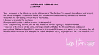
- 1. “Los Hermanos” is the title of my movie, which means “The Brothers” in spanish, the value of brotherhood will be the main point of the whole movie, and this because the relationship between the two main characters it’s very strong, even if they’re not related. I decided to promote the movie on: -Instagram with posters, wallpapers and backstage shot -YouTube publishing a trailer, and it’s also where the movie it’s going to be released itself. The genre of the movie will be crime, more specifically will follow the Mobster/Drama codes and conventions, this is why I decided to have some strong graphic images and aspect in my campaign that will be reflected in my movie. For example the use of: weapons, strong languages and the consume of alcohol. LOS HERMANOS-MARKETING CAMPAIGN
- 2. TARGET AUDIENCE As most of the movies of this kind of genre, the movie is most suitable for people over 15 years old, this because young aged children will not be able to understand what the movie’s talking about. It won’t also be a positive message for the young audience because of the violence background, and the drugs/alcohol misuse. Half of the dialogues are in Spanish, so people that have never watched shows like Narcos or Breaking Bad, which are also shows with an age rating of 15 and 18 years old, wouldn’t feel familiar with this kind of narration and wouldn’t get the reason of why the characters will have this Spanish slang and strong accent. Usually this type of entertainment is aimed to a male audience, this is why all the characters will portray an highlighting of masculinity, but there won’t be no offense to the female world, this because it won’t even be nominated.
- 3. The most recent blockbuster movie that meets the genre criteria of my movie, is The Irishman, this is why I decided to inspire myself by the work of hundred-million dollars movie media campaign. Netflix for The Irishman didn’t only do a traditional generic social media campaign but it also did a viral market campaign. In fact in some of the North and South America states, fake newspapers and wanted posters with Al Pacino’s(portraying Jimmy Hoffa) face have been distributed
- 4. PRIMARY RESEARCH To have a clear feedback from the target, I decided to make them fill a survey for me. Most of them have been aware of films by looking at trailers on youtube or posters on instagram, which are the two media platforms most used by them. A clear 73% of the people that took the survey is not interested in the genre, but they could change their ideas as they’ve been convinced to watch movies they didn’t find interesting at first. People use YouTube roughly 5-10 hours a week. The 100% of people I surveyed don’t read any Newspapers or Magazines, and all of them would be curious of seeing an interesting trailer for my movie, which will induce them to watch it.
- 5. SECONDARY RESEARCH GoodFellas is officially the movie I’ve been inspired the most. In this poster, the actors have some attitude, that makes me think about how much self-confident the characters are. Just on the movie logo there is a quote from the movie, which is really important because it’s the really first catchphrase of the movie, and just below the logo there is “A Martin Scorsese Picture”, to lead the audience to the fact that the movie is made by a famous director. On the bottom we can see all the people that worked at the movie like cast and crew, and also who distributed it. On the top we can see the name of the actors and their faces, which is the dominant image, just below the text, and they’re all three looking at the center of the poster. For my poster I want to express the same self-confidence, power and respect feeling that I get from this poster. I want my characters to dress up elegant like they are, because in this genre, the luxury and the suits are two of the biggest code and conventions.
- 6. MAIN IDEAS Theatrical Poster:I will release other posters than the theatrical one on the instagram page, but the theatrical poster will be the most important, this because it shows the cast, the name of the movie, the name of the director and all with the original logo of the movie. Social Media Page:I decided to point everything on the instagram page, this because the movie is produced and distributed by BLVCK MAG(my own producing company), so I will share all the posters and visuals on the company’s page, which I think is the most effective way online to share some independent project. Teaser Trailer:This will be a short trailer from some of the footage of the official movie, which will only show which genre the movie is, the name of the movie and it will only be about 20/30 seconds long as it will be suitable on every platform as youtube, instagram, facebook, etc...
- 7. TRAILER I had to assemble my trailer with the footage we rolled in 1 day of shooting, me and my crew managed to shoot only two scenes of the movie which I think were enough to catch the attention of my audience. From the way that the characters are dressed,the action scene, the guns and the alcohol shown in the trailer, the audience understands that it’s a mob related movie. I also wanted to add some text boxes between every cut, and each of them saying: “money”, “power”, and “respect”. This because they all 3 are the main values of the movie as they’re all bond each other from the fact that the money brings the power, and from the power you can get a form of respect out of the people who fear you. This is the kind of mindset that usually characters in mob-crime movies have, and I want to get to the audience that my movie is as serious as all the big production hollywood movies that remarked this kind of genre in the 70s/80s/90s, in fact the mood of my movie and my trailer recalls that kind of colours, props and costumes.
- 8. Just in the middle of the trailer I decided to add a cut-to- beat edit of an action scene from the movie which shows that the movie will have violence and weapons. In this scene we can also see a prop jar and drink which will show that the movie also features alcohol. The scene is shot in Green Screen and I used the Ultra Key effect to remove the background, than I replaced it with an image I found on internet, the image is taken from tripadvisor.co.uk and it’s the inside of Restaurant Chocolat. From scene to scene some camera angles change, this why I used more pictures of the restaurant from different shots to use as a background. The last primary scene used in the trailer is a simple scene where one of the characters walk out of the room, this creates suspense in both movie and trailer, this is why I decided to use it just before the announcement of the movie title. I also wanted to give some room between the primary scenes and the name of the movie, that’s why there is a few seconds gap between them.
- 9. Before the title of the movie is revealed I wanted to add a flying bullet effect, and I found what I was looking for on the YouTube channel of My Tech World, who uploaded a green screen effect of a flying 3D bullet, just to give at the weapons and at the violence the right importance in this trailer, as the audience can fully understand the genre. I took away the green background to have a black one, which suits better and matches with the previous text boxes, and the bullet is also followed by a white trail which is best visible on a black background. The title of the movie dissolves in as the the trail of the bullet dissolves out. I wanted to use the original logo of the movie at first, but it didn’t seem appropriate to me, this because it was too different from all the elements saw before in the trailer. This is why I decided to keep all the text boxes same-looking, so everything would match and the eye of the reader would get used to lake at the same spot every time.
- 10. POSTERS The first poster I worked on was just for promotion of the movie via instagram, and it wasn’t a theatrical poster. It was just what I imagined would have been the first post about the movie on the company’s instagram profile. I designed a flat plan to have an idea of how to dispose every element in the poster. After I spent some time in studio trying various poses,lights, expressions and costumes. I decided to use the picture where I looked more like a “Scorsese’s Movie Mobster” for example all the characters from GoodFellas, I wanted to have and show that kind of attitude as far as I could, that was totally the mood I was looking for and that I pictured when I was planning everything.
- 11. After I saw this poster of The Godfather, I wanted to use the same kind of filter used with this image, that’s why I had a look through the photoshop filter gallery and I found the one that looked closer to the one I was inspired by. As in my flat plan I added the rivisited version of the movie Logo, this because having the logo on a vertical page it’s harder to read, because of the bullet holes used as Os in the name. So I decided to lower 40% the opacity of the bullet holes and place a pair of Os on them, as whoever sees it, can immediately understand what’s written.
- 12. Because BLVCK MAG is sponsoring, producing and distributing the movie, I needed to insert the company’s logo, even if the company’s is mine. This because I want the distribution to have a big impact on the movie’s image, this because I want people to see that it’s an independent self- produced movie, and if it ever gets “mainstream”,I want to keep going on the company’s name “The things work like this, and you just have to do what I say” it’s one of the most powerful line that my character says during the movie, that’s why is at the top of the poster and why I’m giving it this much importance, I want the audience to understand the power of the line and to remember it when watching the movie as listening to the dialogues.
- 13. At the end I added the text box saying “Mayank Kumar as Javier”, awaring the audience to the fact that the writer, producer, and director is also going to star in the movie as one of the two leading characters. This shows how much the Director cared about the production and also how much he’s dedicated to this movie. Then I created another version of the poster for the main leading character of the movie, with the same features of the first poster. But this one says “Ethan Farrer as Santiago” and his main quote is “Who put all this together with you? Me.”
- 14. HOW THE POSTERS LOOK LIKE
- 15. THEATRICAL POSTER THEATRICAL POSTER When I thought about my theatrical poster, I wanted it to be as rough as possible. This poster had to be simple and had to get whoever sees it straight to the point, that is not a movie for a young audience, that it has graphic images and it’s only for who loves the genre. I didn't’ want it to be nothing more or nothing less than the flat plan itself. The very first thing I added was the fire line, which I found on shutterstock.com, it’s important because most of the dialogues are in spanish, and fuego is one of the word most known and used in the pop culture, which in fact means fire in spanish. It also gives sort of the “Nacos” mood, which is good because it’s a Series that has a similar genre to my movie.
- 16. I found the bullet rain picture on Shutterstock.com, which wasn’t long enough for the page so I have to clone some parts of the bullets and repeat them for the rest of the empty space. The bullets are for cover the space left from the fire line and the space that the Logo is going to take. When I had the idea of using bullet holes as Os for the logo of my movie, there I decided that I wanted it white on black. As the holes have been done on some glass structure, and the black is the colour where you can see it the most, also because it recalls the dark mood that the movie has being all set in the night.
- 17. My favourite way to work is the “one take”, and this is how the logo has been created the first and only time, when I saw the bullet holes, my only worry was to write the rest of the title around it, and I did it. Because of my experience as a Hip-Hop graffiti writer, I wanted that of being the main mood of the text. So I chose the brush tool, and I hand-free draw the title of the movie on the artboard, then I ended up liking it at the first take. Then I added my name as a director, producer and writer, when I decided that it would have been easier if I just wrote “A Mayank Kumar Movie” In the end I just added the cast name and their characters on the center top, and the company logo at the bottom left as on my flat plan.
- 19. THE INSTAGRAM PAGE Instagram was definitely the social media platform I was going to use since the first time, this because it also is the most used zuckerberg-owned platform to promote movies. I posted on the company’s profile and I didn’t want to create a new profile because it’s harder to get followers when a new profile it’s created from the bottom. While the company’s profile has been created a while ago. Personally I think that the audience and the bigger producers will be more attracted by an independent movie producing company profile, than the profile of a movie that doesn't even have the blue verified sign, the company also have an english name, while the movie’s title is spanish, so not everyone will be attracted from something they can’t even pronounce or they don’t know what it means.
- 20. EVALUATION The three platform are all linked between them by using similar or the same fonts, they all share the company’s logo and they all feature the same colour palette. The instagram page has the biggest role in this campaign, because the post can be share to external links or by direct messages, and the audience can be hyped by reading the names of the cast. The trailer is published with no official date yet, because due to external issues, we haven’t finished the shooting yet. But overall, I believe that I came to an end successfully, and that all my platforms work perfectly fine with the audience.
Editor's Notes
- t