
Recommended
More Related Content
What's hot
What's hot (20)
Viewers also liked
Viewers also liked (9)
Similar to On Point with PowerPoint
Similar to On Point with PowerPoint (20)
On Point with PowerPoint
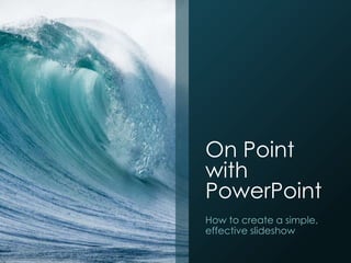
- 1. On Point with PowerPoint How to create a simple, effective slideshow
- 2. Today’s agenda • Planning before creating • The first steps • Textual clues • Using photos on a slide • Adding footnotes
- 3. Planning before creatingSource: Licensed under the Creative Commons Attribution 2.0 Generic license: http://commons.wikimedia.org/wiki/File:Howard_Tilton_Library_Computers_2010.jpg
- 4. Begin with the end • What is the ideal end result? • Inform an audience • Persuade an audience • Convince an audience to think about an issue • The Five Ws • What • Why • When • Where • Who http://www.garrreynolds.com/preso-tips/prepare/
- 5. Morreale, Sherwyn P. (2010). The Competent Public Speaker. New York: Peter Lang. Examine your audience • Personal demographics • Cultural characteristics • Psychological characteristics
- 6. Plan it
- 7. The first steps of your slideshow
- 8. Selecting a slide size Click the DESIGN tab. Click the Slide Size dropdown menu.
- 12. Nature templates
- 15. Textual clues
- 16. Adding text to slides Click the INSERT tab. Click Text Box.
- 17. Modifying text Click the HOME tab. Modify the text using the controls in the Font section.
- 19. Fonts to avoid Don’t use a gimmicky font. Make sure it’s easy to read everywhere in the room.
- 24. Source: NASA public domain: http://upload.wikimedia.org/wikipedia/commons/9/95/Impact-test.jpg
- 25. Enhance with great visuals
- 26. INSERT tab, Pictures Adjust using these dots. Top, bottom, sides will distort. Corners keep it proportional.
- 27. Select your picture, click FORMAT, then CROP Use the little black bars on the corners and sides to crop.
- 28. Use large, high-quality images
- 30. Keep surfing until you find an appropriately sized image. Use Google’s search tools.
- 33. Adding footnotes INSERT, Header & Footer
- 35. Google it for quick instructions Add the version of the software you’re using
- 37. Eye-popping examples Death by Powerpoint: A Letter to Presentation Killers Alexei Kapterev’s Top 10 slides on presentations Garr Reynolds’ Think Like A Designer
- 38. The Communication Center 719-255-4770 CEC@uccs.edu Columbine Hall 312, UCCS Monday, Tuesday, Thursday 9 a.m. to 6 p.m. Wednesday 9 a.m. to 8 p.m. Friday 9 a.m. to 2 p.m.
Editor's Notes
- [Note to presenter: Open with an attention-getter of your choosing before stating your name, your affiliation with the UCCS Communication Center, and other relevant details about the presentation. Your attention getter could be about a particularly great or poor set of slides you witnessed or presented. Alternately, use a startling statistic about how many PowerPoints are created. If appropriate, perhaps joke that research shows a full 50 percent of those are unbearable – this taken from the “Death by Powerpoint” slide show linked on the “eye-popping examples” page.]
- Today, we’ll be talking about the various aspects of the creation of a slideshow. We’ll begin with the planning process, a must for creating a balanced, consistent presentation that accurately portrays the aspects of your topic. Next, I’ll walk you through the steps of building a slideshow from opening a new PowerPoint document, through template selection and use. We’ll talk a little about adding text to a slide – this one sounds simple, but there are many ways to get tripped up, including using a garish, unreadable typeface or going way overboard on how much text you use on a slide. Next, I’ll talk about adding appropriate, useful photos to slides, including how to find images that are free to use for public presentations to avoid violating copyright law. Finally, I will talk about important details for appropriately citing your sources when creating a professional presentation. This presentation is designed to inform you of the basics of using PowerPoint. Keep in mind there are many other facets to this powerful presentation tool that you can employ by reading about them online through Microsoft’s website, or a number of helpful sites and forums devoted to the program. Some PowerPoint features, such as animations and transitions, can be useful in certain situations and distracting in others. If you have a strong desire to use them, consider your audience and the setting where you’ll give the presentation, and ask yourself “Will this add to or take away from my presentation?”
- Firstly, you’ll need to build in a little planning time before you even open PowerPoint. Ideally, this will take the form of an actual written outline you jot down by hand with pen and paper, or typed with a word processor. The latter is especially helpful if you are in Public Speaking 2100, as you are required to turn in an outline for the five major speeches. In that case, print a copy of your speech outline and jot down notes in the margins about ideas to turn your words into a compelling slideshow that adds to your speech rather than detracts or distracts from it. If you have a topic, but aren’t required to submit a formal outline, BEGIN WITH THE END ….
- What do I mean by that? Begin by thinking about what you want to be the end result after someone has viewed your slides and heard your presentation. Answering that question is the first of the traditional five Ws. Thinking through what is the purpose of your presentation and why were you asked to present will give you a good idea of what to include. Ultimately, what does your audience expect from their attendance of your presentation? You might not have any choice in the when and where of your presentation, but these factors can inform your slideshow. For example, if you are creating slides your audience will be viewing on their own on a computer or tablet, you may elect to add significantly more information to the “notes” section visible when viewing PowerPoint in “Normal mode.” Knowing what size screen you’ll be presenting with can be vital to how large you make the elements of your slides such as text, photos, charts and graphs. One of the most important of the five Ws is “who.” With that in mind …
- … Let’s talk about examining your audience. Think about the people who will make up your audience. What are their personal demographics, such as age range, level of education, occupation or religious background? Are they all members of a certain group, such as a club, professional organization, or public speaking class? What are their cultural characteristics? (for example, what groups are they in based on gender, ethnicity, country of origin?) What are the group’s psychological characteristics, such as their needs, motivations, beliefs, attitudes and values? Thinking about these things will help you focus your presentation on what the audience needs or wants to know.
- After you have thought through these elements, jot down an informal outline of what you’d like this presentation to look like. Will you have an attention-getter before your title slide? This could take many forms, such as a one-panel cartoon that ties in to your topic, or a large picture such as this one that offers a complementary visual to an opening story you’ll tell. Typically you’ll then have your title slide, a brief “agenda”-type slide to serve as a roadmap for your audience. Then list the major points you’ll be covering in the presentation. Leave a few lines after each and jot down subpoints. Visual elements are vital to a compelling slideshow, so as you are planning, think of ideal images, charts, graphs, etc. that could serve your purpose with the subtopics. When these ideas come to mind, jot them down next to the corresponding topic or subtopic, as a reminder when it comes time to search for these later. You’ll likely conclude by wrapping up with slide briefly reminding the audience what they have heard during your presentation. In some cases, you’ll have a slide with references listed, although this is much more effective as a handout if it is crucial or just helpful for audience members to actually have access to those source materials. Finally, will you be taking questions at the end? Build in a simple slide that says so, or alternately, a compelling final image on the screen that could serve as background to your conclusion if you need to drop the questions section due to running short on time.
- Now you are ready to build a slideshow. First things first. I’m now going to walk you through the very first steps of creating the slideshow you envisioned as you created a written outline during the planning process.
- In earlier versions of PowerPoint, slides were squarer (4:3). The default slide size in PowerPoint 2013 is widescreen (16:9). However, if you are going to be presenting through a traditionally sized screen and want to make sure the sides of your slides aren’t cut off, you may want to resize your slides to 4:3—and even to a custom size. Click the DESIGN tab. On the far right, click Slide size to switch between standard sizes or create a custom size.
- PowerPoint comes pre-loaded with numerous design templates that can enhance or detract from your presentation. There are advantages and disadvantages to using a template. A template can quickly and easily bring uniformity and visual appeal to your slides. However, a template that has been used too often by other groups of presenters can begin to seem dull and uncreative. You also should consider your subject matter and choose a template that works with the tone of your presentation. To select a template for a new slideshow, simply click “FILE” in the upper left corner, and “NEW” on the menu that appears at right. A handful of slide options are available here, but you can search through hundreds more template options by using the Search box at the top to explore other options.
- For example, there are a wide variety of templates appropriate for a presentation related to business …
- Templates for an education-related or themed presentation …
- Or something using a nature theme, which could be used for a wide variety of presentations. For example, nature backgrounds can create a calming effect and often are used for presentations other than just ones about oceans, forests, conservation, and environments.
- By the way, there are thousands of PowerPoint themes online, many available for free at Microsoft’s website. Simply Google “Microsoft PowerPoint free themes.” Other companies and websites make and sell themes of seemingly unlimited variety. If you find a theme online, download it to your computer. Next, with your presentation open, click the DESIGN tab, then click the little downward facing arrow to enlarge the menu. Click “Browse for themes” and browse to the location on your computer where you have saved your theme.
- However, before automatically going with a theme, consider what you’ll be presenting on your slides. If you’ll be using many of your own pictures, charts, graphs, etc., adding a template to the mix might make your slides look too busy and risk your audience becoming distracted. You may want to select “Blank Presentation” and rely on the visual interest of your own material in such a situation. Remember, it is very important to pick a background color that significantly contrasts with the font you’ll be using. The “cool” color palettes, such as greens and blues, are often much easier on the audience’s eyes when the presentation is viewed on a large screen from a projector. If your slides will be mainly viewed in a classroom using a projector, avoid using the “warm” color palette, meaning the reds, yellows and oranges, as a background. This is especially important if you don’t know what lighting situation will be, or if you won’t have access to changing the lights yourself.
- It is very likely that you’ll want to include some text on some of your slides. It’s easy to do and is one of several effective tools to use in creating an effective slideshow, if done right. I’m going to show you how easy it is to add text to slides, and some of the pitfalls you should avoid, including making a poor font choice
- Some slides may have default text boxes for a slide title and slide content in a smaller font size. If so, simply replace the default text with your own information. If you start with a blank slide, or you want to add a new text box anywhere on a slide, simply click the INSERT tab, and then click Text Box. Then place your cursor wherever you would like and begin typing.
- To modify any piece of text on the slide, simply click on that piece of text, click the HOME tab, and then use the controls in the Font section to adjust your text. “Font” refers to a set of letters, numbers, and punctuation marks that look a certain way. In this section, you can highlight all or part of the text and make it bold, italic, underlined, or give the letters a shadow. You can also change the size of the text, which you must keep in mind when thinking about how the slides will be viewed. Smaller font sizes may be OK if you’ll be presenting on a large projector screen, but may be inappropriate if your slideshow will mostly be distributed as an email attachment that your audience will view on a phone or tablet.
- Check this out. This is nonsensical Latin called “lorem ipsum” that journalists and graphic designers use as placeholder text. Ignore the content for a second and think about which side you can read more quickly. Remember this when creating a slideshow. You don’t want the audience to struggle with reading your slide. Firstly, it is a huge distraction from you, the speaker as they try to puzzle it out. Secondly, the audience could give up reading it, and possibly listening to you all together if their minds turn to asking themselves what you were thinking when you picked a font like that.
- Avoid using font that are gimmicky. They look fun when you are scrolling through the font choices, but in practice, they are difficult to read, and therefore create an extra bit of “Noise” between you (the sender of the message) and your audience (the receivers of the message.) Some of these you can read easier than others. But none of these gimmicky font styles are appropriate for a slideshow. You want the audience to read a simple phrase in second so they can jot it down and return to listening to what you are saying.
- Literally thousands of fonts have been created in the centuries since the printing press was invented. Many of you may be familiar with fonts such as Times New Roman, Garamond, Century Gothic, Verdana, Helvetica, and others. Avoid using font that are gimmicky. They may be appropriate when creating a birthday party invitation or a flyer for a bulletin board. They definitely are fun to look at when you are scrolling through the font choices, but when creating a PowerPoint presentation, they are difficult to read, and create “Noise.” Think about your audience. Do you want them to be distracted thinking about a fun-looking font? Do you want them thinking “This is difficult to read!” and then tuning out everything related to that particular slide? You do not, therefore, it is best to ….
- … use easy to read fonts such as a variation on one of these. Different computers have a variety of different font sets installed. Simply use your best judgment to pick a font that is easy to read, quick to read, contrasts well with your background color, and generally does not distract from your text in any way.
- This is a good time to talk about how much text to use on a slide. Your audience’s first tendency when a new slide comes up is to begin reading it. Immediately upon seeing a new slide, the audience focus turns to the slide and less on you, the speaker. Keep this in mind with every slide you create. How many of you have been in a presentation and had ….
- … something like this come up. What happens when I pull up this slide? How many of you are now reading this slide right now? It is very difficult for the human brain to process speech heard orally while reading. Instead of this …
- … Perhaps I could use this photo of a leading-edge panel after impact testing in the investigation of the Space Shuttle Columbia disaster. I can then orally present the information contained on that wordy, distracting green slide example, yet with this photo I maintain audience attention on me, the presenter. This is much more likely to create a lasting impression on the points I am making. Keep your slides simple. Just because PowerPoint allows you to add subtopics of increasingly smaller font sizes doesn’t mean that you should. Three points per slide, and ideally fewer, is what you’re shooting for. Save the information you would have put onscreen in a subtopic for what you present orally to the audience. Let them be in awe of a great informative picture like this one without pulling their brains away from the words coming out of your mouth.
- Indeed Photos are especially important to a compelling, informative slideshow. So how do you add a photo?
- First, know where your photo is saved on your computer. You may want to create a new folder on your desktop or flash drive called “Presentation elements” or something more specific to the slideshow you are making. Then, while on the slide where you want the photo, click the INSERT tab, and click pictures. Browse to your photo and click “Insert.” Next, you’ll probably want to adjust the size of your photo. Do this by clicking and dragging the little dots surrounding the image box. Beware, however that adjusting the image by the dots on the top, bottom and sides will distort the image so it look stretched vertically or horizontally. This may be okay for an illustration or cartoon, or perhaps a chart or graph, but is not OK when presenting a high quality photograph. To adjust the image proportionally, meaning as the width gets larger or smaller, the height also gets smaller or larger, click the little dots in the CORNERS of the image.
- If you only want to use part of a photograph in order to put text and a photo on one slide, use the cropping feature. Select your picture box, then click FORMAT. On the far right side of that menu, click Crop and the click the Crop that pops up in the menu. Then simply use the little black bars that appear on the sides and corners of the picture to crop proportionally. When satisfied with your crop, click off to the side and you are done. If you want to modify your crop later, simply follow the same steps, and the hidden parts of the photo will still be available if you want to restore parts of the image.
- As a general rule, and especially if your slides will be shown on a projector screen, you want to employ large, high-quality images. If your picture is fuzzy, you’re creating a distraction.
- What is your reaction to this, compared to the last slide? Are you thinking “That could be really neat if I could see it.”? Are you thinking, “wasn’t there a larger version available”? Sometimes there are larger versions, sometime there are not. If so, use it. If not, find a different photo or a different way to communicate you point. Let’s talk about how to find high quality images using a google search.
- Does this look familiar? It’s a Google image search result. If you find a photo you like but the image is too small (take a look at the numbers on the second line of text), click Search by image. Then, this screen comes up. If other sizes are available, they will show up here and can be view by clicking “All sizes,” “Large,” etc.
- Depending on the purpose of your presentation, and whether or not it will be seen publicly, you’ll want to use images that do not violate United States copyright law. If you took the photo or created the image yourself, you don’t need to worry about this. Also, you may be able to get permission to use the photo or graphic from the person who did make it. Otherwise, you’ll need to use images licensed for reuse or photos from a stock photo service that you or your school has paid for, or a book or DVD of clip art that has been paid for. You can use Google’s image search tools to find fair-use images. I’ll show you how.
- Type a subject into Google’s search bar and click images. Just to the right is a button labeled Search tools. These tools help you narrow your search to find the type of image you’re looking for, but also let you sort by whether or not the copyright owner allows the image to be repurposed or used without permission. This is a requirement for graduate level work at most institutions, including UCCS, so you might want to get in the habit of taking this extra step now. Once you’ve found the perfect image, how do you cite the source?
- To add a footnote to cite a source of information or and image, click the INSERT tab, and then “Header & Footer.” In the box that pops up, put a checkmark by footer and add the relevant information in that field. Click Apply to add the footnote to tat particular slide. If you click Apply to All, you will be adding the footnote to every slide in your show.
- When you hit Apply, PowerPoint automatically adds the footer at the bottom of the slide, which you can then manipulate mike any other text on the slide. A footer that is sourcing a photo should be unobtrusive and in a small font near the bottom. However, take care to make sure it’s visible, i.e. use a light or white font color over dark positions of the image, or use a dark or black font color over light places in the image.
- This informative presentation and the graphics used here are from Microsoft PowerPoint 2013, the version installed on most computers at UCCS. For both this version and any version you are using, here is a helpful tip. When you want to add or change something in your slides, but don’t know how, the quickest way to find some instructions is to Google “PowerPoint 2013” and the question you want answers to.
- Today, I have told you about the basics of creating a great slideshow presentation using Microsoft PowerPoint. We began by talking about building in time to plan your slides before even opening the program. We talked about the creation process, including using templates. We discussed adding text and why, more often than not, less is more when it comes to words on the screen. We talked about enhancing your presentation with great visuals and how to manipulate images to get the look you want on the screen. Finally, we walked through the steps of adding footnotes to show your sources, adding to the professional nature of your slideshow. Many of these tips will seem easy to you once you have time to play around with them. Do not be afraid to Google your PowerPoint questions for help, and don’t be afraid to try something. After all, if it doesn’t work, you can always hit Ctrl-Z on your keyboard.
- These hyperlinks will take us to some especially great PowerPoints about creating great PowerPoints. If we have time, we can take a look at some of these.
- But first I would like to thank you for listening and let you know about the UCCS Communication Center, a student-run entity in Columbine Hall available to you for free as part of your tuition and student fees. The Comm Center offers speech and presentation practice and feedback from skilled individuals, as well as help with creating great presentations using PowerPoint or other presentation tools. The Comm Center schedule fills quickly, especially near the end of a semester, so call or email early to get a spot. Are there any questions?