
Recommended
More Related Content
Similar to Popstars the 90's research
Similar to Popstars the 90's research (20)
More from Marco Marsh
More from Marco Marsh (16)
Recently uploaded
Recently uploaded (20)
Popstars the 90's research
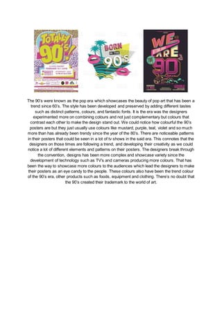
- 1. The 90’s were known as the pop era which showcases the beauty of pop art that has been a trend since 60’s. The style has been developed and preserved by adding different tastes such as distinct patterns, colours, and fantastic fonts. It is the era was the designers experimented more on combining colours and not just complementary but colours that contrast each other to make the design stand out. We could notice how colourful the 90’s posters are but they just usually use colours like mustard, purple, teal, violet and so much more than has already been trendy since the year of the 80’s. There are noticeable patterns in their posters that could be seen in a lot of tv shows in the said era. This connotes that the designers on those times are following a trend, and developing their creativity as we could notice a lot of different elements and patterns on their posters. The designers break through the convention, designs has been more complex and showcase variety since the development of technology such as TV’s and cameras producing more colours. That has been the way to showcase more colours to the audiences which lead the designers to make their posters as an eye candy to the people. These colours also have been the trend colour of the 90’s era, other products such as foods, equipment and clothing. There’s no doubt that the 90’s created their trademark to the world of art.