2. In this project I have aimed to represent the social group of mature males, aged
predominantly between 18-35 aiming towards those interested in entertainment and
in depth analysis as seen in my main feature article and stories on the main contents
page. My target audience culture is mainly males with a mature aspect with an
interest in general areas of a mature nature such as politics and entertainment. They
tend to be higher income earners with money to spend with an interest in rock music
and a sense of class in aesthetically pleasing design hence why my design has a very
classy design with not a lot of “loud” colours (such as neon colours or bright blues
and yellows) and instead opt for a bold mature design that isn’t visually insulting to
the eyes. The language and content used in the product how the mature aspect of
the design and reflect the target audience chosen such as in depth looks at “The End
of Cinema?” and “Inside Politics”. The content all reflect the main aspect of the front
cover image of reflection and sophistication such as the “Oscar Schwartz Returns”
reflecting on his life and sophistication in Oscar’s costume and the magazine content.
This sophistication is reflected throughout the design so it appeals to the target
audience and encourages the audience to engage in the discussion. The language
used in my product is the type expected to be seen for my target audience and this
has been done for obvious reason as to appeal to the target audience to attract more
readers. The magazine has highly intellectual language so the target audience isn’t
patronised by simple vocabulary and would gain my traction with readers becoming
more popular. The design is bold as its target audience are bold and confident males.
The bold design is shown by the three main contrasting colours making the magazine
stand out. Additionally the fonts used in the design are very simple so the reader can
focus on the content and not have to decipher the font. The content covered in the
double page spread is very mature which is also related to the target audience and
something the people may have an interest in.
In regards to psychographics, my magazine suggest that my audience aren’t
influenced by externalities but instead like to stay informed and educated and make
decisions based on this. My audience and rational but do still follow trends in fashion
and entertainment such as the popularity in different movie genres such as the
popularity of the western genre in the 1950s and 1960s to the new popularity of the
super hero genre. As the magazine is very bold the link to rock music is made with
the rock genre obviously being very bold and loud. My magazines intertextual design
relates to such magazines as Rolling Stone and Maxim.
My audiences taste in fashion would be based around dressing smart and focusing
on brand fashion such as Calvin Klein and Hugo Boss. As my audience will mainly be
high income earners they can afford nice clothing and hence why they can afford to
dress like this. As most readers will be finishing university or in work the suit will be a
popular choice of dress wear for the target audience. This aspect of dressing smart is
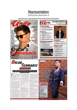
3. shown in all the images of “Oscar Schwartz” with the front cover image being the
model in a smart white shirt and bow tie showing sophistication and maturity so the
audience are attracted to the product.
My Front Cover Rolling Stone Front Cover _
When comparing my magazine to the “Rolling Stone” magazine, there are both
similarities such as the use of colour and layout but the use of image is different such
as lighting, angle, and mode of address. The target audiences of both magazines are
of similar types and all conventions used reflect that.
Conclusion
In conclusion, my product in many ways highly represents adult males who are
sophisticated and mature. The design, colours, features, layout, and language
all have conventional and unconventional features to appeal to the audience
and match stereotypes. This has been done to make the audience appreciate
and interested in the magazine. These unconventional features are used to
create brand image and magazine identity to stand out so the audience are
attracted to the product.