ICT role in 21st century education and it's challenges.
Web design
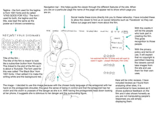
1. Navigation bar - this helps guide the viewer through the different features of the site. When
you are on a particular page the name of the page will appear red to show which page you
are on.
Social media these icons directly link you to these networks. I have included these
to allow the viewer to find us on social networks such as ‘Facebook’ so they can
follow our page and learn more about the film.
Ive watched the film 10 times and still want to
watch it again - Joseph Michaels, Film Critic
Title of the film -
The title of the film is meant to look
like a subscriber button from Youtube.
This linked to the plot of the film as it
is about a Youtuber. The font used for
this was called ‘The Black Box’ from
1001 fonts. I then edited it to make the
writing white and the background red.
Tagline - the font used for the tagline
is from 1001 fonts and its called
‘VTKS GOOD FOR YOU.’ The font I
used for both, the tagline and the
title, was kept the same as the
poster as it shows consistency.
Here will be critic reviews. I have
included reviews as I found from
analysing other sites, it is
conventional to have reviews as it
shows audience feedback on the
film and it also shows honestly as
you are not manipulating people’s
responses you are simply
displaying them.
The image - I decided to use this image because with the chosen body language of the antagonist with her
hand on the protagonists shoulder, this gave the sense of being in control and that the antagonist has her
victim and the victim is unaware of the danger as she is in. With having the protagonists head down looking
at her phone, it suggests she is oblivious to her danger and the surrounding figure.
With the credits it
will list the people
who took part in
creating the film.
This gives
recognition to those
people.
With the privacy
policy and terms of
use, it will explain
that no copyright is
permitted meaning
the viewers cannot
take images from
the site and use
them for their own
uses.