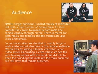
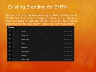
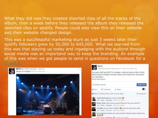
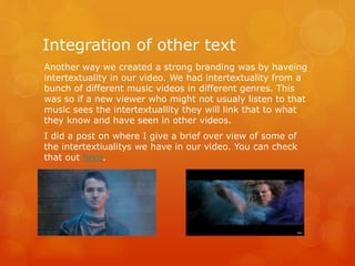
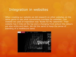
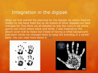
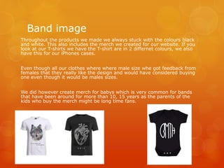
Evaluation Question 2
Branding
By Kristian Oevreeide
Our Product
 We created 3 products for our proo package this year:
 Music Video
 Digipak
 Website
Bands usualy release products through different companys with different
companys doing different things. For the digipak you have the designer,
for the music video you have the director, actors, record lable and many
more crew members. The record lable that has a contract with a band
might be one of the big 3. In this case then the Parent company will most
likley distribute and employee the people to work with the band.
In our case we had to do research into the genre of our band and see
who did what and how the link between these products created a sense
of branding.
In our promo package the three products all link together. For example
the Black metlecore colors flow throughout the 3 products. The reason for
the use of these colours are beacuse they back up not only the metlecore
genre but also the bands prevoius work meaning the sense of branding
hasnt changed so the audience are still following.
The Bedroom Sessions
Audience
 Our Primary target audience is
 16-25 year olds
We got a lot of audience feedback where we specificly asked
for who they though the target audience.
 Our Secondary audience is
 25-60 year olds
The reson for this is becuase some people might have grown
up listening to them and the band members are around 30
year old.
Audience
BMTHs target audience is aimed mainly at males but
still with a high number of female fans. On their
website they seem to appeal to both male and
female equaliy through merhc. There is merch for
both males and females and the modles are also
male and female.
In our music video we decided to mainly target a
male audience but also draw in the female audience.
We did this by adding a female character in our
video aswell as creating a video where we see fan
girls takeing selfies with the band. We did this to
keep the branding that male are the main audience
but still have that female audience.
Existing Branding for BMTH
To keep a strong brand aswell as grow their existing brand
BMTH created a unique Spotify activation for the release of
their new band “THATS THE SPIRIT” doing this thire brand
grew and all their top spotify tracks are from that album.
What they did was they created disorted clips of all the tracks of the
album, then a week before they released the album they released the
desorted clips on spotify. People could also view this on their website
and their website changed design.
This was a succfesssful marketing stunt as just 3 weeks later their
spotify followers grew by 50,000 to 645,000. What we learned from
this was that staying up today and ingadging with the audicne through
social media was an importand way to keep the branding. An example
of this was when we got people to send in questions on Facebook for a
Q and A.
Integration of other text
Another way we created a strong branding was by haveing
intertextuality in our video. We had intertextuality from a
bunch of different music videos in different genres. This
was so if a new viewer who might not usualy listen to that
music sees the intertextuallity they will link that to what
they know and have seen in other videos.
I did a post on where I give a brief over view of some of
the intertextiualitys we have in our video. You can check
that out here.
Integration in websites
When creating our website we did research on other websites on the
same genre to see what conventions overlapp for websites. One
website we used of inspiration was “Bullet for My Valentine”. Their
website has 5 links at the top and a changing front picture the colours
are also white and black. We did the same to keep the sense of
branding of a medtlecore band.
Integration in the digipak
When we first started the planning for the digipak we where inspired
mostly by the band itself but as we looked at other digipaks our idea
changed lot. One think we all desided on was the colours we where
gonna use which where black and white. I was inspired by the
album cover A/B by Kaleo but insted of having a white background
and black hands we changed them to keep the branding of a darker
band. You can read more about it here.
Band image
Throughout the products we made we always stuck with the colours black
and white. This also includes the merch we created for our website. If you
look at our T-shirts we have the T-shirt are in 2 differnet colours, we also
have this for our iPhones cases.
Even though all our clothes where where male size whe got feedback from
females that they really like the design and would have considered buying
one even though it would be males sizes.
We did however create merch for babys which is very common for bands
that have been around for more than 10, 15 years as the parents of the
kids who buy the merch might be long time fans.

Evaluation question 2

  • 1.
  • 2.
    Our Product  Wecreated 3 products for our proo package this year:  Music Video  Digipak  Website
  • 3.
    Bands usualy releaseproducts through different companys with different companys doing different things. For the digipak you have the designer, for the music video you have the director, actors, record lable and many more crew members. The record lable that has a contract with a band might be one of the big 3. In this case then the Parent company will most likley distribute and employee the people to work with the band. In our case we had to do research into the genre of our band and see who did what and how the link between these products created a sense of branding. In our promo package the three products all link together. For example the Black metlecore colors flow throughout the 3 products. The reason for the use of these colours are beacuse they back up not only the metlecore genre but also the bands prevoius work meaning the sense of branding hasnt changed so the audience are still following. The Bedroom Sessions
  • 4.
    Audience  Our Primarytarget audience is  16-25 year olds We got a lot of audience feedback where we specificly asked for who they though the target audience.  Our Secondary audience is  25-60 year olds The reson for this is becuase some people might have grown up listening to them and the band members are around 30 year old.
  • 5.
    Audience BMTHs target audienceis aimed mainly at males but still with a high number of female fans. On their website they seem to appeal to both male and female equaliy through merhc. There is merch for both males and females and the modles are also male and female. In our music video we decided to mainly target a male audience but also draw in the female audience. We did this by adding a female character in our video aswell as creating a video where we see fan girls takeing selfies with the band. We did this to keep the branding that male are the main audience but still have that female audience.
  • 6.
    Existing Branding forBMTH To keep a strong brand aswell as grow their existing brand BMTH created a unique Spotify activation for the release of their new band “THATS THE SPIRIT” doing this thire brand grew and all their top spotify tracks are from that album.
  • 7.
    What they didwas they created disorted clips of all the tracks of the album, then a week before they released the album they released the desorted clips on spotify. People could also view this on their website and their website changed design. This was a succfesssful marketing stunt as just 3 weeks later their spotify followers grew by 50,000 to 645,000. What we learned from this was that staying up today and ingadging with the audicne through social media was an importand way to keep the branding. An example of this was when we got people to send in questions on Facebook for a Q and A.
  • 8.
    Integration of othertext Another way we created a strong branding was by haveing intertextuality in our video. We had intertextuality from a bunch of different music videos in different genres. This was so if a new viewer who might not usualy listen to that music sees the intertextuallity they will link that to what they know and have seen in other videos. I did a post on where I give a brief over view of some of the intertextiualitys we have in our video. You can check that out here.
  • 9.
    Integration in websites Whencreating our website we did research on other websites on the same genre to see what conventions overlapp for websites. One website we used of inspiration was “Bullet for My Valentine”. Their website has 5 links at the top and a changing front picture the colours are also white and black. We did the same to keep the sense of branding of a medtlecore band.
  • 10.
    Integration in thedigipak When we first started the planning for the digipak we where inspired mostly by the band itself but as we looked at other digipaks our idea changed lot. One think we all desided on was the colours we where gonna use which where black and white. I was inspired by the album cover A/B by Kaleo but insted of having a white background and black hands we changed them to keep the branding of a darker band. You can read more about it here.
  • 11.
    Band image Throughout theproducts we made we always stuck with the colours black and white. This also includes the merch we created for our website. If you look at our T-shirts we have the T-shirt are in 2 differnet colours, we also have this for our iPhones cases. Even though all our clothes where where male size whe got feedback from females that they really like the design and would have considered buying one even though it would be males sizes. We did however create merch for babys which is very common for bands that have been around for more than 10, 15 years as the parents of the kids who buy the merch might be long time fans.