
Recommended
More Related Content
What's hot
What's hot (15)
Similar to Font Analysis
Similar to Font Analysis (20)
More from KirstyMaeHarragan
More from KirstyMaeHarragan (20)
Recently uploaded
Recently uploaded (20)
Font Analysis
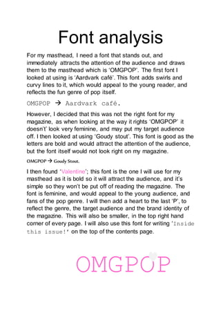
- 1. Font analysis For my masthead, I need a font that stands out, and immediately attracts the attention of the audience and draws them to the masthead which is ‘OMGPOP’. The first font I looked at using is ‘Aardvark café’. This font adds swirls and curvy lines to it, which would appeal to the young reader, and reflects the fun genre of pop itself. OMGPOP Aardvark café. However, I decided that this was not the right font for my magazine, as when looking at the way it rights ‘OMGPOP’ it doesn’t’ look very feminine, and may put my target audience off. I then looked at using ‘Goudy stout’. This font is good as the letters are bold and would attract the attention of the audience, but the font itself would not look right on my magazine. OMGPOP Goudy Stout. I then found ‘Valentine’; this font is the one I will use for my masthead as it is bold so it will attract the audience, and it’s simple so they won’t be put off of reading the magazine. The font is feminine, and would appeal to the young audience, and fans of the pop genre. I will then add a heart to the last ‘P’, to reflect the genre, the target audience and the brand identity of the magazine. This will also be smaller, in the top right hand corner of every page. I will also use this font for writing ‘Inside this issue!’ on the top of the contents page. OMGPOP
- 2. The font for my main sell-line has to be attention grabbing, but can’t draw the attention away from the masthead. For my main sell line, I decided to use ‘Adobe Heiti STD R’, as it is bold and will attract the attention of the audience, whilst showing the importance of it without taking the attention away from the masthead. EXCLUSIVE! INTERVIEW WITH HANNAH VICKERS! “My parents were really shocked…” For the editor’s letter on the contents page, I will use the Script MT Bold’ font so it looks hand written: ‘Dear girls… ’ I decided to use this font to show direct address with the audience, and make I feel like it has been personally written for that reader.