SlideShare a Scribd company logo
1 of 8
Goal:
My goal with this informational
poster is to convince college
students of the importance of
digging into the bureaucratic
details of the administrative
aspects of college. My goal is for
them to persevere through the
boredom of becoming
bureaucratically savvy and
develop a new skill that will
serve them well throughout
their adult lives.
Audience:
My audience is all college
students. I think both first-
generation, low income students
and affluent students whose
parents are college graduates
need this message. College
students of varying backgrounds
have equal aversion to
proactively managing the
bureaucratic nitty-gritty of
college life, so this message is
for any student who steps on a
college campus.
Message:
My message is that taking care
of boring bureaucratic details is
important. It often makes the
difference between receiving
financial aid or not, or being
able to register for your classes
on time. My message is also that
college is time to start handling
your own business and rely less
on others (parents, staff) to tell
you what to do.
From the outset, I wanted the design to be
simple, mostly monochromatic with a few color
details, and evocative of boring, bureaucratic
stuff. I thought that calling out the boring
nature of “reading the fine print” was a must in
this information campaign—no point in trying to
make bureaucracy sexy and exciting with one
poster…it just wasn’t going to happen, so I
thought the stark honesty of “boring but
important” was the way to go.
I made this design before we read the chapter
on alignment, and now looking at the center-
aligned elements, I cringe slightly! I did get
contrast right with typeface size and structure,
but the fact that I used so many different text
boxes is distracting to me now.
For this design, I wanted to try situating my
message in a more concrete scenario that
college students would be able to recognize as
relevant to their lives. Discussions among college
students about what they need to spend their
time studying up on are commonplace, and I
wanted to show that “keeping financial aid
eligibility” is as important as studying for classes
that give you grades and show up on your
transcript.
I’m not crazy about the alignment I used, or the
choice to overlap text over the picture, but I
corrected that in the next design. I again
overused white text boxes here. Not my finest
design hour, I’ll admit.
This is a re-do of the previous design. I didn’t
overlap the dialogue text with the picture, and I
got rid of the white text boxes. I aligned things
such that the eye could travel left to right while
it went top to bottom and there wouldn’t be a
lot of bouncing around for the eye. I wish I
would have used more size contrast with the
fonts.
While this was an improvement over my previous
design, I still wasn’t in love with it. The picture
of the two students conversing do not at all go
with my desired “mood” of “boring but
important.”
I totally switched gears here. I wanted
to duplicate a bureaucratic form.
Forms are everywhere in our lives and
are boring and would NEVER be used
as an eye-catching poster! This was
the point—for a bureaucratic form to
catch someone’s eye on a poster
board and make the person think
“what in the world is a boring form
like that doing on a wall that is
supposed to be full of colorful images
and eye-catching headlines.
This particular design was supposed to
make use of repetition, and my
repeated element here was the
check-box and empty text fields that
are classic elements of a bureaucratic
form.
This is a version of my bureaucratic
form that makes use of contrast to
help make it more eye-catching. I
made some text boxes black and used
white font (Courier New font, of
course…the classic “typewriter”
font). I also threw in some red for
the “I have read the fine print”
acknowledgement. If my message
could be summed up in one phrase, it
would be “Read the Fine Print.”
I used just one image/graphic in this
design—my “Office of Important
Stuff” seal with the magnifying glass
in the center. I make it using Word
Art and incorporating clip art and I
think it looks hokey.
This version of the bureaucratic
form was from the color scheme
assignment (monochromatic).
While the color is bold and eye-
catching, it strays too far from
the style of bureaucratic form to
be “believable.” It doesn’t look
like a form you’d fill out
anymore—it just looks like a
regular poster that is trying to
make use of colors and shapes,
but it has too many words on it
to look pretty.
This one is my latest and
greatest. I kept the
bureaucratic form look, but
jazzed up the heading a
little bit with contrasting
font (both in color and
size). I added some more
realistic-looking items from
the world of bureaucracy
(e.g. official stamp,
signature flag sticker, “this
space left intentionally
blank”). I made use of a
few different alignments
for the purpose of looking
like a bureaucratic form
that isn’t super
sophisticated and that has
to pack in a lot of fine
print.

More Related Content

Similar to Westervelt parker 9.4

School magazine annalasyse
School magazine annalasyseSchool magazine annalasyse
School magazine annalasyselwica1999
 
School magazine annalasyse
School magazine annalasyseSchool magazine annalasyse
School magazine annalasyselwica1999
 
School magazine annalasyse
School magazine annalasyseSchool magazine annalasyse
School magazine annalasyselwica1999
 
College Magazine Analysis
College Magazine AnalysisCollege Magazine Analysis
College Magazine Analysissienamatkin
 
Self evaluation for preliminary task
Self evaluation for preliminary taskSelf evaluation for preliminary task
Self evaluation for preliminary taskOlivia Mungham-Gray
 
Evaluation 2 blog
Evaluation 2 blogEvaluation 2 blog
Evaluation 2 blogmikejduffin
 
Music Magazine Double Page Progression
Music Magazine Double Page ProgressionMusic Magazine Double Page Progression
Music Magazine Double Page ProgressionBaneTMB
 
Zeeshans Music Magazine Double Page Progression
Zeeshans Music Magazine Double Page ProgressionZeeshans Music Magazine Double Page Progression
Zeeshans Music Magazine Double Page Progressiondhensonheywood
 
Evaluation question 7
Evaluation question 7Evaluation question 7
Evaluation question 7Ellenodell
 
CCN Magazine Self Evaluation
CCN Magazine Self EvaluationCCN Magazine Self Evaluation
CCN Magazine Self Evaluationj1huntridgedixon
 
College Magazine Evaluation
College Magazine EvaluationCollege Magazine Evaluation
College Magazine Evaluationj7ralph
 
Digital graphics evaluation pro forma
Digital graphics evaluation pro formaDigital graphics evaluation pro forma
Digital graphics evaluation pro formaaa12134455
 
Digital graphics evaluation pro forma
Digital graphics evaluation pro formaDigital graphics evaluation pro forma
Digital graphics evaluation pro formaENCRES DUBUIT
 
Digital graphics evaluation pro forma
Digital graphics evaluation pro formaDigital graphics evaluation pro forma
Digital graphics evaluation pro formaAaron Aacster
 

Similar to Westervelt parker 9.4 (20)

School magazine annalasyse
School magazine annalasyseSchool magazine annalasyse
School magazine annalasyse
 
School magazine annalasyse
School magazine annalasyseSchool magazine annalasyse
School magazine annalasyse
 
School magazine annalasyse
School magazine annalasyseSchool magazine annalasyse
School magazine annalasyse
 
College Magazine Analysis
College Magazine AnalysisCollege Magazine Analysis
College Magazine Analysis
 
Self evaluation for preliminary task
Self evaluation for preliminary taskSelf evaluation for preliminary task
Self evaluation for preliminary task
 
Evaluation 2 blog
Evaluation 2 blogEvaluation 2 blog
Evaluation 2 blog
 
Music Magazine Double Page Progression
Music Magazine Double Page ProgressionMusic Magazine Double Page Progression
Music Magazine Double Page Progression
 
Zeeshans Music Magazine Double Page Progression
Zeeshans Music Magazine Double Page ProgressionZeeshans Music Magazine Double Page Progression
Zeeshans Music Magazine Double Page Progression
 
Evaluation question 7
Evaluation question 7Evaluation question 7
Evaluation question 7
 
Evaluation
EvaluationEvaluation
Evaluation
 
CCN Magazine Self Evaluation
CCN Magazine Self EvaluationCCN Magazine Self Evaluation
CCN Magazine Self Evaluation
 
College Magazine Evaluation
College Magazine EvaluationCollege Magazine Evaluation
College Magazine Evaluation
 
Question 7
Question 7Question 7
Question 7
 
School magazine analysis
School magazine analysisSchool magazine analysis
School magazine analysis
 
My Preliminary Task x
My Preliminary Task xMy Preliminary Task x
My Preliminary Task x
 
Digital graphics evaluation pro forma
Digital graphics evaluation pro formaDigital graphics evaluation pro forma
Digital graphics evaluation pro forma
 
Digital graphics evaluation pro forma
Digital graphics evaluation pro formaDigital graphics evaluation pro forma
Digital graphics evaluation pro forma
 
Digital graphics evaluation pro forma
Digital graphics evaluation pro formaDigital graphics evaluation pro forma
Digital graphics evaluation pro forma
 
7 evaluation
7 evaluation7 evaluation
7 evaluation
 
Media work
Media workMedia work
Media work
 

Recently uploaded

Features of Video Calls in the Discuss Module in Odoo 17
Features of Video Calls in the Discuss Module in Odoo 17Features of Video Calls in the Discuss Module in Odoo 17
Features of Video Calls in the Discuss Module in Odoo 17Celine George
 
Championnat de France de Tennis de table/
Championnat de France de Tennis de table/Championnat de France de Tennis de table/
Championnat de France de Tennis de table/siemaillard
 
How to Manage Closest Location in Odoo 17 Inventory
How to Manage Closest Location in Odoo 17 InventoryHow to Manage Closest Location in Odoo 17 Inventory
How to Manage Closest Location in Odoo 17 InventoryCeline George
 
HVAC System | Audit of HVAC System | Audit and regulatory Comploance.pptx
HVAC System | Audit of HVAC System | Audit and regulatory Comploance.pptxHVAC System | Audit of HVAC System | Audit and regulatory Comploance.pptx
HVAC System | Audit of HVAC System | Audit and regulatory Comploance.pptxKunal10679
 
Graduate Outcomes Presentation Slides - English (v3).pptx
Graduate Outcomes Presentation Slides - English (v3).pptxGraduate Outcomes Presentation Slides - English (v3).pptx
Graduate Outcomes Presentation Slides - English (v3).pptxneillewis46
 
size separation d pharm 1st year pharmaceutics
size separation d pharm 1st year pharmaceuticssize separation d pharm 1st year pharmaceutics
size separation d pharm 1st year pharmaceuticspragatimahajan3
 
Removal Strategy _ FEFO _ Working with Perishable Products in Odoo 17
Removal Strategy _ FEFO _ Working with Perishable Products in Odoo 17Removal Strategy _ FEFO _ Working with Perishable Products in Odoo 17
Removal Strategy _ FEFO _ Working with Perishable Products in Odoo 17Celine George
 
An Overview of the Odoo 17 Discuss App.pptx
An Overview of the Odoo 17 Discuss App.pptxAn Overview of the Odoo 17 Discuss App.pptx
An Overview of the Odoo 17 Discuss App.pptxCeline George
 
The basics of sentences session 4pptx.pptx
The basics of sentences session 4pptx.pptxThe basics of sentences session 4pptx.pptx
The basics of sentences session 4pptx.pptxheathfieldcps1
 
The Last Leaf, a short story by O. Henry
The Last Leaf, a short story by O. HenryThe Last Leaf, a short story by O. Henry
The Last Leaf, a short story by O. HenryEugene Lysak
 
MOOD STABLIZERS DRUGS.pptx
MOOD     STABLIZERS           DRUGS.pptxMOOD     STABLIZERS           DRUGS.pptx
MOOD STABLIZERS DRUGS.pptxPoojaSen20
 
An overview of the various scriptures in Hinduism
An overview of the various scriptures in HinduismAn overview of the various scriptures in Hinduism
An overview of the various scriptures in HinduismDabee Kamal
 
REPRODUCTIVE TOXICITY STUDIE OF MALE AND FEMALEpptx
REPRODUCTIVE TOXICITY  STUDIE OF MALE AND FEMALEpptxREPRODUCTIVE TOXICITY  STUDIE OF MALE AND FEMALEpptx
REPRODUCTIVE TOXICITY STUDIE OF MALE AND FEMALEpptxmanishaJyala2
 
demyelinated disorder: multiple sclerosis.pptx
demyelinated disorder: multiple sclerosis.pptxdemyelinated disorder: multiple sclerosis.pptx
demyelinated disorder: multiple sclerosis.pptxMohamed Rizk Khodair
 
Navigating the Misinformation Minefield: The Role of Higher Education in the ...
Navigating the Misinformation Minefield: The Role of Higher Education in the ...Navigating the Misinformation Minefield: The Role of Higher Education in the ...
Navigating the Misinformation Minefield: The Role of Higher Education in the ...Mark Carrigan
 
Dementia (Alzheimer & vasular dementia).
Dementia (Alzheimer & vasular dementia).Dementia (Alzheimer & vasular dementia).
Dementia (Alzheimer & vasular dementia).Mohamed Rizk Khodair
 
MichaelStarkes_UncutGemsProjectSummary.pdf
MichaelStarkes_UncutGemsProjectSummary.pdfMichaelStarkes_UncutGemsProjectSummary.pdf
MichaelStarkes_UncutGemsProjectSummary.pdfmstarkes24
 
ĐỀ THAM KHẢO KÌ THI TUYỂN SINH VÀO LỚP 10 MÔN TIẾNG ANH FORM 50 CÂU TRẮC NGHI...
ĐỀ THAM KHẢO KÌ THI TUYỂN SINH VÀO LỚP 10 MÔN TIẾNG ANH FORM 50 CÂU TRẮC NGHI...ĐỀ THAM KHẢO KÌ THI TUYỂN SINH VÀO LỚP 10 MÔN TIẾNG ANH FORM 50 CÂU TRẮC NGHI...
ĐỀ THAM KHẢO KÌ THI TUYỂN SINH VÀO LỚP 10 MÔN TIẾNG ANH FORM 50 CÂU TRẮC NGHI...Nguyen Thanh Tu Collection
 
24 ĐỀ THAM KHẢO KÌ THI TUYỂN SINH VÀO LỚP 10 MÔN TIẾNG ANH SỞ GIÁO DỤC HẢI DƯ...
24 ĐỀ THAM KHẢO KÌ THI TUYỂN SINH VÀO LỚP 10 MÔN TIẾNG ANH SỞ GIÁO DỤC HẢI DƯ...24 ĐỀ THAM KHẢO KÌ THI TUYỂN SINH VÀO LỚP 10 MÔN TIẾNG ANH SỞ GIÁO DỤC HẢI DƯ...
24 ĐỀ THAM KHẢO KÌ THI TUYỂN SINH VÀO LỚP 10 MÔN TIẾNG ANH SỞ GIÁO DỤC HẢI DƯ...Nguyen Thanh Tu Collection
 

Recently uploaded (20)

Features of Video Calls in the Discuss Module in Odoo 17
Features of Video Calls in the Discuss Module in Odoo 17Features of Video Calls in the Discuss Module in Odoo 17
Features of Video Calls in the Discuss Module in Odoo 17
 
Championnat de France de Tennis de table/
Championnat de France de Tennis de table/Championnat de France de Tennis de table/
Championnat de France de Tennis de table/
 
How to Manage Closest Location in Odoo 17 Inventory
How to Manage Closest Location in Odoo 17 InventoryHow to Manage Closest Location in Odoo 17 Inventory
How to Manage Closest Location in Odoo 17 Inventory
 
HVAC System | Audit of HVAC System | Audit and regulatory Comploance.pptx
HVAC System | Audit of HVAC System | Audit and regulatory Comploance.pptxHVAC System | Audit of HVAC System | Audit and regulatory Comploance.pptx
HVAC System | Audit of HVAC System | Audit and regulatory Comploance.pptx
 
“O BEIJO” EM ARTE .
“O BEIJO” EM ARTE                       .“O BEIJO” EM ARTE                       .
“O BEIJO” EM ARTE .
 
Graduate Outcomes Presentation Slides - English (v3).pptx
Graduate Outcomes Presentation Slides - English (v3).pptxGraduate Outcomes Presentation Slides - English (v3).pptx
Graduate Outcomes Presentation Slides - English (v3).pptx
 
size separation d pharm 1st year pharmaceutics
size separation d pharm 1st year pharmaceuticssize separation d pharm 1st year pharmaceutics
size separation d pharm 1st year pharmaceutics
 
Removal Strategy _ FEFO _ Working with Perishable Products in Odoo 17
Removal Strategy _ FEFO _ Working with Perishable Products in Odoo 17Removal Strategy _ FEFO _ Working with Perishable Products in Odoo 17
Removal Strategy _ FEFO _ Working with Perishable Products in Odoo 17
 
An Overview of the Odoo 17 Discuss App.pptx
An Overview of the Odoo 17 Discuss App.pptxAn Overview of the Odoo 17 Discuss App.pptx
An Overview of the Odoo 17 Discuss App.pptx
 
The basics of sentences session 4pptx.pptx
The basics of sentences session 4pptx.pptxThe basics of sentences session 4pptx.pptx
The basics of sentences session 4pptx.pptx
 
The Last Leaf, a short story by O. Henry
The Last Leaf, a short story by O. HenryThe Last Leaf, a short story by O. Henry
The Last Leaf, a short story by O. Henry
 
MOOD STABLIZERS DRUGS.pptx
MOOD     STABLIZERS           DRUGS.pptxMOOD     STABLIZERS           DRUGS.pptx
MOOD STABLIZERS DRUGS.pptx
 
An overview of the various scriptures in Hinduism
An overview of the various scriptures in HinduismAn overview of the various scriptures in Hinduism
An overview of the various scriptures in Hinduism
 
REPRODUCTIVE TOXICITY STUDIE OF MALE AND FEMALEpptx
REPRODUCTIVE TOXICITY  STUDIE OF MALE AND FEMALEpptxREPRODUCTIVE TOXICITY  STUDIE OF MALE AND FEMALEpptx
REPRODUCTIVE TOXICITY STUDIE OF MALE AND FEMALEpptx
 
demyelinated disorder: multiple sclerosis.pptx
demyelinated disorder: multiple sclerosis.pptxdemyelinated disorder: multiple sclerosis.pptx
demyelinated disorder: multiple sclerosis.pptx
 
Navigating the Misinformation Minefield: The Role of Higher Education in the ...
Navigating the Misinformation Minefield: The Role of Higher Education in the ...Navigating the Misinformation Minefield: The Role of Higher Education in the ...
Navigating the Misinformation Minefield: The Role of Higher Education in the ...
 
Dementia (Alzheimer & vasular dementia).
Dementia (Alzheimer & vasular dementia).Dementia (Alzheimer & vasular dementia).
Dementia (Alzheimer & vasular dementia).
 
MichaelStarkes_UncutGemsProjectSummary.pdf
MichaelStarkes_UncutGemsProjectSummary.pdfMichaelStarkes_UncutGemsProjectSummary.pdf
MichaelStarkes_UncutGemsProjectSummary.pdf
 
ĐỀ THAM KHẢO KÌ THI TUYỂN SINH VÀO LỚP 10 MÔN TIẾNG ANH FORM 50 CÂU TRẮC NGHI...
ĐỀ THAM KHẢO KÌ THI TUYỂN SINH VÀO LỚP 10 MÔN TIẾNG ANH FORM 50 CÂU TRẮC NGHI...ĐỀ THAM KHẢO KÌ THI TUYỂN SINH VÀO LỚP 10 MÔN TIẾNG ANH FORM 50 CÂU TRẮC NGHI...
ĐỀ THAM KHẢO KÌ THI TUYỂN SINH VÀO LỚP 10 MÔN TIẾNG ANH FORM 50 CÂU TRẮC NGHI...
 
24 ĐỀ THAM KHẢO KÌ THI TUYỂN SINH VÀO LỚP 10 MÔN TIẾNG ANH SỞ GIÁO DỤC HẢI DƯ...
24 ĐỀ THAM KHẢO KÌ THI TUYỂN SINH VÀO LỚP 10 MÔN TIẾNG ANH SỞ GIÁO DỤC HẢI DƯ...24 ĐỀ THAM KHẢO KÌ THI TUYỂN SINH VÀO LỚP 10 MÔN TIẾNG ANH SỞ GIÁO DỤC HẢI DƯ...
24 ĐỀ THAM KHẢO KÌ THI TUYỂN SINH VÀO LỚP 10 MÔN TIẾNG ANH SỞ GIÁO DỤC HẢI DƯ...
 

Westervelt parker 9.4

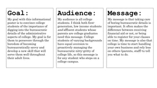
  • 1. Goal: My goal with this informational poster is to convince college students of the importance of digging into the bureaucratic details of the administrative aspects of college. My goal is for them to persevere through the boredom of becoming bureaucratically savvy and develop a new skill that will serve them well throughout their adult lives. Audience: My audience is all college students. I think both first- generation, low income students and affluent students whose parents are college graduates need this message. College students of varying backgrounds have equal aversion to proactively managing the bureaucratic nitty-gritty of college life, so this message is for any student who steps on a college campus. Message: My message is that taking care of boring bureaucratic details is important. It often makes the difference between receiving financial aid or not, or being able to register for your classes on time. My message is also that college is time to start handling your own business and rely less on others (parents, staff) to tell you what to do.
  • 2. From the outset, I wanted the design to be simple, mostly monochromatic with a few color details, and evocative of boring, bureaucratic stuff. I thought that calling out the boring nature of “reading the fine print” was a must in this information campaign—no point in trying to make bureaucracy sexy and exciting with one poster…it just wasn’t going to happen, so I thought the stark honesty of “boring but important” was the way to go. I made this design before we read the chapter on alignment, and now looking at the center- aligned elements, I cringe slightly! I did get contrast right with typeface size and structure, but the fact that I used so many different text boxes is distracting to me now.
  • 3. For this design, I wanted to try situating my message in a more concrete scenario that college students would be able to recognize as relevant to their lives. Discussions among college students about what they need to spend their time studying up on are commonplace, and I wanted to show that “keeping financial aid eligibility” is as important as studying for classes that give you grades and show up on your transcript. I’m not crazy about the alignment I used, or the choice to overlap text over the picture, but I corrected that in the next design. I again overused white text boxes here. Not my finest design hour, I’ll admit.
  • 4. This is a re-do of the previous design. I didn’t overlap the dialogue text with the picture, and I got rid of the white text boxes. I aligned things such that the eye could travel left to right while it went top to bottom and there wouldn’t be a lot of bouncing around for the eye. I wish I would have used more size contrast with the fonts. While this was an improvement over my previous design, I still wasn’t in love with it. The picture of the two students conversing do not at all go with my desired “mood” of “boring but important.”
  • 5. I totally switched gears here. I wanted to duplicate a bureaucratic form. Forms are everywhere in our lives and are boring and would NEVER be used as an eye-catching poster! This was the point—for a bureaucratic form to catch someone’s eye on a poster board and make the person think “what in the world is a boring form like that doing on a wall that is supposed to be full of colorful images and eye-catching headlines. This particular design was supposed to make use of repetition, and my repeated element here was the check-box and empty text fields that are classic elements of a bureaucratic form.
  • 6. This is a version of my bureaucratic form that makes use of contrast to help make it more eye-catching. I made some text boxes black and used white font (Courier New font, of course…the classic “typewriter” font). I also threw in some red for the “I have read the fine print” acknowledgement. If my message could be summed up in one phrase, it would be “Read the Fine Print.” I used just one image/graphic in this design—my “Office of Important Stuff” seal with the magnifying glass in the center. I make it using Word Art and incorporating clip art and I think it looks hokey.
  • 7. This version of the bureaucratic form was from the color scheme assignment (monochromatic). While the color is bold and eye- catching, it strays too far from the style of bureaucratic form to be “believable.” It doesn’t look like a form you’d fill out anymore—it just looks like a regular poster that is trying to make use of colors and shapes, but it has too many words on it to look pretty.
  • 8. This one is my latest and greatest. I kept the bureaucratic form look, but jazzed up the heading a little bit with contrasting font (both in color and size). I added some more realistic-looking items from the world of bureaucracy (e.g. official stamp, signature flag sticker, “this space left intentionally blank”). I made use of a few different alignments for the purpose of looking like a bureaucratic form that isn’t super sophisticated and that has to pack in a lot of fine print.