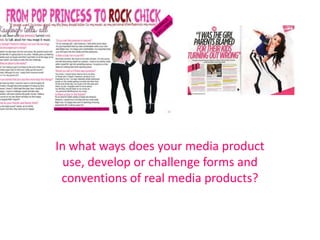
SlideShare a Scribd company logo
1 of 9
In what ways does your media product
  use, develop or challenge forms and
 conventions of real media products?
Headline
The headline can either be found across the double page spread or on one side. I decided to do it across the
double page spread. I also discovered through research that the headline is usually unique to the magazine
and there isn't really a convention in regards to the font of the headline. This is why I chose the font I did as I
believe it reflects the nature of the cover line. From all the magazines I’ve researched, I noticed that the
headline is usually a quote but I wanted to allow the reader to know what the article was about which is why I
used ‘FROM POP PRINCESS TO ROCK CHICK’. However, I put a quote below the headline as I wanted to
follow some conventions that pop magazines follow. I used a unique font and made it pink as that is a
stereotypically pink colour, however, I put ‘rock’ as a dark colour to show the contrast of pop and rock.
Main Image
Usually on a double page spread, there is one main image. However, I challenged this convention and used
two images. I wanted to show the contrast between rock and pop as this is what the story is about. This is
why one of the images includes props which relate to pop such as the pink glasses and the other image uses
things which represent rock such as red lipstick. Originally, I put the images in the middle of the page as I
thought the layout looked better, however, in magazines, they are usually on the right or left due to the
magazine being cut in between the middle when opening and closing. So, to make it more of a professional
magazine, I changed the layout of the double page spread to what it is now. The poses of the model suggest
she is strong and independent which is what I wanted the model to suggest as if she looks confident, the
reader would be encouraged.
Colour Scheme
I wanted to use a contrast of colours as the article is about rock and pop. This is why I used he colours pink
and dark reds. I only used the dark red when speaking about the rock image as evident within the head line.
I used a white background as when going through the double page spreads in existing pop magazines, they
all have white background to make the popish colours such as pinks stand out more. I followed the
convention of not using too many colours as I wanted to avoid it looking cluttered and make it look neat


                                       Moderate use of colour
Stand first
Magazines conventionally use a stand first which is an introductory paragraph at the beginning of the
interview. It tells the reader what the article will be about. I also used a fun font that’s different to the other
fonts as I wanted to it stand out more. I also challenged the convention slightly and put colour into the stand
first which isn't a usual convention within pop magazines but I wanted to make my magazine unique.
Quotes
Quotes are a usual convention usually used within double page spread. They are usually used within the
headlines of the double page spread. However, I just put it below the headline. It had to be a interesting quote
as it encourages the reader to continue with the magazine. I also put it in a dark red to show the contrast
between the pop and rock which is what the article is about.
Columns
Double page spreads are conventionally laid out in columns. I just to continue this convention in order for it to
look professional and neat.
Subject Name
In regards to subject name, I challenged the convention of where the subject names is usually introduced. I
positioned it in its own line to make it unique and stand out more. This is evident in the ‘Kayleigh tells all’.
In Conclusion….

                        Colour Scheme

Subject Name
                Subject Line


                    Columns

More Related Content

What's hot (18)

My double page spread
My double page spreadMy double page spread
My double page spread
 
Rolling stone double page spread analysis
Rolling stone double page spread analysisRolling stone double page spread analysis
Rolling stone double page spread analysis
 
production experiments for magazine
production experiments for magazineproduction experiments for magazine
production experiments for magazine
 
Construction Douple Page Article
Construction Douple Page ArticleConstruction Douple Page Article
Construction Douple Page Article
 
Construction douple page article
Construction douple page articleConstruction douple page article
Construction douple page article
 
Music magazine shot planning
Music magazine shot planningMusic magazine shot planning
Music magazine shot planning
 
Use develop challenge
Use develop challengeUse develop challenge
Use develop challenge
 
My chosen images
My chosen imagesMy chosen images
My chosen images
 
USE DEVELOP CHALLENGE Magazine Cover
USE DEVELOP CHALLENGE Magazine CoverUSE DEVELOP CHALLENGE Magazine Cover
USE DEVELOP CHALLENGE Magazine Cover
 
mediaPr11 production commentary
mediaPr11 production commentarymediaPr11 production commentary
mediaPr11 production commentary
 
Evaluation
EvaluationEvaluation
Evaluation
 
Comparing my magazine to others
Comparing my magazine to othersComparing my magazine to others
Comparing my magazine to others
 
Music Magazine Construction
Music Magazine ConstructionMusic Magazine Construction
Music Magazine Construction
 
Creating my magazine front cover
Creating my magazine front coverCreating my magazine front cover
Creating my magazine front cover
 
Pr(1)
Pr(1)Pr(1)
Pr(1)
 
Music Magazine Construction
Music Magazine ConstructionMusic Magazine Construction
Music Magazine Construction
 
Looking at music magazines
Looking at music magazinesLooking at music magazines
Looking at music magazines
 
Improvements fmp production
Improvements fmp productionImprovements fmp production
Improvements fmp production
 

Viewers also liked (7)

Habits for a healthy heart
Habits for a healthy heartHabits for a healthy heart
Habits for a healthy heart
 
Running order
Running orderRunning order
Running order
 
Editing Diary
Editing DiaryEditing Diary
Editing Diary
 
Montage
MontageMontage
Montage
 
Ndim1 2009 Web Design
Ndim1 2009 Web DesignNdim1 2009 Web Design
Ndim1 2009 Web Design
 
Mo ef finally admits air pollution kills
Mo ef finally admits air pollution killsMo ef finally admits air pollution kills
Mo ef finally admits air pollution kills
 
Will more aiims dilute brand
Will more aiims dilute brandWill more aiims dilute brand
Will more aiims dilute brand
 

Similar to Evaluation question one double page spread

Poppy question one evaluation
Poppy question one evaluationPoppy question one evaluation
Poppy question one evaluation
Charis Creber
 
Media evaluation q1
Media evaluation q1Media evaluation q1
Media evaluation q1
Michel Cooke
 
Construction Process
Construction ProcessConstruction Process
Construction Process
guest788bd8
 
Construction Process
Construction ProcessConstruction Process
Construction Process
guest788bd8
 
Evaluation question 1
Evaluation question 1 Evaluation question 1
Evaluation question 1
05knotwelllau
 
Evaluation 1- In what ways does your media product use, develop or challenge ...
Evaluation 1- In what ways does your media product use, develop or challenge ...Evaluation 1- In what ways does your media product use, develop or challenge ...
Evaluation 1- In what ways does your media product use, develop or challenge ...
Daisy Birchall
 
AS Media Presentation - Rae Vasconcelos
AS Media Presentation - Rae VasconcelosAS Media Presentation - Rae Vasconcelos
AS Media Presentation - Rae Vasconcelos
SFX
 
In what ways does your media product use, develop or challenge forms and conv...
In what ways does your media product use, develop or challenge forms and conv...In what ways does your media product use, develop or challenge forms and conv...
In what ways does your media product use, develop or challenge forms and conv...
RyanDenner
 
Evaluation of my music magazine production
Evaluation of my music magazine productionEvaluation of my music magazine production
Evaluation of my music magazine production
Ashleigh Foy
 
Evaluation of my own music magazine production
Evaluation of my own music magazine productionEvaluation of my own music magazine production
Evaluation of my own music magazine production
Ashleigh Foy
 

Similar to Evaluation question one double page spread (20)

Evaluation
Evaluation Evaluation
Evaluation
 
Q1
Q1Q1
Q1
 
Evaluation Complete
Evaluation CompleteEvaluation Complete
Evaluation Complete
 
Poppy question one evaluation
Poppy question one evaluationPoppy question one evaluation
Poppy question one evaluation
 
Media evaluation q1
Media evaluation q1Media evaluation q1
Media evaluation q1
 
Construction Process
Construction ProcessConstruction Process
Construction Process
 
Construction Process
Construction ProcessConstruction Process
Construction Process
 
Question 1
Question 1Question 1
Question 1
 
QUESTION 1
QUESTION 1QUESTION 1
QUESTION 1
 
Evaluation question 1
Evaluation question 1 Evaluation question 1
Evaluation question 1
 
Construction
ConstructionConstruction
Construction
 
Evaluation 1- In what ways does your media product use, develop or challenge ...
Evaluation 1- In what ways does your media product use, develop or challenge ...Evaluation 1- In what ways does your media product use, develop or challenge ...
Evaluation 1- In what ways does your media product use, develop or challenge ...
 
Conventions
ConventionsConventions
Conventions
 
Question 1 evaluation
Question 1 evaluationQuestion 1 evaluation
Question 1 evaluation
 
Question 1 evaluation
Question 1 evaluationQuestion 1 evaluation
Question 1 evaluation
 
AS Media Presentation - Rae Vasconcelos
AS Media Presentation - Rae VasconcelosAS Media Presentation - Rae Vasconcelos
AS Media Presentation - Rae Vasconcelos
 
In what ways does your media product use, develop or challenge forms and conv...
In what ways does your media product use, develop or challenge forms and conv...In what ways does your media product use, develop or challenge forms and conv...
In what ways does your media product use, develop or challenge forms and conv...
 
Evaluation Q1 & Q2
Evaluation Q1 & Q2Evaluation Q1 & Q2
Evaluation Q1 & Q2
 
Evaluation of my music magazine production
Evaluation of my music magazine productionEvaluation of my music magazine production
Evaluation of my music magazine production
 
Evaluation of my own music magazine production
Evaluation of my own music magazine productionEvaluation of my own music magazine production
Evaluation of my own music magazine production
 

Evaluation question one double page spread

  • 1. In what ways does your media product use, develop or challenge forms and conventions of real media products?
  • 2. Headline The headline can either be found across the double page spread or on one side. I decided to do it across the double page spread. I also discovered through research that the headline is usually unique to the magazine and there isn't really a convention in regards to the font of the headline. This is why I chose the font I did as I believe it reflects the nature of the cover line. From all the magazines I’ve researched, I noticed that the headline is usually a quote but I wanted to allow the reader to know what the article was about which is why I used ‘FROM POP PRINCESS TO ROCK CHICK’. However, I put a quote below the headline as I wanted to follow some conventions that pop magazines follow. I used a unique font and made it pink as that is a stereotypically pink colour, however, I put ‘rock’ as a dark colour to show the contrast of pop and rock.
  • 3. Main Image Usually on a double page spread, there is one main image. However, I challenged this convention and used two images. I wanted to show the contrast between rock and pop as this is what the story is about. This is why one of the images includes props which relate to pop such as the pink glasses and the other image uses things which represent rock such as red lipstick. Originally, I put the images in the middle of the page as I thought the layout looked better, however, in magazines, they are usually on the right or left due to the magazine being cut in between the middle when opening and closing. So, to make it more of a professional magazine, I changed the layout of the double page spread to what it is now. The poses of the model suggest she is strong and independent which is what I wanted the model to suggest as if she looks confident, the reader would be encouraged.
  • 4. Colour Scheme I wanted to use a contrast of colours as the article is about rock and pop. This is why I used he colours pink and dark reds. I only used the dark red when speaking about the rock image as evident within the head line. I used a white background as when going through the double page spreads in existing pop magazines, they all have white background to make the popish colours such as pinks stand out more. I followed the convention of not using too many colours as I wanted to avoid it looking cluttered and make it look neat Moderate use of colour
  • 5. Stand first Magazines conventionally use a stand first which is an introductory paragraph at the beginning of the interview. It tells the reader what the article will be about. I also used a fun font that’s different to the other fonts as I wanted to it stand out more. I also challenged the convention slightly and put colour into the stand first which isn't a usual convention within pop magazines but I wanted to make my magazine unique.
  • 6. Quotes Quotes are a usual convention usually used within double page spread. They are usually used within the headlines of the double page spread. However, I just put it below the headline. It had to be a interesting quote as it encourages the reader to continue with the magazine. I also put it in a dark red to show the contrast between the pop and rock which is what the article is about.
  • 7. Columns Double page spreads are conventionally laid out in columns. I just to continue this convention in order for it to look professional and neat.
  • 8. Subject Name In regards to subject name, I challenged the convention of where the subject names is usually introduced. I positioned it in its own line to make it unique and stand out more. This is evident in the ‘Kayleigh tells all’.
  • 9. In Conclusion…. Colour Scheme Subject Name Subject Line Columns