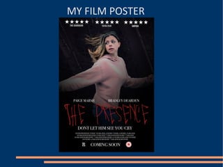
2. USE
● Most posters for horror films use the dark
gradient around the outer edges of the image,
in order to create a sense of darkness and the
unknown.
● My film poster uses red, black and grey,
colours that are usually seen on horror film
posters, due to their negative connotations
and links to the genre as a whole
● My poster also follows the codes and
conventions of film posters, such as the
inclusion of a tag-line and the credits at the
bottom of my poster.
3. DEVELOP
● Although some conventions of film posters
such as reviews are quite common amongst
other genres, these do not commonly appear
on horror films. However, I felt that including
them on my poster was necessary, as it would
help to better inform the potential audience
on the film, and perhaps persuade them to
watch it.
4. CHALLENGE
● Film posters in general do not regularly include the
film's age rating. However I felt that his was something
that should be include, so that the audience is fully
aware of what to expect from the film, which is
especially important for a genre such as horror.
●
● Although my poster uses red, black and grey, I also use
the colour pink on my main character, which is an
unusually bright colour for horror posters. I chose to do
this in order to reflect the innocence of the main
character, rather than dressing her in dark clothes that
would suggest something negative about her.
●
● Lots of horror posters that feature the main character
use close-ups. However, I chose to use a mid shot, as it
allowed me to present some kind of action, creating
and atmosphere of suspense.