Strategies for Unlocking Knowledge Management in Microsoft 365 in the Copilot...
Codes and conventions of music magazines
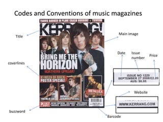
1. Codes and Conventions of music magazines
Main image
Title
Date Issue
Price
number
coverlines
Website
buzzword
Barcode
2. Masthead
The title is usually top left aligned and either goes completely across the top or top leftish if they
are short titles like Q magazine or NME. The fonts are usually big and unique.
Images can partially cover the title, but only if the magazine is well known, e.g. Kerrang
The positioning statement is the magazines line of promotion for itself/ethos either above or
below the title
3. Barcode
The barcode is usually at the bottom right of the page and can be both horizontal or vertical.
On the barcode could be the price of the magazine, the date it was issued and the website for the
magazine. Sometime you can find the number on the barcode too.
5. Images
The main image is usually of a well know person that gives direct address and range from mid
shots or close ups, whereas longer shots are used if the
image is of a band.
There is never any texts on any facial aspect of the image and the images are generally posed.
The background to the main image is mainly plain to make the image stand out more.
There are smaller subsidiary images that link to other stories inside the magazine or other
coverlines
6. Colour scheme
• There is normally 3-4 colours maximum and it is usually a simple colour scheme with primary
colours.
7. Text
Magazine covers usually have coverlines that are quite ambiguous on purpose to draw the reader
in by not telling them much. Coverlines are always written in capitals and are the same font
Bold and simple.
Coverlines normally frame the image and the main coverline anchors the main image
There is usually about 5 to 6 coverlines with 3-4 words on a magazine cover with a subline which
adds detail to the coverline, yet not always making the story clear.
There are only a few fonts used on magazine covers;
Serif font
Arial
Or Times New Roman