The document discusses the codes and conventions of magazine front covers. Key elements include:
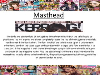
1) The magazine title is positioned in the top left corner in a large, bold font that stands out. Additional information like the positioning statement may be included.
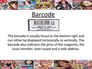
2) A barcode at the bottom right indicates price, issue number, and date.
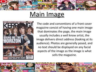
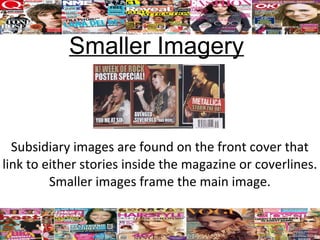
3) A dominant main image featuring a celebrity or event with no text over faces. Smaller images relate to stories inside.
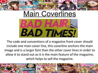
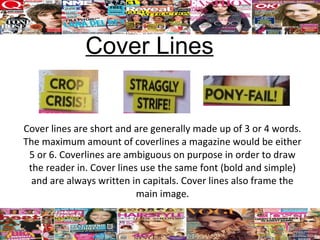
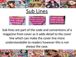
4) One main cover line in a large font anchors the main image, while additional cover lines use the same bold, capitalized font to frame the image.
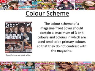
5) A limited color scheme using primary colors ensures images stand out against