👙 Kolkata Call Girls Sonagachi 💫💫7001035870 Model escorts Service
Front cover anaylsis
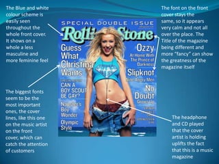
1. The Blue and white The font on the front
colour scheme is cover stays the
easily seen same, so it appears
throughout the very calm and not all
whole front cover. over the place. The
It shows on a Title of the magazine
whole a less being different and
masculine and more “fancy” can show
more feminine feel the greatness of the
magazine itself
The biggest fonts
seem to be the
most important
ones, the cover
lines, like this one The headphone
on the music artist and CD played
on the front that the cover
cover, which can artist is holding
catch the attention uplifts the fact
of customers that this is a music
magazine
2. The Strong black
heading shows that
The text saying “the
this front cover is
ultimate hip hop
more masculine than
experience” can say
feminine, and the red
to us that this is
colour seen around
definitely a Hip hop
the front cover can
genre magazine
also support this
The style of
This text can camera shot
capture the interest that has been
of customers with taken of the
information and cover artist
names of can show the
commonly known high status of
artists him
3. The use of the
green colour The use of the
scheme additional copy “Real
throughout the Rap” confirms the
magazine cover genre of the
reinforces its target magazine.
audience and the
fact that its
masculine coded
because green is
stereotypically a
masculine coded
The use of the colour
colour.
Black for the wording
“The Game” draws
attention to the audience
and attracts consumers.
The magazine It also allows this
incorporates the particular part of the
image of the artists copy to stand out from
name to establish to the rest of the part of the
the audience who copy “Why … is still in the
the magazine cover game”.
is. Also reinforces
the fact that its
masculine coded.