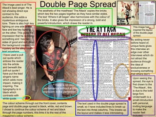
1. The image used is of The
Attack’s lead singer. He is
Double Page Spread
not showing direct eye The aesthetic of the masthead ‘The Attack’ copies the bricks
contract to the which ties the two pages together as they have similar styles.
audience, this adds a The text ‘Where it all began’ also harmonizes with the colour of
mysterious ambiguous the bricks. It also gives the impression of a strong, bold and
tone. There is also high key powerful introduction, which draws the reader in.
lighting on one side of the This image has
face and low key lighting inspired the layout
on the other. This gives the of the double page
impression that he is hiding spread.
something and has two By adding never
sides of good and evil. Also before heard of,
the background creates unique facts gives
mystery as the alley could this interview an
lead anywhere. edge over other
I have used a pull interviews which do
out quote which not attract the
entices the reader audience through
into the article the idea of
and beneath the exclusiveness or
pull out quote I knowing something
have put the lead that others don’t.
singers name
Upon seeing the
which adds more
spread, the eye is
impact, making it
first drawn to the
inspiring. The
‘The Attack’, this
typography is in
is due to the bold
black which
large font.
contrasts with
Underneath is a
white quote.
small introduction
The colour scheme through out the front cover, contents The text used in the double page spread is with personal,
page and double page spread is black, white, red and brown. small, so I have included lines to break up inviting language
I chose to continue the colour scheme of red and black the text into three columns. This breaks up to make the
through the page numbers, this links it to the rest of the the layout and makes it less intimidating. reader feel
magazine’s colour scheme. included.