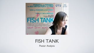
2. Accolades won by the film
By using a blue colour, the awards are
given prominence against the
background.
Natural Background
Torn wallpapers indicates a naturality
about the background from being disused
and under-maintained. This creates a Rule of thirds
Creates more room for credits
point about misé en scene, and describes
but also applies a key photographic principal,
her present situation in an estate that is
making the photo more engaging for the
falling apart. The background is also using
viewer.
contrasting colours to signify importance,
and then link that back to representation;
the wall have been crudely wallpapered Protagonist
Having the protagonist against the side
over in a neutral colour, and after time,
of the frame creates a representation of
the bright coloured paint is showing
a closed environment, similar to the
through after being covered up. The paint
nature of a fish-tank. Looking out of a
serves as a metaphor for the protagonists
window towards a wider world
identity; it has been covered for some
symbolises a longing for something
time, but as she gets older, her identity
more on the part of the protagonist. So,
breaks through once again.
it communicates a message, and at the
same time, gives plenty of space for
Colouring titles and credits. By looking away from
Blue and pink are colours that are the camera, the audience are turned
contrasting against the cream into observers of the situation rather
wallpapered background. The blue and Main Title
The main title of the film takes up roughly 1/6 of the page. This immediately than being addressed by her.
pink, while being contrasting colours, draws the viewer’s attention, as it is in direct contrast to the background. Having the
also work as a symbol of gender; light title next to the protagonist also aides in directing the viewers attention. Another key
blue and pink are what many would point to make about the main title is the interplay between the title and the
consider to be “girly colours”. background. The background starts to infringe on the title by overlapping in some
places, and as a result, creates a sense of fluidity in the poster, where each element
has a different effect on the elements around it.