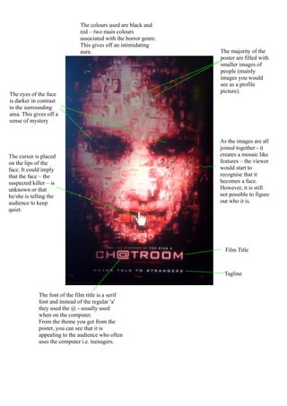
1. The colours used are black and
red – two main colours
associated with the horror genre.
This gives off an intimidating
aura. The majority of the
poster are filled with
smaller images of
people (mainly
images you would
see as a profile
picture).
The eyes of the face
is darker in contrast
to the surrounding
area. This gives off a
sense of mystery
As the images are all
joined together - it
The cursor is placed creates a mosaic like
on the lips of the features – the viewer
face. It could imply would start to
that the face – the recognise that it
suspected killer – is becomes a face.
unknown or that However, it is still
he/she is telling the not possible to figure
audience to keep out who it is.
quiet.
Film Title
Tagline
The font of the film title is a serif
font and instead of the regular 'a'
they used the @ - usually used
when on the computer.
From the theme you get from the
poster, you can see that it is
appealing to the audience who often
uses the computer i.e. teenagers.